POLS 1140
What is public opinion?
Updated Apr 13, 2026
Thursday
Plan for the Today
Public Opinion and current events. Class Survey stuff (Tuesday)
Statistics and POLS 1140 Part I (Tuesday)
Public opinion and democratic theory (Today)
Statistics and POLS 1140 Part II ( Today)
Measuring public opinion through surveys ( Today)
Statistics and POLS 1140 Part III (Next Tuesday)
Using polls to forecast elections (Next Tuesday)
For Next Week
Public Opinion on ICE

Reflection Papers
For an 85 take a paper on the syllabus, and summarize the following
- What’s the research question?
- What’s the theoretical framework?
- Describe the data and methods
- What are the results?
- What are the broader contributions?
For a 100, do the same for a related paper not on the syllabus.
Tip
Typically, I’ll give you a list of related articles in the slides. You might also plug the paper from the syllabus into google scholar, and search citing and related articles
Public Opinion on ICE

Shootings in Minnesota
Take a few moments to think about some questions we might ask about public opinion in the wake in of recent shootings of Renee Good and Alex Pretti in Minnesota
- Start broad
- Anything that comes to mind
- Refine and reframe
- What’s the outcome of interest
- Is your question causal or descriptive
- Why do we care?
- What are your expectations?
- What are alternative explanations
- How would we know?
- What would be credible evidence in support of your expectations?
Class Survey
Why We’re Taking this Course
Worries?
Course Plan
You’ve commited a murder
Why do you ask?
It’s cousin Nick’s fault…
I think it’s a funny question that reveals interesting things about our relationships with our parents
What assumptions are we making when we ask this question?
You’re not a murderer
You don’t know someone who’s committed a murder or been murdered
You’ve got a mom and dad
How might we make this question better?
- Use a screener question: “Would you feel comfortable…”
- “Pipe” in responses from a prior question : “Who are two people who raised you…”
What questions we ask and how we ask them matters
Statistics and POLS 1140 Part I
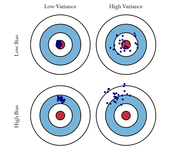
Describing what’s typical
What do you need to know?
Today we’ll cover some basic tools that social scientists use to make the following kinds of inferences:
Descriptive
- How do you feel about college professors
Predictive
- How do feelings about college professors change with age
Causal
- What’s the effect of having a great professor on these attitudes
A lot of statistics is about describing what’s typical.
- Mean: A typical value of some variable
- \(\bar{y} = 1/n \sum y_i\)m=; \(E[Y] = \sum y_i\cdot Pr(Y)\)
- Variance How much do values vary around the mean
- \(\text{var(y)=}\sigma_y^2 = 1/(n-1) \sum (y_i - \bar{y})^2\)
- Standard Deviation How much do values typically vary around the mean
- \(\sigma_y = \sqrt{1/(n-1) \sum (y_i - \bar{y})^2}\)
- Covariance How two variables vary together
- \(\text{cov(xy)=}\sigma_y^2 = 1/(n-1) \sum (x_i - \bar{x})(y_i - \bar{y})\)
- Correlation A standardized measure of covariance
- \(\rho = \frac{\text{cov(x,y)}}{\sigma_x \sigma_y}\)
- Conditional Means The mean of a variable conditional on the values of another variable
- \(E[Y|X] = \sum y_i\cdot Pr(Y|X)\)
What you need to know?
A lot of statistical modeling revolves around estimating conditional means
- How does some outcome change with some explanatory variable
Linear regression (and extensions of the linear model) are the primary tool for making
Statistical inference revolves around quantifying uncertainty about what could have happened.
- Variances, covariances, and related quantities are central to this process.
Linear regression
- Linear regression provides a linear estimate of the conditional expectation function.
- \(y = \beta_0 + \beta_1 x + \epsilon\)
- \(y = \beta_0 + \beta_1 x_1 + \beta_2 x_2 + \dots + \beta_k x_k + \epsilon\)
- \(y = X\beta + \epsilon\)
- The technical details are not important to this class, our goal by the end of the week will be to develop skills to interpret and critique linear models
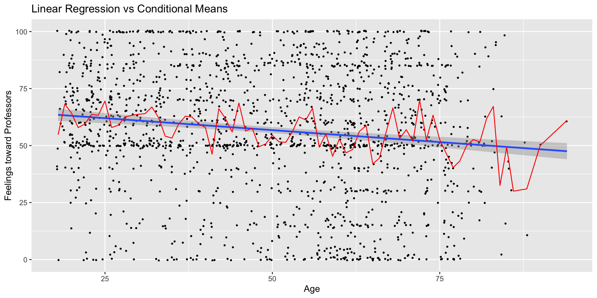
How do people feel about college professors
Let’s explore this question using data from the 2024 NES Pilot Study
Outcome: Feelings toward professors measured on 0-100 point scale
Predictors:
- Age (in years)
- Education (college degree)
What are our expectations?
| Measure | Mean |
|---|---|
| Unconditional | |
| Overall | 56.88 |
| Conditional on Education | |
| No college degree | 53.33 |
| College degree | 61.03 |
| Conditional on Age | |
| Under 30 | 61.95 |
| Over Thirty | 55.68 |
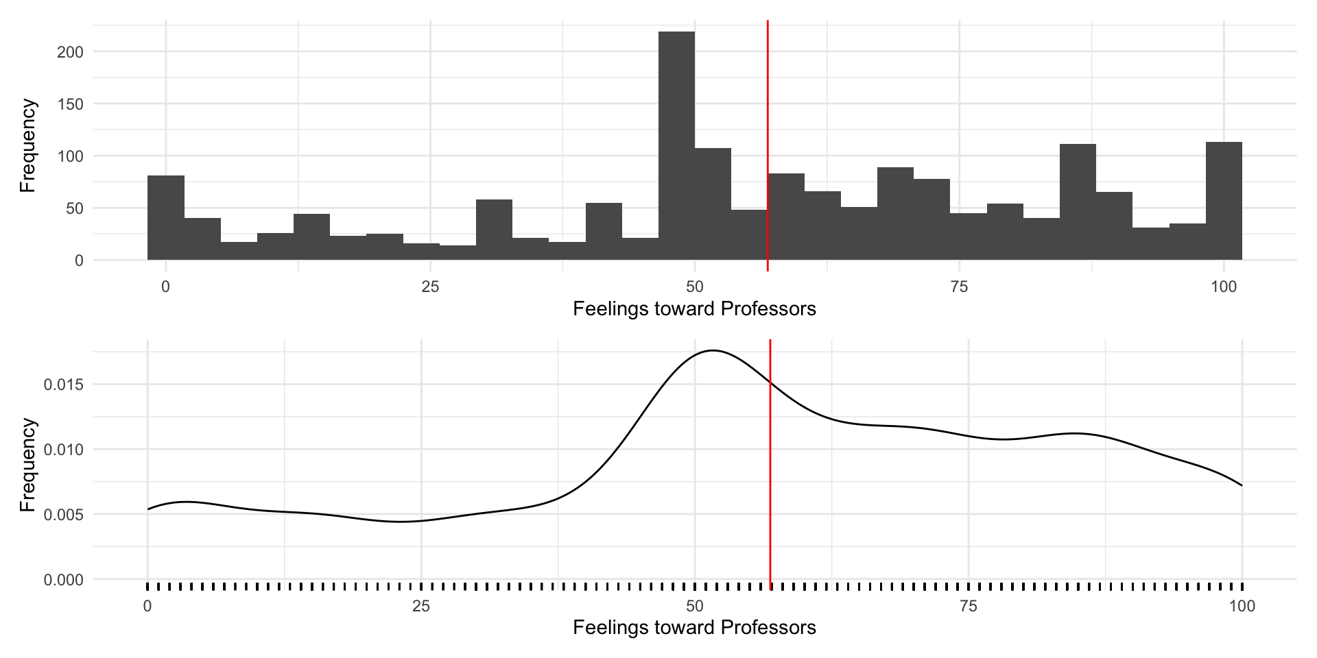
Now lets see how we can use regression to explore these relationships
| Measure | Mean |
|---|---|
| Unconditional | |
| Overall | 56.88 |
| Conditional on Education | |
| No college degree | 53.33 |
| College degree | 61.03 |
| Conditional on Age | |
| Under 30 | 61.95 |
| Over Thirty | 55.68 |
| term | estimate | std.error | statistic | p.value | conf.low | conf.high | df | outcome |
|---|---|---|---|---|---|---|---|---|
| (Intercept) | 61.95 | 1.33 | 46.50 | 0 | 59.34 | 64.57 | 1691 | ft_professors |
| age_catOver Thirty | -6.27 | 1.54 | -4.07 | 0 | -9.30 | -3.25 | 1691 | ft_professors |
| Model 1 | Model 2 | Model 3 | Model 4 | |
|---|---|---|---|---|
| (Intercept) | 61.95*** | 67.26*** | 53.33*** | 64.35*** |
| (1.33) | (1.81) | (0.94) | (1.83) | |
| age_catOver Thirty | -6.27*** | |||
| (1.54) | ||||
| age | -0.21*** | -0.23*** | ||
| (0.04) | (0.04) | |||
| has_degreeCollege degree | 7.70*** | 8.36*** | ||
| (1.34) | (1.34) | |||
| R2 | 0.01 | 0.02 | 0.02 | 0.04 |
| Adj. R2 | 0.01 | 0.02 | 0.02 | 0.04 |
| Num. obs. | 1693 | 1693 | 1693 | 1693 |
| RMSE | 27.80 | 27.65 | 27.64 | 27.35 |
| ***p < 0.001; **p < 0.01; *p < 0.05 | ||||
Summary
- Statistics is about describing what’s typical
- What’s a typical value
- What’s a typical amount of variation
- How does an outcome typically vary with a predictor
- Regression is a tool for providing linear estimates of conditional means
- A way of fitting lines to data
- A way of partitioning variance
- We interpret regression coefficients in terms of their
- sign (positive or negative)
- size (substantively meaningful)
- statistical significance (more later)
Definitions of public opinion
How do you define public opinion
Take a few minutes to write down your own definition of public opinion.
Now take a few minutes to share your definitions with the person next to you
Five Definitions
Five definitions from Glynn et al. (2015)
Aggregation beliefs
Public vs private
Political conflict
Elite vs mass
Lies! Damn lies!

1. Public opinion is an aggregation of individual opinions
“Polling is merely an instrument for gauging public opinion. When a President, or any other leader, pays attention to poll results, he is, in effect, paying attention to the views of the people. Any other interpretation is nonsense.” – George Gallup (1972)

2. Public opinion is a reflection of majority beliefs
“Opinions on controversial issues that one can express in public without isolating oneself”– Elisabeth Noelle-Neumann (1984)

3. Public opinion is found in the conflict of group interests
“The people are involved in public affairs by the conflict system. Conflicts open up questions for public intervention.” – E.E. Schattschneider (1960)

4. Public opinion is simply a reflection of elite influence
“The voice of the people is but an echo. The output of an echo chamber bears an inevitable and invariable relation to the input. As candidates and parties clamor for attention and vie for popular support, the people’s verdict can be no more than a selective reflection from the alternatives and outlooks presented to them.” - V.O. Key (1968)

5. Public opinion does not exist
Bourdieu (1972) argues polls assume
- Everyone can have an opinion
- All opinions are equally valid
- We all agree questions worth asking
Polling thus represents and reconstructs political interests
So what’s the right definition?
None of them
All of them
It depends on the question you’re asking
Each definition has strengths and weaknesses
What are the ways we could study public opinion?
Let’s take a few minutes to write down the different ways we could study public opinion
Think about the places, venues, methods, and results of these approaches
Are some more suited for some definitions of public opinion than others?
Ok let’s share our responses
- How many people wrote down something involving polls and surveys?
- How many people wrote down something else?
A brief history of public opinion
Some caveats
I am not a historian
This is a very abridged and largely western history
Provide a broad overview that introduces recurrent themes
Claims
Public opinion is a reflection of the “public sphere”
Public opinion is a contextual and a function of politics, society, technology and ???
Debates about public opinion and its role in society are persistent
The formal study of public opinion as we know it, is more recent.
Early examples of public opinion

Some early debates about public opinion
“In the same way, when there are many, each can bring his share of goodness and moral prudence; and when all meet together, the people may thus become something in the nature of a single person who – as he has many feet, many hands and many senses – may also have many qualities of character and intelligence” - Aristotle (Politics)

Some early debates about public opinion
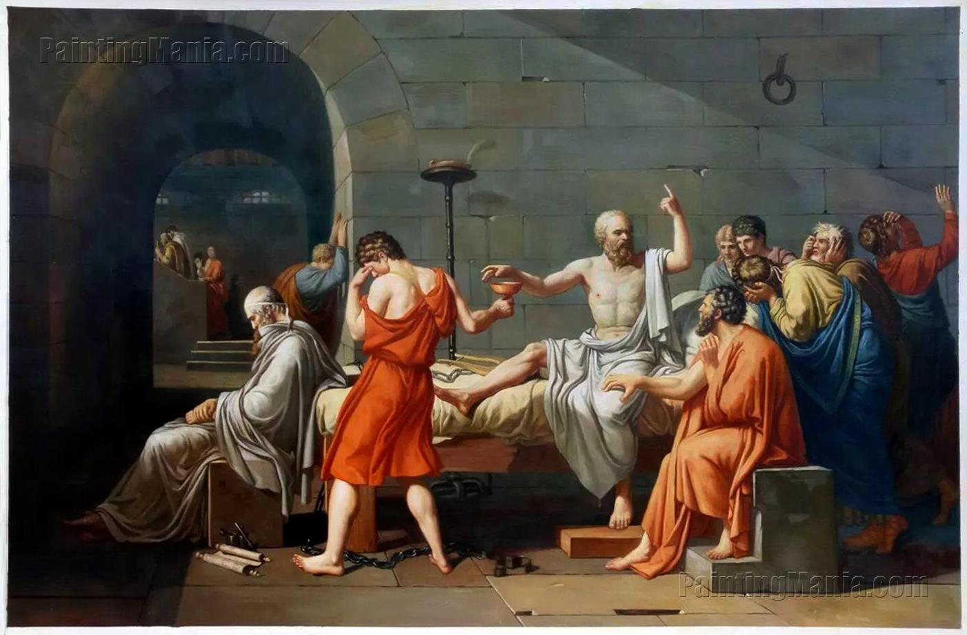
“Then, my friend, we must not regard what the many say of us; but what he, the one man who has understanding of just and unjust, will say, and what the truth will say.” Plato (The Crito)
Some early debates about public opinion
“Men are so simple, and governed so absolutely by their present needs, that he who wishes to deceive will never fail in finding willing dupes” – Machiavelli

Early Technologies of Public Opinion
Oration and rhetoric
Mass demonstration
The written word
Some important “Revolutions” In Public Opinion
- Philosophical
- Social Contract Theory
- Utilitarianism
- Political
- Democratic revolutions
- Expansions of suffrage and political rights
- Progressive reforms like direct democracy
- Socio-Cultural:
- Economic changes
- Public spaces
- Nature and means of communication
The First Straw Polls
Proto-polls emerge around the 1824 Election
- Emerge in response to failures of state caucus to produce clear nominee

The Literary Digest Pools
Began polling readership in 1916
Correctly called, Wilson, Harding, Coolidge, Hoover, and Roosevelt in 1932…
But wildly off in 1936…

Three Eras of Survey Research (Groves 2011)
- Birth (1930-1960)
- Expansion (1960-1990)
- Adaption (1990-present)
Birth (1930-1960)
Advances in statistical theory provide foundation for probability-based sampling
Birth of modern polling firms like Gallup and Roper, with a keen interest on politics in general, and elecitons in partiuclar

Expansion (1960-1990)
Polling becomes ubiquitous as advances in technology (telephones, computers) lower costs
Most surveys have high responses
Two key schools of thought in political science:
- The Columbia School
- The Michigan School
The Colubmia School
Concerned with how individuals are infleunce by the media
Sociological studies based in specific localities (Sandusky, OH, Elmira, NY; Decatur IL)
Propose a two-step flow of communication, where information from the media is filtered through “opinion leaders”
Personal Influence and the two-step flow of communication

The Michigan School
Concerned with how people make political decisions
Based off of surveys that would become the American National Election Studies
Most people cast their votes on the basis of partisan identifications largely inherited from their families

Adaption (1990-present)
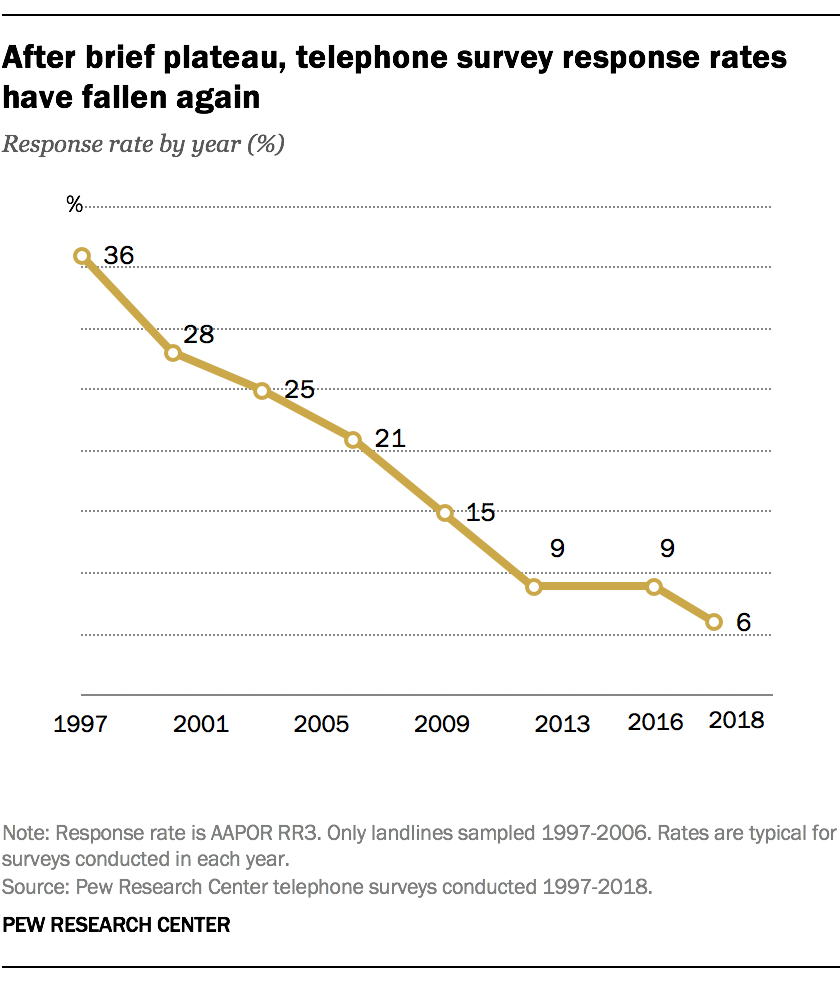
Declining response rates
The internet and the return of non-probability samples
New sources of data and new tools of analysis
Summary
Debates about public opinion are longstanding
Changes in the public sphere change our conceptions of public opinion
Need to be clear about our questions of interest and the contexts in which we’re studying them
Public opinion and democratic theory
The Folk Theory of Democracy

What is Democracy?
Dahl 1998 lays out some general requirements for democracy:
Effective participation people have to have an opportunity to express their preferences
Voting equality votes should count equally
Enlightened understanding people should understand alternatives
Control of the agenda people can bring new items to the agenda; can’t rig the rules of the game
Inclusion of adults not just propertied, white dudes
The Folk Theory of Democracy
Bartels and Achen argue if democracy “begins with voters” then, these voters:
Have genuine opinions on policies
Take time to form those opinions
Elect politicians to represent those opinions
Those politicians then do as they’re told
Chapter 2 contrasts these “democratic ideals” with “dreary” empirical realities
Two Models of Democratic Theory
- Populism
- Democracy is about translating the will of the people into action
- Leadership selection
- Democracy is about selecting good leaders
How might these models work in practice?
Spatial Models of Voting
Represent voters preferences as “ideal points” on a ideological spectrum
For a two party system, with first past the post elections, parties will converge on the preferences of the median voter.
Seemed empirically true in the 1950s/60s

Spatial Models of Voting: The Median Voter Theorem
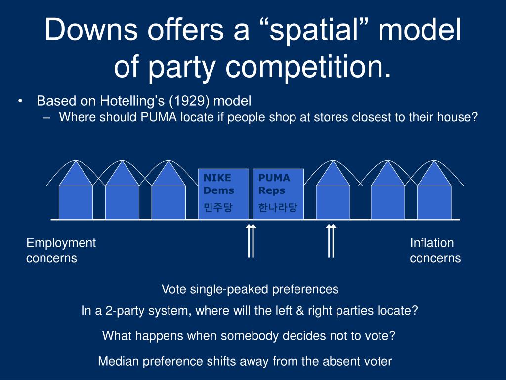
Source: James Vreeland
Limits of the Spatial Model
- Theoretical
- Condorcet’s paradox
- Arrow’s Impossibility Theorem
- Empirical
- Are preferences really unidimensional?
- Are preferences politically meaningful?
- Are preferences reflected in policy
Condorcet’s Paradox: British Preferences for Brexit
- A > B: Remain vs May Deal (Soft exit) -> Remain wins
- B > C: May Deal (Soft exit) vs No Deal (Hard exit) -> May Deal wins
- C > A: Remain vs No Deal (Hard exit) -> No Deal wins

Voting Cycles
Voting cycles – where the order of consideration influences the outcome – are one example of the logical challenges for the folk theory of democracy
Arrow’s Impossibility Theorem
The problem of voting cycles – any outcome is possible depending on the order of consideration – is one example of a more general challenge of aggregating preferences
Arrow (1950) given some reasonable criteria for fairness:
- No dictators, Universality, IIA, Monotonicity, Sovereignty
No rank-order electoral system (e.g. Plurarlity, Instant Run Off, Borda) can be designed that always satisfies all theses criteria
Limits of the Spatial Model
- Theoretical
- Condorcet’s paradox
- Arrow’s Impossibility Theorem
- Empirical
- Are preferences really unidimensional?
- Are preferences politically meaningful?
- Are preferences represented politically?
Are preferences unidimensional?
- The median voter theorem depends on nicely behaved preferences (p. 26)
- one dimension
- single peaked
- If we allow for multiple dimensions, this stable equilibrium vanishes
Are preferences politically meaningful?
- Do people have cleaer issues preferences?
- Do people think in ideological terms?
- Are people’s attitudes consistent over time?
- Do these preferences influence voting
Framing Effects:
For example, 63% to 65% of Americans in the mid-1980s said that the federal government was spending too little on “assistance to the poor”; but only 20% to 25% said that it was spending too little on “welfare” (Rasinski 1989, 391)
Converse (1964) finds:
“[A]bout 3% of voters were clearly classifiable as “ideologues,” with another 12% qualifying as “near-ideologues”; the vast majority of voters (and an even larger proportion of nonvoters) seemed to think about parties and candidates in terms of group interests or the “nature of the times,” or in ways that conveyed “no shred of policy significance whatever”
And only modest correlations across similar issue positions
Again from Converse (1964):
Successive responses to the same questions turned out to be remarkably inconsistent. The correlation coefficients measuring the temporal stability of responses for any given issue from one interview to the next ranged from a bit less than .50 down to a bit less than .30, suggesting that issue views are “extremely labile for individuals over time”
- Causal ambiguity on issue voting (p. 42). Could be:
- issue voting (issues inform vote choice)
- persuasion (candidate positions change issue preferences)
- projection (issue preferences influence candidate perceptions)
The “Miracle” of Aggregation
Even if individuals citizens are “rational ignorant” holding incoherent positions that are easily swayed by things like question wording, perhaps democracy can still function in the aggregate
Achen and Bartels argue this is also not likely to be the case
Condorcet’s jury theorem: As long as voters have a better than than average chance of making the right choice (p > 0.5), with enough voters, society will tend to make the right decision
- Lau and Redlawsk (2006) “found that about 70% of voters, on average, chose the candidate who best matched their own expressed preferences”
Achen and Bartels: Only works if the errors are independent
When thousands or millions of voters misconstrue the same relevant fact or are swayed by the same vivid campaign ad, no amount of aggregation will produce the requisite miracle; individual voters’ “errors” will not cancel out in the overall election outcome (p. 41)
Achen and Bartels discuss a range of research suggesting:
- Levels of political knowledge tend to be low (p. 37)
most people “know jaw-droppingly little about politics.”
Information shortcuts (cues and heuristics) can be unreliable (p. 39)
“Fully informed” preferences differ markedly actual preferences (p. 40)
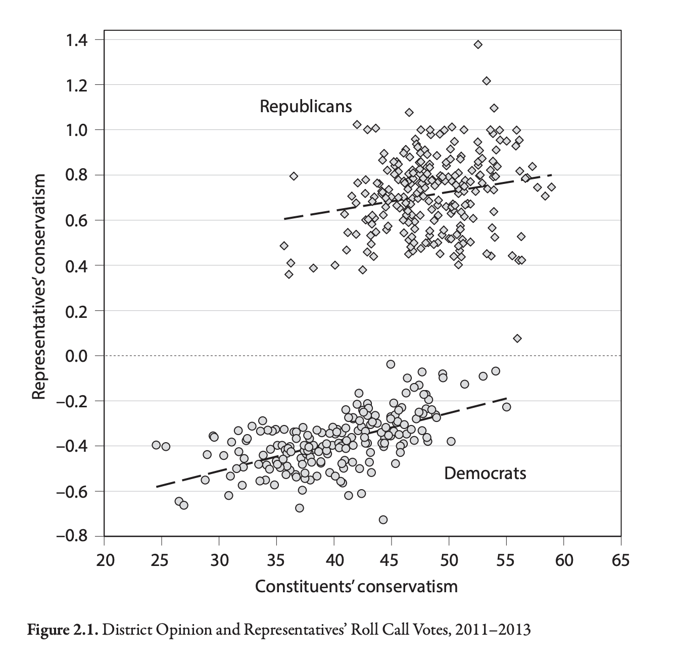
Are preferences represented by politicians
What does Figure 2.1 show?
What would the Folk Theory predict?
Statistics and POLS 1140 Part II
Inference and Uncertainty
Statistical inference involves quantifying uncertainty about what could have happened.
Today, we’ll introduce the concepts of:
Samples and Populations
Confidence Intervals and Hypotheses Tests
There is more content here than we’ll discuss in class.
You don’t need to know how to conduct a hypothesis test or construct a confidence interval
You do need a functional understanding about how to use these tools to understand claims about statistical significance
Sampling distributions
When we conduct a survey we are trying to learn about a population by generalizing from a specific sample
What would have happened if we had a different sample? How different would our result be?
Let’s treat the 2024 NES pilot as the population
Take repeated samples of size N = 10, 30, 300
For each sample of size N, calculate the sample mean of
feelings torward professorsPlot the distribution of sample means (i.e. the sampling distribution)
# Load Data
# load(url("https://pols1600.paultesta.org/files/data/nes24.rda"))

# ---- Population ----

# Population average
mu_prof <- mean(df$ft_professors, na.rm=T)
# Population standard deviation
sd_prof <- sd(df$ft_professors, na.rm = T)

# ---- Function to Take Repeated Samples From Data ----

sample_data_fn <- function(
    dat=df, var=ft_professors, samps=1000, sample_size=10,
    resample = F){
  if(resample == F){
  df <- tibble(
  sim = 1:samps,
  distribution = "Sampling",
  size = sample_size,
  sample_from = "Population",
  pop_mean = dat %>% pull(!!enquo(var)) %>% mean(., na.rm=T),
  pop_sd = dat %>% pull(!!enquo(var)) %>% sd(., na.rm=T),
  se_asymp = pop_sd / sqrt(size),
  ll_asymp = pop_mean - 1.96*se_asymp,
  ul_asymp = pop_mean + 1.96*se_asymp,
) %>%
  mutate(
    sample = purrr::map(sim, ~ slice_sample(dat %>% select(!!enquo(var)), n = sample_size, replace = F)),
    sample_mean = purrr::map_dbl(sample, \(x) x %>% pull(!!enquo(var)) %>% mean(.,na.rm=T)),
    ll = sample_mean - 1.96*sd(sample_mean),
    ul = sample_mean + 1.96*sd(sample_mean)
  )
  }
  if(resample == T){
    df <- tibble(
  sim = 1:samps,
  distribution = "Resampling",
  size = sample_size,
  sample_from = "Sample",
  pop_mean = dat %>% pull(!!enquo(var)) %>% mean(., na.rm=T),
  pop_sd = dat %>% pull(!!enquo(var)) %>% sd(., na.rm=T),
  se_asymp = pop_sd / sqrt(size),
  ll_asymp = pop_mean - 1.96*se_asymp,
  ul_asymp = pop_mean + 1.96*se_asymp,
) %>%
  mutate(
    sample = purrr::map(sim, ~ slice_sample(dat %>% select(!!enquo(var)), n = sample_size, replace = T)),
    sample_mean = purrr::map_dbl(sample, \(x) x %>% pull(!!enquo(var)) %>% mean(.,na.rm=T))
  )
  }
  return(df)
}

# ---- Plot Single Distribution -----

plot_distribution <- function(the_pop,the_samp, the_var, ...){
  mu_pop <- the_pop %>% pull(!!enquo(the_var)) %>% mean(., na.rm=T)
  mu_samp <- the_samp %>% pull(!!enquo(the_var)) %>% mean(., na.rm=T)
  ll <- the_pop %>% pull(!!enquo(the_var)) %>% as.numeric() %>%  min(., na.rm=T)
  ul <- the_pop %>% pull(!!enquo(the_var)) %>% as.numeric() %>% max(., na.rm=T)
  p<- the_samp %>%
    ggplot(aes(!!enquo(the_var)))+
    geom_density()+
    geom_rug()+
    theme_void()+
    geom_vline(xintercept = mu_samp, col = "red")+
    geom_vline(xintercept = mu_pop, col = "grey40",linetype = "dashed")+
    xlim(ll,ul)
  return(p)
}

# ---- Plot multiple distributions ----

plot_samples <- function(pop, x, variable,n_rows = 4, ...){
  sample_plots <- x$sample[1:(4*n_rows)] %>%
  purrr::map( \(x) plot_distribution(the_pop=pop, the_samp = x,
                                     the_var = !!enquo(variable)))
  p <- wrap_elements(wrap_plots(sample_plots[1:(4*n_rows)], ncol=4))
  return(p)

}

# ---- Plot Combined Figure ----

plot_figure_fn <- function(
    d=df,
    v=age,
    sim=1000,
    size=10,
    rows = 4){
  # Population average
  mu <- d %>% pull(!!enquo(v)) %>% mean(., na.rm=T)
  sd <- d %>% pull(!!enquo(v)) %>% sd(., na.rm=T)
  se <- sd/sqrt(size)
  # Range
  ll <- d %>% pull(!!enquo(v)) %>% as.numeric() %>%  min(., na.rm=T)
  ul <- d %>% pull(!!enquo(v)) %>% as.numeric() %>% max(., na.rm=T)
  # Population standard deviation
  # Sample data
  samp_df <- sample_data_fn(dat=d, var = !!enquo(v), samps = sim, sample_size = size)
  # Plot Population
  p_pop <- d %>%
    ggplot(aes(!!enquo(v)))+
      geom_density(col ="grey60")+
      geom_rug(col = "grey60", )+
      geom_vline(xintercept = mu, col="grey40", linetype="dashed")+
      theme_void()+
      labs(title ="Population")+
      xlim(ll,ul)+
      theme(plot.title = element_text(hjust = 0))


  p_samps <- plot_samples(pop=d, x= samp_df,variable = !!enquo(v),
                          n_rows = rows)
  p_samps <- p_samps +
    ggtitle(paste("Repeated samples of size N =",size,"from the population"))+
    theme(plot.title = element_text(hjust = 0.5),
          plot.background = element_rect(
            fill = NA, colour = 'black', linewidth = 2)
          )


  p_dist <- samp_df %>%
  ggplot(aes(sample_mean))+
  geom_density(col="red",aes(y= after_stat(ndensity)))+
  geom_rug(col="red")+
  geom_density(data = df, aes(!!enquo(v), y= after_stat(ndensity)),
               col="grey60")+
  geom_vline(xintercept = mu, col="grey40", linetype="dashed")+
  xlim(ll,ul)+
  theme_void()+
    labs(
      title = "Sampling Distribution"
    )+  theme(plot.title = element_text(hjust = 0))

  range_upper_df <- tibble(
  x = seq( ((ll+ul)/2 -5), ((ll+ul)/2 +5), length.out = 20),
  xend = seq(ll-5, ul+5, length.out = 20),
  y = rep(9, 20),
  yend = rep(1, 20)
)
p_upper <- range_upper_df %>%
  ggplot(aes(x=x, xend = xend, y=y,yend=yend))+
  geom_segment(
    arrow = arrow(length = unit(0.05, "npc"))
  )+
  theme_void()+
  coord_fixed(ylim=c(0,10),
              xlim =c(ll-5,ul+5),clip="off")
  # Lower
  range_df <- samp_df %>%
  summarise(
    min = min(sample_mean),
    max = max(sample_mean),
    mean = mean(sample_mean)
  )

  plot_df <- tibble(
  id = 1:50,
  # x = sort(rnorm(50, mu, sd)),
  x = sort(runif(50, ll, ul)),
  xend = sort(rnorm(50, mu, se)),
  y = 9,
  yend = 1
)

p_lower <- plot_df %>%
  ggplot(aes(x,y, group =id))+
  geom_segment(aes(xend=xend, yend=yend),
               col = "red",arrow = arrow(length = unit(0.05, "npc"))
               )+
  theme_void()+
  coord_fixed(ylim=c(0,10),xlim = c(ll,ul),clip="off")


  design <-"##AAAA##
            ##AAAA##
            ##AAAA##
            BBBBBBBB
            BBBBBBBB
            #CCCCCC#
            #CCCCCC#
            #CCCCCC#
            #CCCCCC#
            DDDDDDDD
            DDDDDDDD
            ##EEEE##
            ##EEEE##
            ##EEEE##"

  fig <- p_pop / p_upper / p_samps / p_lower / p_dist +
    plot_layout(design = design)
  return(fig)


}

# ---- Samples and Figures Varying Sample Size ----
## N = 10
set.seed(1234)
samp_n10 <- sample_data_fn(sample_size  = 10, samps = 1000)
set.seed(1234)
fig_n10 <- plot_figure_fn(v=ft_professors,size = 10)

## N = 30
set.seed(1234)
samp_n30 <- sample_data_fn(sample_size  = 30, samps = 1000)
set.seed(1234)
fig_n30 <- plot_figure_fn(v=ft_professors,size = 30,rows=4)

## N = 300
set.seed(1234)
samp_n300 <- sample_data_fn(sample_size  = 300, samps = 1000)
set.seed(1234)
fig_n300 <- plot_figure_fn(v=ft_professors,size = 300)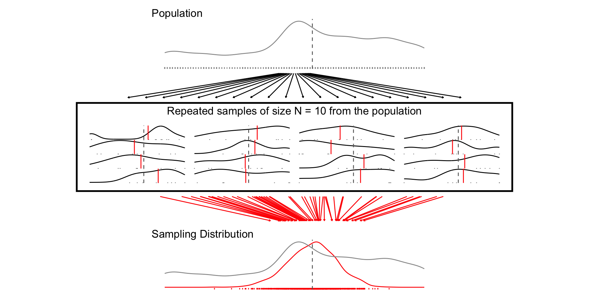
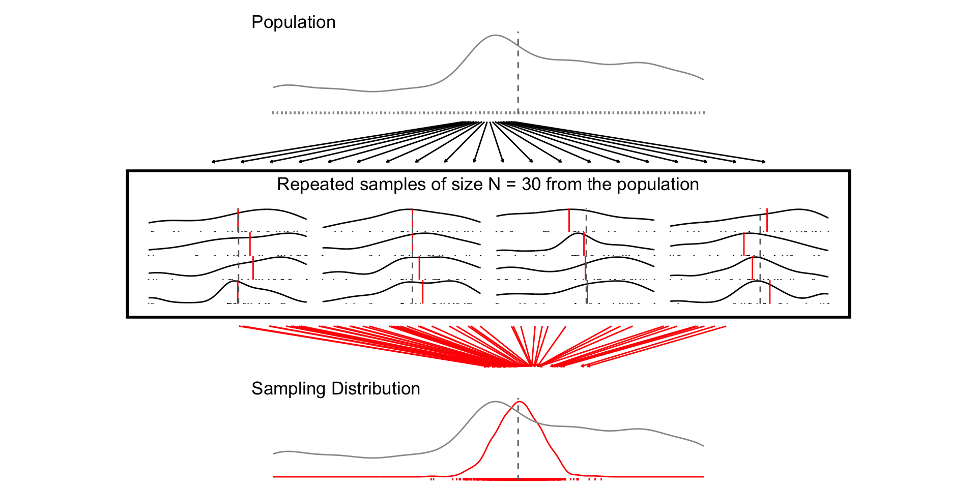
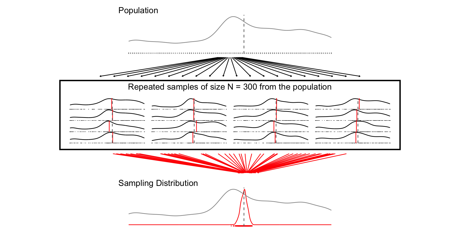
Random sampling ensures the sampling distribution is centered around the population value (unbiased estimator)
As the sample sample size increases:
The width of the sampling distribution decreases (Law of Large Numbers)
The shape of the sampling distribution approximates a Normal distribution (Central Limit Theorem)
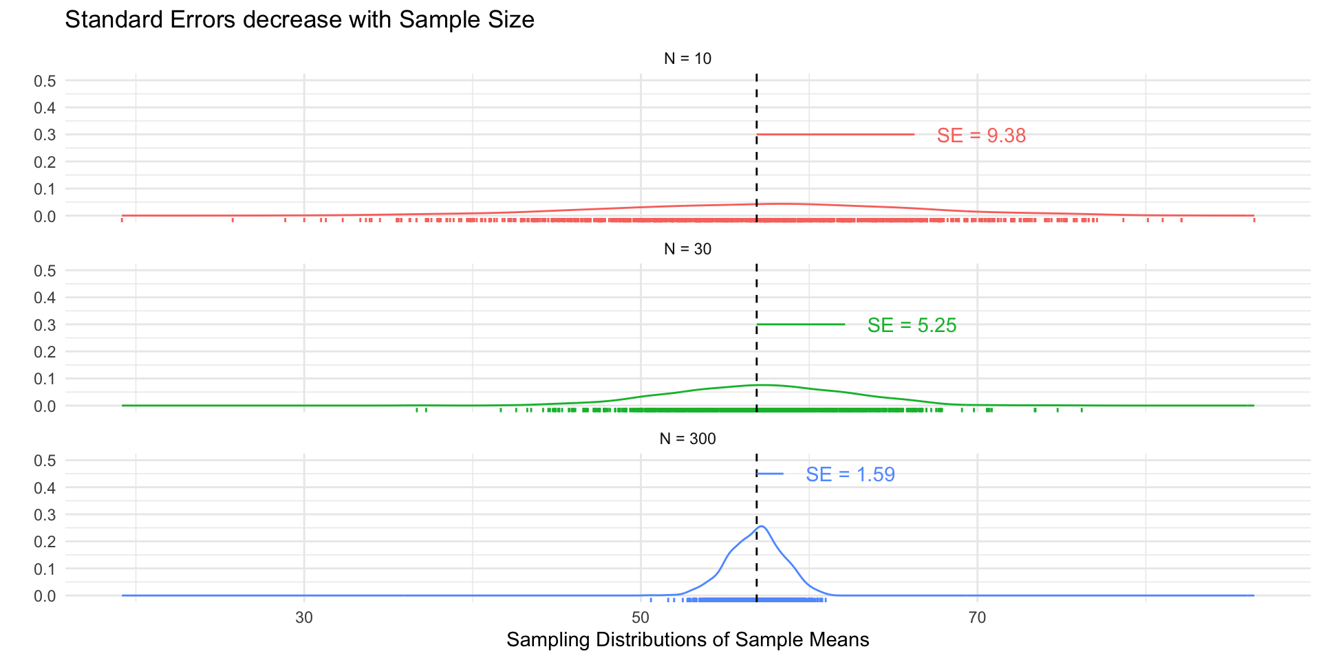
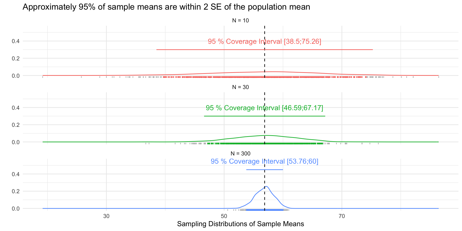
Standard errors
The standard error (SE) is simply the standard deviation of the sampling distribution.
The SE decreases as the sample size increases (by the LLN):
Approximately 95% of the sample means will be within 2 SEs of the population mean (CLT)
se_df <- tibble(
  `Sample Size` = factor(paste("N =",c(10,30, 300))),
  se = c(sd(samp_n10$sample_mean),
         sd(samp_n30$sample_mean),
         sd(samp_n300$sample_mean)),
  SE = paste("SE =", round(se,2)),
  ll = mu_prof,
  ul = mu_prof + se,
  y = c(.3,.3,.45),
  yend = y
)

ci_df <- tibble(
  `Sample Size` = factor(paste("N =",c(10,30, 300))),
  se = c(sd(samp_n10$sample_mean),
         sd(samp_n30$sample_mean),
         sd(samp_n300$sample_mean)),
  mu = mu_prof,
  ll = round(mu_prof - 1.96 *se,2),
  ul = round(mu_prof + 1.96 *se,2),
  ci = paste("95 % Coverage Interval [",ll,";",ul,"]",sep=""),
  y = c(.3,.3,.45),
  yend = y
)
sim_df <- samp_n10 %>%
  bind_rows(samp_n30) %>%
  bind_rows(samp_n300) %>%
  mutate(
    `Sample Size` = factor(paste("N =",size))
    ) %>%
  left_join(ci_df) %>%
  mutate(
    Coverage = case_when(
      sample_mean > ll_asymp & sample_mean < ul_asymp  & size == 10~ "#F8766D",
      sample_mean > ll_asymp & sample_mean < ul_asymp  & size == 30~ "#00BA38",
      sample_mean > ll_asymp & sample_mean < ul_asymp  & size == 300~ "#619CFF",
      T ~ "grey"
    )
  )


fig_se <- sim_df %>%
  ggplot(aes(sample_mean, col = `Sample Size`))+
  geom_density()+
  geom_rug()+
  geom_vline(xintercept = mu_prof, linetype = "dashed")+
  theme_minimal()+
  facet_wrap(~`Sample Size`, ncol=1)+
  ylim(0,.5)+
  guides(col="none")+
  geom_segment(
    data = se_df,
    aes(x= ll, xend =ul, y = y, yend = yend)
  )+
  geom_text(
    data = se_df,
    aes(x = ul, y =y, label = SE),
    hjust = -.25
  ) +
  labs(
    y = "",
    x = "Sampling Distributions of Sample Means",
    title = "Standard Errors decrease with Sample Size"
  )

fig_coverage <- sim_df %>%
  ggplot(aes(sample_mean,col=`Sample Size`))+
  geom_density()+
  geom_rug(col=sim_df$Coverage)+
  geom_vline(xintercept = mu_prof, linetype = "dashed")+
  theme_minimal()+
  facet_wrap(~`Sample Size`, ncol=1)+
  ylim(0,.55)+
  guides(col="none")+
  geom_segment(
    data = ci_df,
    aes(x= ll, xend =ul, y = y, yend = yend)
  )+
  geom_text(
    data = ci_df,
    aes(x = mu, y =y, label = ci),
    hjust = .5,
    nudge_y =.1
  ) +
  labs(
    y = "",
    x = "Sampling Distributions of Sample Means",
    title = "Approximately 95% of sample means are within 2 SE of the population mean"
  )
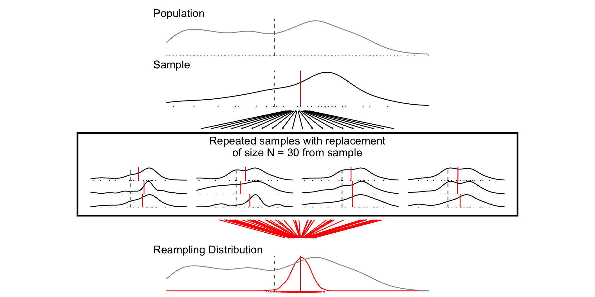
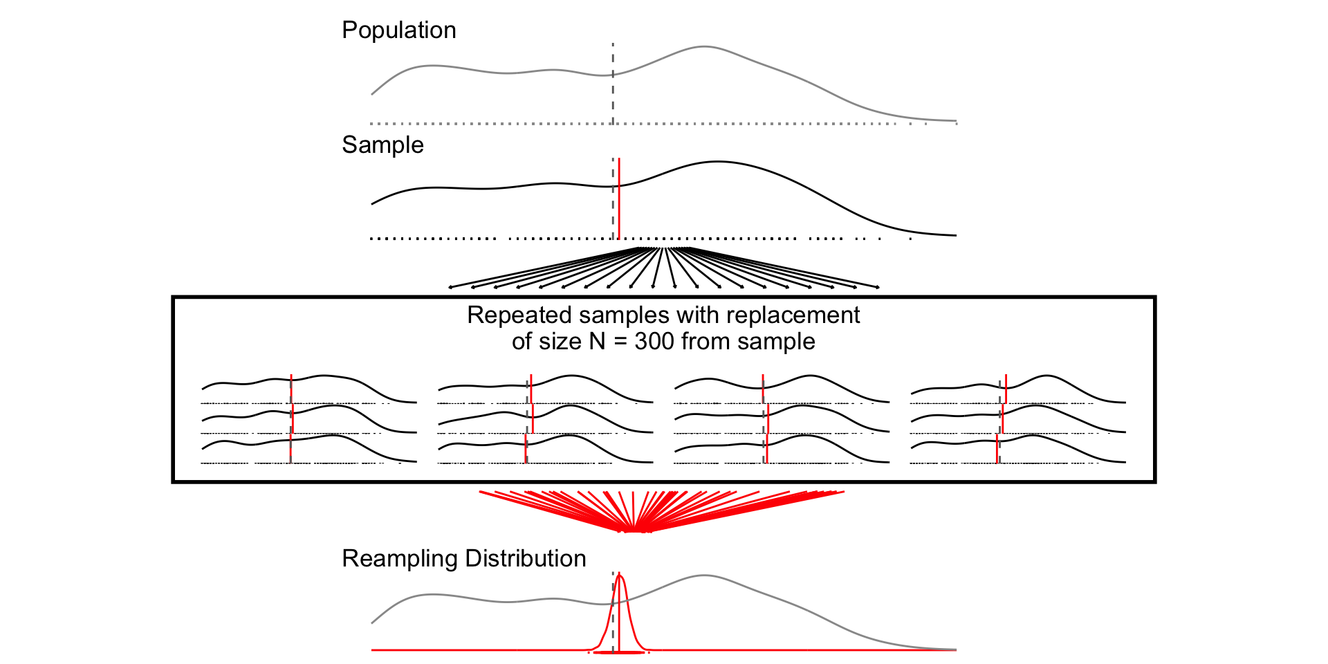
How do we calculate a standard error from a single sample?
Calculating standard errors
- Simulation:
- Treat sample as population
- Sample with replacement (“bootstrapping”)
- Estimate SE from standard deviation of resampling distribution (“plug-in principle”)
- Analytic
- Characterize sampling distribution from sample mean and variance via asymptotic theory (the LLT and CLT)
- For a sample mean, \(\bar{x}\)
\[ SE_{\bar{x}} = \frac{\sigma_x}{\sqrt(n)} \]
plot_resampling_fn <- function(d=df, v=age, sim=1000, size=10,rows=3){
  # Population average
  mu <- d %>% pull(!!enquo(v)) %>% mean(., na.rm=T)
  # Population standard deviation and SE
  sd <- d %>% pull(!!enquo(v)) %>% sd(., na.rm=T)
  se <- sd/sqrt(size)
  # Range
  ll <- d %>% pull(!!enquo(v)) %>% as.numeric() %>%  min(., na.rm=T)
  ul <- d %>% pull(!!enquo(v)) %>% as.numeric() %>% max(., na.rm=T)
  # Resampling with replace
  # Draw 1 Sample
  sample <- sample_data_fn(dat=d, var = !!enquo(v), samps = 1, sample_size = size, resample = F)
  samp_df <- as.data.frame(sample$sample)
  # Resample from sample with replacement
  resamp_df <- sample_data_fn(dat=samp_df, var = !!enquo(v), samps = sim, sample_size = size, resample = T)
  # Plot Population
  p_pop <- d %>%
    ggplot(aes(!!enquo(v)))+
      geom_density(col ="grey60")+
      geom_rug(col = "grey60", )+
      geom_vline(xintercept = mu, col="grey40", linetype="dashed")+
      theme_void()+
      labs(title ="Population")+
      xlim(ll,ul)+
      theme(plot.title = element_text(hjust = 0))

  p_samp <- plot_distribution(the_pop = d,
                              the_samp = samp_df,
                              the_var = age)+
    labs(title ="Sample")+
      xlim(ll,ul)+
      theme(plot.title = element_text(hjust = 0))

  p_samps <- plot_samples(pop=d, x= resamp_df,variable = !!enquo(v), n_rows =rows)
  p_samps <- p_samps +
    ggtitle(paste("Repeated samples with replacement\nof size N =",size,"from sample"))+
    theme(plot.title = element_text(hjust = 0.5),
          plot.background = element_rect(
            fill = NA, colour = 'black', linewidth = 2)
          )

  # Resampling Distribution


  p_dist <- resamp_df %>%
  ggplot(aes(sample_mean))+
  geom_density(col="red",aes(y= after_stat(ndensity)))+
  geom_rug(col="red")+
  geom_density(data = df, aes(!!enquo(v), y= after_stat(ndensity)),
               col="grey60")+
  geom_vline(xintercept = unique(resamp_df$pop_mean), col="red", linetype="solid")+
  geom_vline(xintercept = mu, col="grey40", linetype="dashed")+
  xlim(ll,ul)+
  theme_void()+
    labs(
      title = "Reampling Distribution"
    )+  theme(plot.title = element_text(hjust = 0))

   range_upper_df <- tibble(
  x = seq( ((ll+ul)/2 -5), ((ll+ul)/2 +5), length.out = 20),
  xend = seq(ll-5, ul+5, length.out = 20),
  y = rep(9, 20),
  yend = rep(1, 20)
)
p_upper <- range_upper_df %>%
  ggplot(aes(x=x, xend = xend, y=y,yend=yend))+
  geom_segment(
    arrow = arrow(length = unit(0.05, "npc"))
  )+
  theme_void()+
  coord_fixed(ylim=c(0,10),
              xlim =c(ll-5,ul+5),clip="off")
  # Lower
  range_df <- resamp_df %>%
  summarise(
    min = min(sample_mean),
    max = max(sample_mean),
    mean = mean(sample_mean)
  )

  plot_df <- tibble(
  id = 1:50,
  # x = sort(rnorm(50, mu, sd)),
  x = sort(runif(50, ll, ul)),
  xend = sort(rnorm(50, unique(resamp_df$pop_mean), se)),
  y = 9,
  yend = 1
)

p_lower <- plot_df %>%
  ggplot(aes(x,y, group =id))+
  geom_segment(aes(xend=xend, yend=yend),
               col = "red",arrow = arrow(length = unit(0.05, "npc"))
               )+
  theme_void()+
  coord_fixed(ylim=c(0,10),xlim = c(ll,ul),clip="off")


  design <-"##AAAA##
            ##AAAA##
            ##AAAA##
            ##BBBB##
            ##BBBB##
            ##BBBB##
            CCCCCCCC
            CCCCCCCC
            #DDDDDD#
            #DDDDDD#
            #DDDDDD#
            #DDDDDD#
            EEEEEEEE
            EEEEEEEE
            ##FFFF##
            ##FFFF##
            ##FFFF##"

  fig <- p_pop / p_samp /p_upper / p_samps / p_lower / p_dist +
    plot_layout(design = design)
  return(fig)


}
set.seed(123)
resamp_n10 <- sample_data_fn(
  dat = sample_data_fn(samps = 1, sample_size = 10, resample = T)$sample %>%  as.data.frame(),
  sample_size = 10,
  resample = T)
set.seed(123)
fig_n10_bs <- plot_resampling_fn(size=10)

set.seed(12345)
resamp_n30 <- sample_data_fn(
  dat = sample_data_fn(samps = 1, sample_size = 30, resample = T)$sample %>%  as.data.frame(),
  samps = 1000, sample_size = 30, resample = T)

set.seed(12345)
fig_n30_bs <- plot_resampling_fn(size=30)

set.seed(1234)
resamp_n300 <- sample_data_fn(
  dat = sample_data_fn(samps = 1, sample_size = 300, resample = T)$sample %>%  as.data.frame(),
  samps = 1000, sample_size = 300, resample = T)
set.seed(1234)
fig_n300_bs <- plot_resampling_fn(size=300)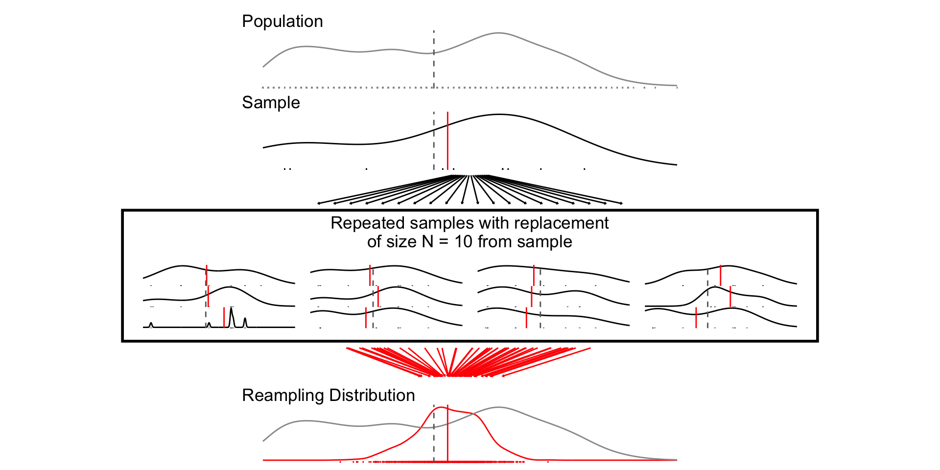
| Bootstrap SE | Analytic SE |
|---|---|
| 9.85 | 8.82 |
| 5.79 | 5.09 |
| 1.85 | 1.61 |
Confidence intervals
Confidence intervals:
provide a way of quantifying uncertainty about estimates
describe a range of plausible values for an estimate
are a function of the standard error of the estimate, and the a critical value determined by \(\alpha\), which describes the degree of confidence we want
Calculating a confidence interval
Choose level of confidence \((1-\alpha)\times 100%\)
- \(\alpha = 0.05\), corresponds to a 95% confidence level.
Derive the sampling distribution of the estimator
- Simulation: bootstrap re-sampling
- Analytically: computing its mean and variance.
Compute the standard error
Compute the critical value \(z_{\alpha/2}\)
- as the \(1.96 = \Phi(z_{0.5/2})\) for a 95% CI
Compute the lower and upper confidence limits
- lower limit = \(\hat{\theta} - z_{\alpha/2}\times SE\)
- upper limit = \(\hat{\theta} + z_{\alpha/2}\times SE\)
resamp_df <-
  resamp_n10 %>%
  bind_rows(resamp_n30) %>%
  bind_rows(resamp_n300) %>%
  mutate(
    `Sample Size` = factor(paste("N =",size))
    )

resamp_ci_df <- tibble(
  `Sample Size` = factor(paste("N =",c(10,30,300))),
  mu = unique(resamp_df$pop_mean),
  ll = unique(resamp_df$ll_asymp),
  ul = unique(resamp_df$ul_asymp),
  y = c(.3, .3,.5)
)

fig_ci1 <- resamp_df %>%
  ggplot(aes(sample_mean,
             col = `Sample Size`))+
  geom_density()+
  geom_rug()+
  geom_vline(xintercept = mu_prof, linetype = "dashed")+
  geom_vline(data = resamp_ci_df,
             aes(xintercept = mu,
                 col = `Sample Size`))+
  geom_segment(data = resamp_ci_df,
               aes(x = ll, xend =ul, y = y, yend =y,
                   col = `Sample Size`))+
  facet_wrap(~`Sample Size`, ncol=1)+
  theme_minimal()+
  labs(
    y = "",
    x = "Resampling Distribution",
    title = "95% Confidence Intervals"
  )


samp_ci_df <- samp_n10 %>%
  bind_rows(samp_n30) %>%
  bind_rows(samp_n300) %>%
  mutate(
    `Sample Size` = factor(paste("N =",size))
    ) %>%
  mutate(
    Coverage = case_when(
      pop_mean > ll & pop_mean < ul ~ "red",
      T ~ "black"
    )
  )

fig_ci2 <- samp_ci_df %>%
  filter(sim %in% 1:100) %>%
  filter(size == 10) %>%
  ggplot(aes(y = sample_mean, x= sim))+
  geom_pointrange(aes(ymin = ll, ymax =ul, col=Coverage))+
  geom_hline(yintercept = mu_prof, linetype = "dashed")+
  coord_flip()+
  theme_minimal()+
  guides(col = "none")+
  facet_wrap(~`Sample Size`)

fig_ci3 <- samp_ci_df %>%
  filter(sim %in% 1:100) %>%
  ggplot(aes(y = sample_mean, x= sim))+
  geom_pointrange(aes(ymin = ll, ymax =ul, col=Coverage))+
  geom_hline(yintercept = mu_prof, linetype = "dashed")+
  coord_flip()+
  theme_minimal()+
  guides(col = "none")+
  facet_wrap(~`Sample Size`)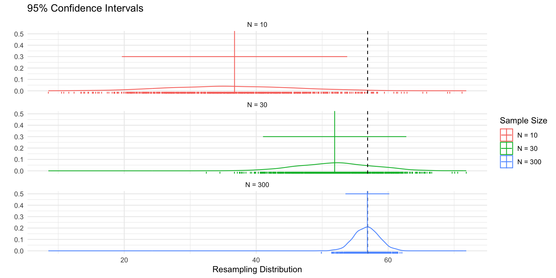
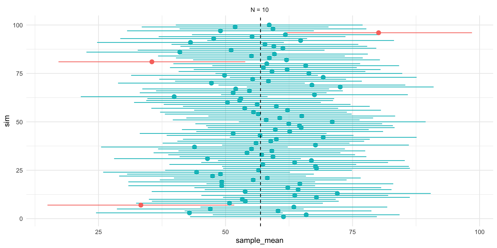
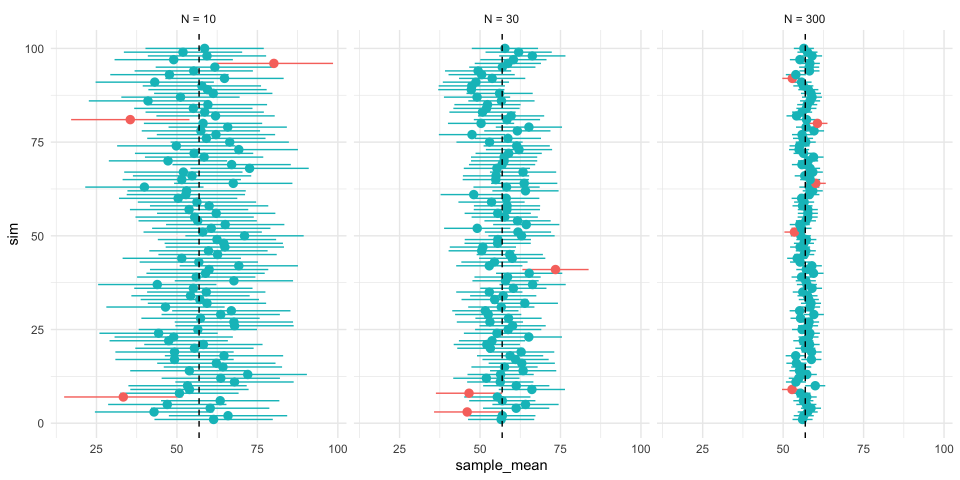
Figure 1 shows 3 confidences intervals for 3 samples of different sizes (N = 10, 30, 300). The CIs for N = 10 and N = 300, intervals contain the truth (include the population mean). By chance, the CI for N=30 falls outside of the truth.
Figure 2 shows that our confidence is about the property of the interval. Over repeated sampling, 95% of the intervals would contain the truth, 5% percent would not.
- In any one sample, the population parameter either is or is not within the interval.
Figure 3, shows that while the width of the interval declines with the sample size, the coverage properties remains the same.
Interpreting confidence intervals
Confidence intervals give a range of values that are likely to include the true value of the parameter \(\theta\) with probability \((1-\alpha) \times 100\%\)
- \(\alpha = 0.05\) corresponds to a “95-percent confidence interval”
Our “confidence” is about the interval
In repeated sampling, we expect that \((1-\alpha) \times 100\%\) of the intervals we construct would contain the truth.
For any one interval, the truth, \(\theta\), either falls within in the lower and upper bounds of the interval or it does not.
Hypothesis testing
What is a hypothesis test
A formal way of assessing statistical evidence. Combines
Deductive reasoning distribution of a test statistic, if the a null hypothesis were true
Inductive reasoning based on the test statistic we observed, how likely is it that we would observe it if the null were true?
What is a test statistic?
- A way of summarizing data
- difference of means
- coefficients from a linear model
- coefficients from a linear model divided by their standard errors
- R^2
- Sums of ranks
Note
Different test statistics may be more or less appropriate depending on your data and questions.
What is a null hypothesis?
A statement about the world
Only interesting if we reject it
Would yield a distribution of test statistics under the null
Typically something like “X has no effect on Y” (Null = no effect)
Never accept the null can only reject
What is a p-value?
A p-value is a conditional probability summarizing the likelihood of observing a test statistic as far from our hypothesis or farther, if our hypothesis were true.
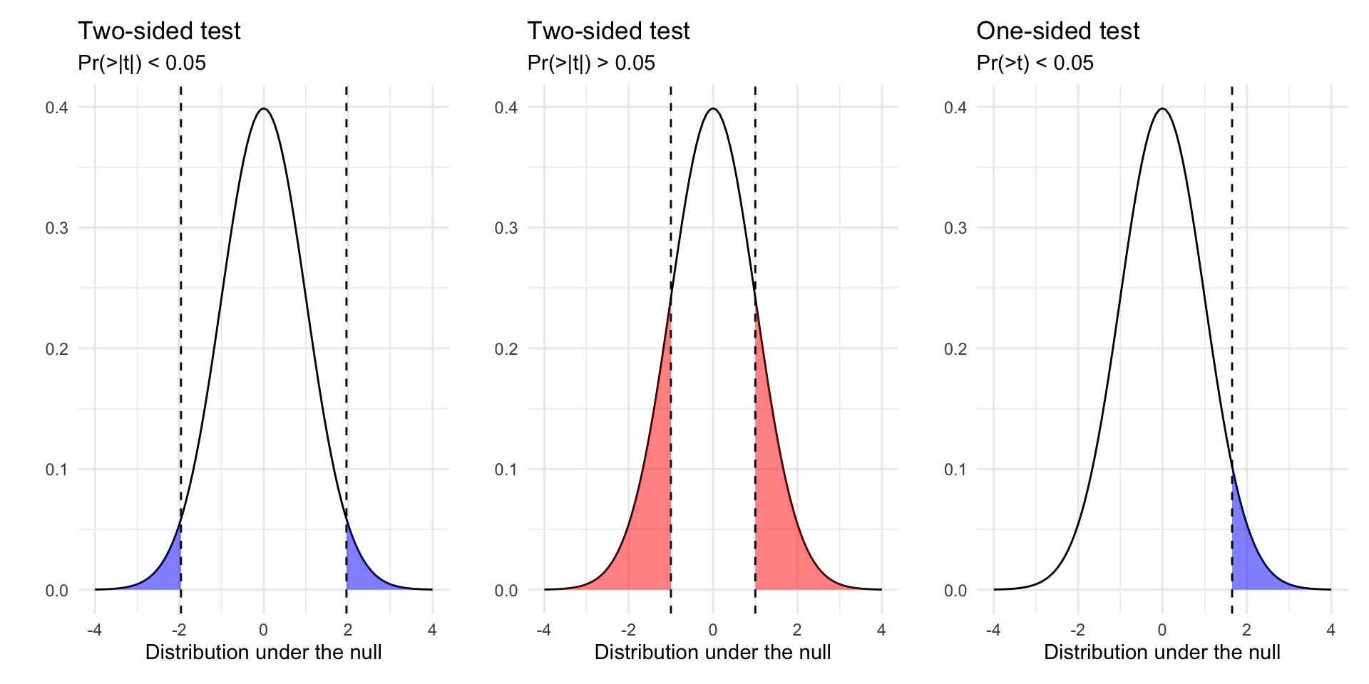
How do we do hypothesis testing?
Posit a hypothesis (e.g. \(\beta = 0\))
Calculate the test statistic (e.g. \((\hat{\beta}-\beta)/se_\beta\))
Derive the distribution of the test statistic under the null via simulation or asymptotic theory
Compare the test statistic to the distribution under the null
Calculate p-value (Two Sided vs One sided tests)
Reject or fail to reject/retain our hypothesis based on some threshold of statistical significance (e.g. p < 0.05)
Outcomes of hypothesis tests
Two conclusions from of a hypothesis test: we can reject or fail to reject a hypothesis test.
We never “accept” a hypothesis, since there are, in theory, an infinite number of other hypotheses we could have tested.
Our decision can produce four outcomes and two types of error:
| Reject \(H_0\) | Fail to Reject \(H_0\) | |
|---|---|---|
| \(H_0\) is true | False Positive | Correct! |
| \(H_0\) is false | Correct! | False Negative |
- Type 1 Errors: False Positive Rate (p < 0.05)
- Type 2 Errors: False negative rate (1 - Power of test)
Quantifying uncertainty in regression
Quantifying uncertainty in regression
How education condition the relationship between age and feelings toward professors?
Let’s fit the following “interaction” model to assess whether education moderates the relationship between age and evaluations
\[ y = \beta_0 + \beta_1\text{age} + \beta_2 \text{degree} + \beta_3 \text{age} \times \text{degree} + \epsilon \]
And unpack the output
                          term estimate std.error statistic p.value conf.low
1                  (Intercept)   62.812     2.326    27.001   0.000   58.249
2                          age   -0.197     0.048    -4.069   0.000   -0.292
3     has_degreeCollege degree   12.168     3.602     3.378   0.001    5.103
4 age:has_degreeCollege degree   -0.076     0.072    -1.064   0.288   -0.217
  conf.high   df       outcome
1    67.375 1689 ft_professors
2    -0.102 1689 ft_professors
3    19.234 1689 ft_professors
4 0.064 1689 ft_professors| Model 1 | |
|---|---|
| (Intercept) | 62.81*** |
| (2.33) | |
| age | -0.20*** |
| (0.05) | |
| has_degreeCollege degree | 12.17*** |
| (3.60) | |
| age:has_degreeCollege degree | -0.08 |
| (0.07) | |
| R2 | 0.04 |
| Adj. R2 | 0.04 |
| Num. obs. | 1693 |
| RMSE | 27.35 |
| ***p < 0.001; **p < 0.01; *p < 0.05 | |
| Model 1 | |
|---|---|
| (Intercept) | 62.81* |
| [58.25; 67.37] | |
| age | -0.20* |
| [-0.29; -0.10] | |
| has_degreeCollege degree | 12.17* |
| [ 5.10; 19.23] | |
| age:has_degreeCollege degree | -0.08 |
| [-0.22; 0.06] | |
| R2 | 0.04 |
| Adj. R2 | 0.04 |
| Num. obs. | 1693 |
| RMSE | 27.35 |
| * 0 outside the confidence interval. | |
pred_df <- expand_grid(
  has_degree = c("College degree", "No college degree"),
  age = 18:80
  )

pred_df <- cbind(pred_df,
    predict(m1, newdata = pred_df, interval = "confidence")$fit
  )

m1_plot <- pred_df %>%
  ggplot(aes(age, fit, fill = has_degree))+
  geom_ribbon(aes(ymin=lwr, ymax=upr),alpha=0.5)+
  geom_line() +
  labs(
    fill = "Education",
    x = "Age",
    y = "Predicted Feelings toward Professors"
  )+
  theme_minimal()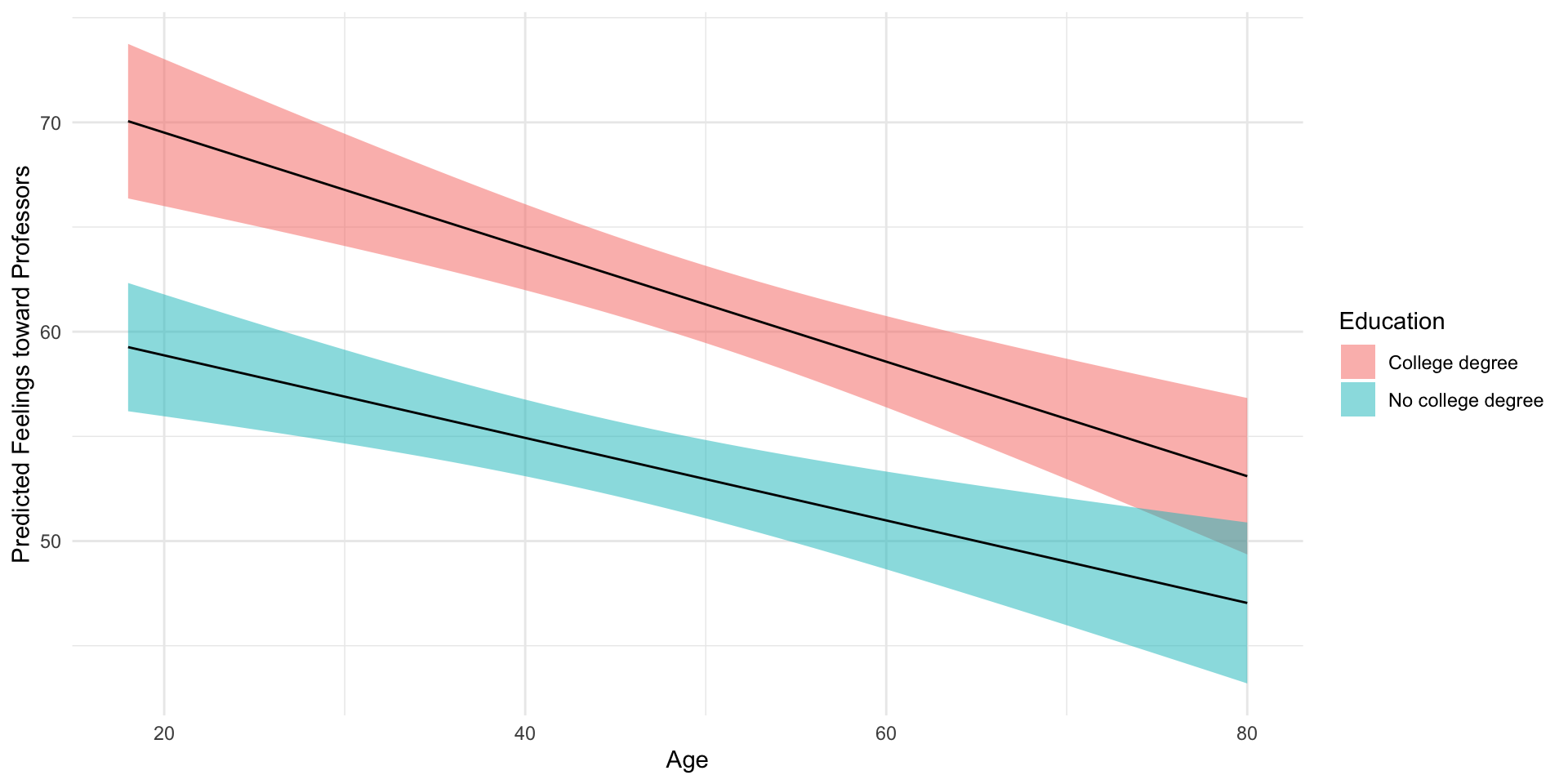
The relationship between age and feelings toward professors does not appear to vary with based on whether you have a college degree or not.
- The coefficient on the interaction term is non-significant
- It’s p-value is \(0.51\)
- The 95% confidence interval is [-0.22; 0.06]
- Both suggesting 0 (no evidence of moderation) is plausible claim given the data
- We this in the plot, where we find clear evidence of the main effects of each variable (negative slope for age, big differences between college and no college), but little evidence of an interaction (similar slopes)
Class Survey
How polling works
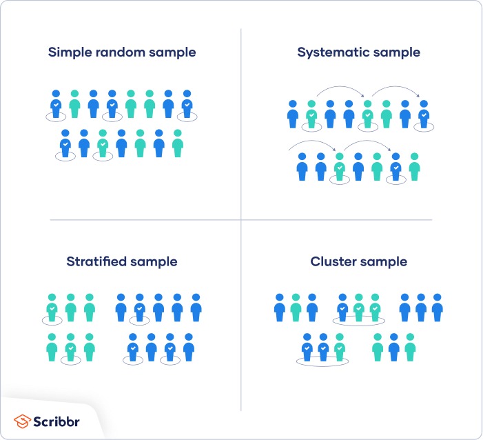
What’s a survey
A survey is a structured interview designed to generate data
Survey’s are conducted on samples from a population
- Draw inferences about the population based on estimates from our sample
The theory of polling depends on the power of random sampling
The practice of polling tries to account and adjust for all the ways a poll can fall short of this theoretical ideal
Key Features of an (Election) Survey
Pollster: Who’s doing the survey
Sampling frame: A list from which the sample was drawn (e.g. a voter file)
Sampling Procedure: How people are selected from the sampling frame to participate in survey
Sample size: How many people were surveyed
Survey mode: How the survey was conducted
Survey instrument: What the survey asked
Survey weights: Adjustments to make the survey more representative of the population
Likely voter model: A way of distinguishing (likely) voters from non-voters
Margin of error: A range of plausible values for the true population value
Probability based sampling (Why surveys work?)
Changing Polling Methods

How polls can be wrong?
Error and Bias
Polling Error
Total Survey Error in election polling is a function of:
Sampling Error
Temporal Error
Non-Sampling Error
Polling Error
Total Survey Error in election polling is a function of:
- Sampling Error:
That error that arises from sampling from a population
Sample Size \(\uparrow\) \(\to\) Sampling error \(\downarrow\)
Margins of error typically only reflect sampling error
Polling Error
Total Survey Error in election polling is a function of:
Sampling Error:
Temporal Error:
The error that comes from polling a dynamic race at specific point in time
Polls closer to the election \(\to\) Temporal Error \(\downarrow\)
Polling Error
Total Survey Error in election polling is a function of:
Sampling Error:
Temporal Error:
Non-sampling Error:
- Errors that arise from how a poll is implemented and analyzed
- Coverage error: Sampling Frame \(\neq\) Population
- Response bias: Some people are more less likely to take a poll
- Measurement bias: Question wording, order, can influence responses
- Processing and adjustment error: Failing to weight for key demographics
- And more…
- Errors that arise from how a poll is implemented and analyzed
Polling is Hard
Polling is hard
Response rates are low
Response rates differ
Adjustments are imperfect and uncertain
Polling for elections is particularly hard
- The population of interest is unknown (voters) and changing

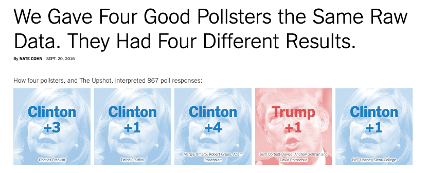
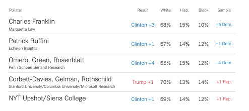

What to weight on

Question wording effects
Would you:
- favor or oppose taking military action in Iraq to end Saddam Hussein’s rule
- 68% favor, 25% oppose
- favor or oppose taking military action in Iraq to end Saddam Hussein’s rule even if it meant that U.S. forces might suffer thousands of casualties
- 43% favor, 48% oppose
Source: Pew
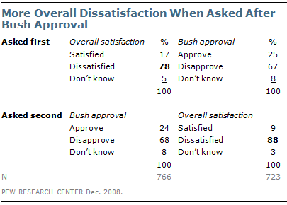
Question order effects
Election Polling: Example
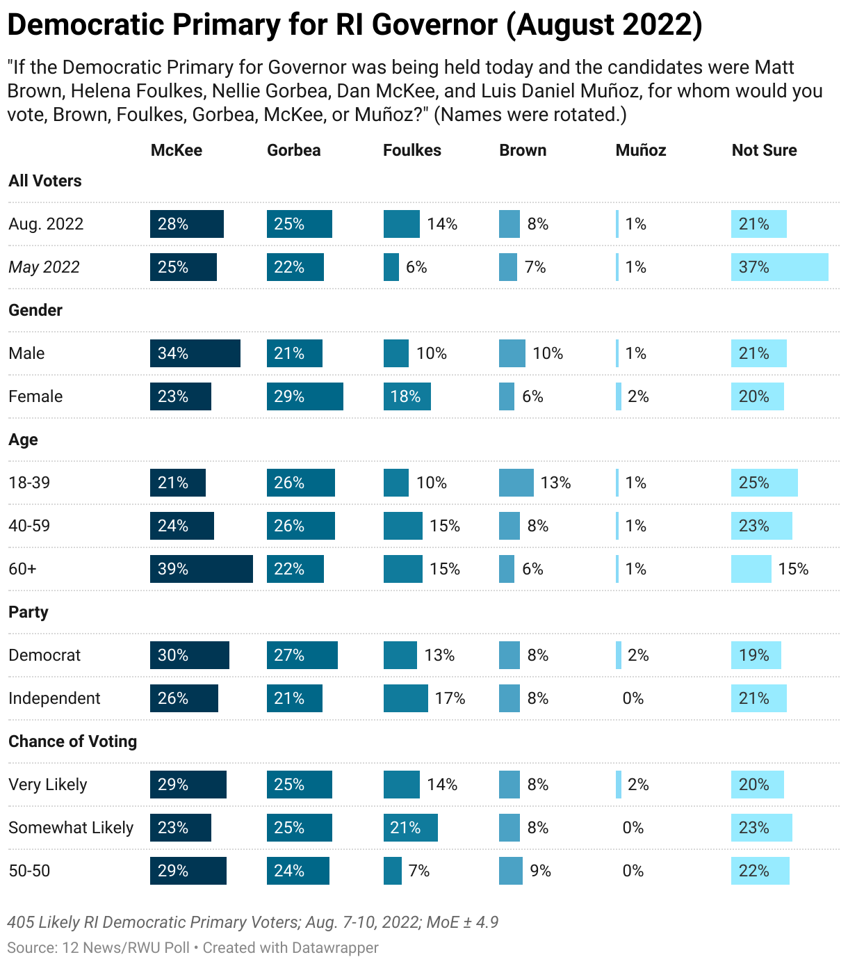
12 News/Roger Williams University Poll – August 2022
- Pollster: Fleming & Associates
- Sampling frame: Probability sample of registered voters, Aug 7-10, 2022
- Sample size: 405
- Survey mode: Live caller with land lines and cell phone
- Survey Instrument: See cross tabs of the questions here Questions
- Survey weights: None that I can tell
- Likely Voter Model: Hard to say, but based on past surveys probably two-part screener:
- Are you registered to vote?
- How likely are you to vote in the Democratic Primary?
- Margin of Error:
\[ \begin{align} MoE &= \pm 4.9 \\ &= 1.96 *\sqrt{((p*(1-p))/N)}\\ &= 1.96 *\sqrt{((0.5*(1-0.5))/405)}\\ &= \pm 4.869659 \end{align} \]
Evaluating the Performance of a Single Poll
Two criteria
- Did the poll call the race correctly?
- Yes! McKee won
- Did the poll get the margin right?
- Not exactly…
- McKee won by about 3% percentage points over Foulkes, not Gorbea

Statistics and POLS 1140 Part III
Causal claims involve counterfactual comparisons
Causal claims imply claims about counterfactuals
What would have happened if we were to change some aspect of the world?
We can represent counterfactuals in terms of potential outcomes
Individual Causal Effects
Let \(Y\) measure outcomes and \(D \in \{0,1\}\) denote the presence or absence of some treatment
For any individual, we can imagine different potential outcomes:
\[ \begin{align} Y_i(D_i = 1) & & \text{Outcome under treatment}\\ Y_i(0) & & \text{Outcome under control}\\ \end{align} \] The individual causal effect is simply the difference in these potential outcomes
\[ \begin{align} \tau_i = Y_i(1) - Y_i(0) && \text{Individual Causal Effect} \end{align} \]
The fundamental problem of causal inference is that individual causal effects are unknowable because we only observe one of many potential outcomes
- A problem of missing data
A statistical solution to the FPoCI
Rather than focus individual causal effects:
\[ \tau_i \equiv Y_i(1) - Y_i(0) \]
We focus on average causal effects (Average Treatment Effects [ATEs]):
\[ E[\tau_i] = \overbrace{E[Y_i(1) - Y_i(0)]}^{\text{Average of a difference}} = \overbrace{E[Y_i(1)] - E[Y_i(0)]}^{\text{Difference of Averages}} \]
When does the difference of averages provide us with a good estimate of the average difference?
Let’s consider a simple example
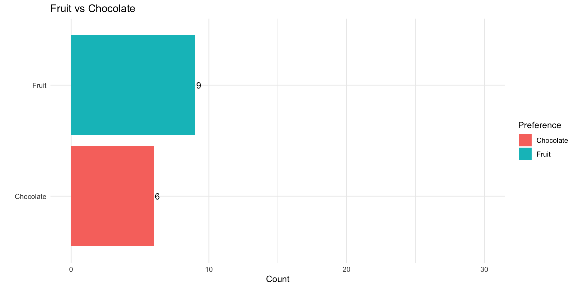
Does eating chocolate make you happy?
\(Y_i\) happiness measured on a 0-10 scale
\(D_i\) whether a person ate chocolate \((D=1)\) or fruit \((D = 0)\)
\(Y_i(1)\) a person’s happiness eating chocolate
\(Y_i(0)\) a person’s happiness eating fruit
\(X_i\) a person’s self-reported preference \((X_i \in\) {chocolate, fruit })
Potential Outcomes:
| \(Y_i(1)\) | \(Y_i(0)\) | \(\tau_i\) |
|---|---|---|
| 7 | 3 | 4 |
| 8 | 6 | 2 |
| 5 | 4 | 1 |
| 4 | 3 | 1 |
| 6 | 10 | -4 |
| 8 | 9 | -1 |
| 5 | 4 | 1 |
| 7 | 8 | -1 |
| 4 | 3 | 1 |
| 6 | 0 | 6 |
| \(E[Y_i(1)]\) | \(E[Y_i(0)]\) | \(E[\tau_i]\) |
|---|---|---|
| 6 | 5 | 1 |
If we could observe everyone’s potential outcomes, we could calculate the ICE
On average eating chocolate increases happiness by 1 point on our 10-point scale (ATE = 1)
Suppose we conducted a study and let folks select what they wanted to eat.
Potential Outcomes:
| \(Y_i(1)\) | \(Y_i(0)\) | \(\tau_i\) |
|---|---|---|
| 7 | 3 | 4 |
| 8 | 6 | 2 |
| 5 | 4 | 1 |
| 4 | 3 | 1 |
| 6 | 10 | -4 |
| 8 | 9 | -1 |
| 5 | 4 | 1 |
| 7 | 8 | -1 |
| 4 | 3 | 1 |
| 6 | 0 | 6 |
| \(E[Y_i(1)]\) | \(E[Y_i(0)]\) | \(ATE\) |
|---|---|---|
| 6 | 5 | 1 |
Observed Treatment:
| \(x_i\) | \(d_i\) | \(y_i\) |
|---|---|---|
| chocolate | 1 | 7 |
| chocolate | 1 | 8 |
| chocolate | 1 | 5 |
| chocolate | 1 | 4 |
| fruit | 0 | 10 |
| fruit | 0 | 9 |
| chocolate | 1 | 5 |
| fruit | 0 | 8 |
| chocolate | 1 | 4 |
| chocolate | 1 | 6 |
| \(\bar{y}_{d=1}\) | \(\bar{y}_{d=0}\) | \(\hat{ATE}\) |
|---|---|---|
| 5.57 | 9 | -3.43 |
Selection Bias
Our estimate of the ATE is biased by the fact that folks who prefer fruit seem to be happier than folks who prefer chocolate in this example
In general, selection bias occurs when folks who receive the treatment differ systematically from folks who don’t
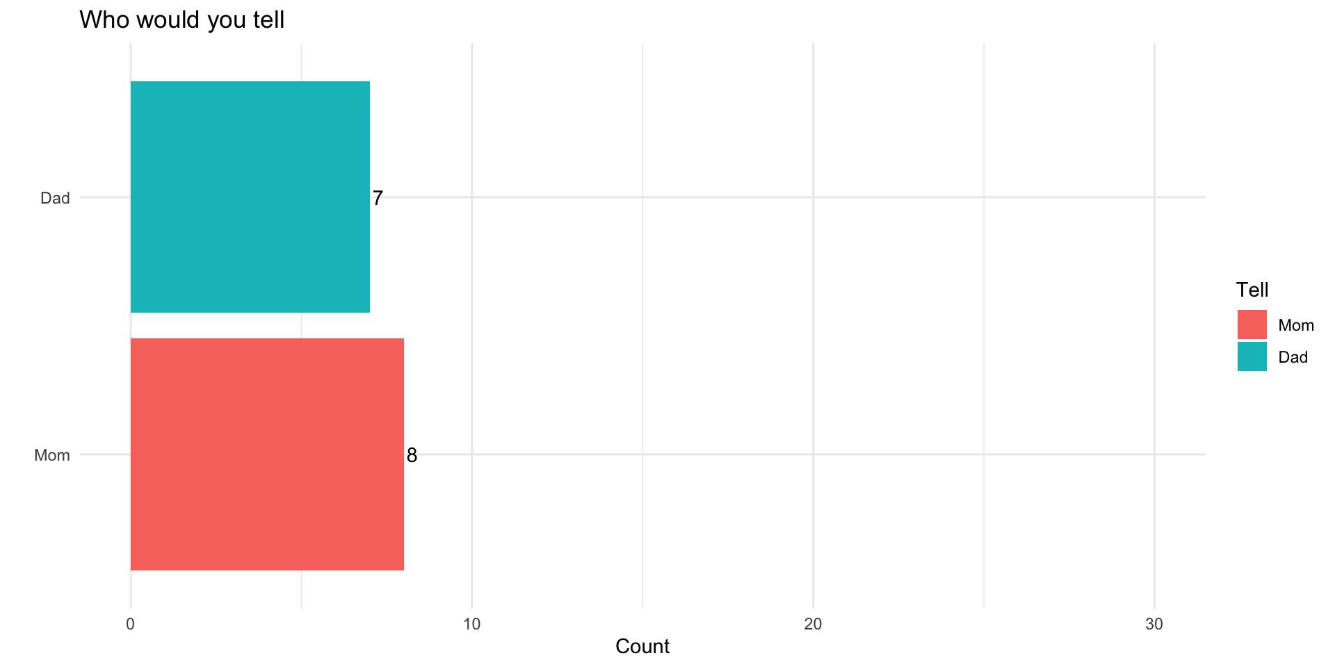
What if instead of letting people pick and choose, we randomly assigned half our respondents to chocolate and half to receive fruit
Potential Outcomes:
| \(Y_i(1)\) | \(Y_i(0)\) | \(\tau_i\) |
|---|---|---|
| 7 | 3 | 4 |
| 8 | 6 | 2 |
| 5 | 4 | 1 |
| 4 | 3 | 1 |
| 6 | 10 | -4 |
| 8 | 9 | -1 |
| 5 | 4 | 1 |
| 7 | 8 | -1 |
| 4 | 3 | 1 |
| 6 | 0 | 6 |
| \(E[Y_i(1)]\) | \(E[Y_i(0)]\) | \(ATE\) |
|---|---|---|
| 6 | 5 | 1 |
Randomly Assigned Treatment:
| \(x_i\) | \(d_i\) | \(y_i\) |
|---|---|---|
| chocolate | 1 | 7 |
| chocolate | 1 | 8 |
| chocolate | 0 | 4 |
| chocolate | 1 | 4 |
| fruit | 0 | 10 |
| fruit | 1 | 8 |
| chocolate | 0 | 4 |
| fruit | 0 | 8 |
| chocolate | 1 | 4 |
| chocolate | 0 | 0 |
| \(\bar{y}_{d=1}\) | \(\bar{y}_{d=0}\) | \(\hat{ATE}\) |
|---|---|---|
| 6.2 | 5.2 | 1 |
Randomly Assigned Treatment:
| \(x_i\) | \(d_i\) | \(y_i\) |
|---|---|---|
| chocolate | 1 | 7 |
| chocolate | 1 | 8 |
| chocolate | 0 | 4 |
| chocolate | 1 | 4 |
| fruit | 0 | 10 |
| fruit | 1 | 8 |
| chocolate | 0 | 4 |
| fruit | 0 | 8 |
| chocolate | 1 | 4 |
| chocolate | 0 | 0 |
| \(\bar{y}_{d=1}\) | \(\bar{y}_{d=0}\) | \(\hat{ATE}\) |
|---|---|---|
| 6.6 | 2.8 | 3.8 |
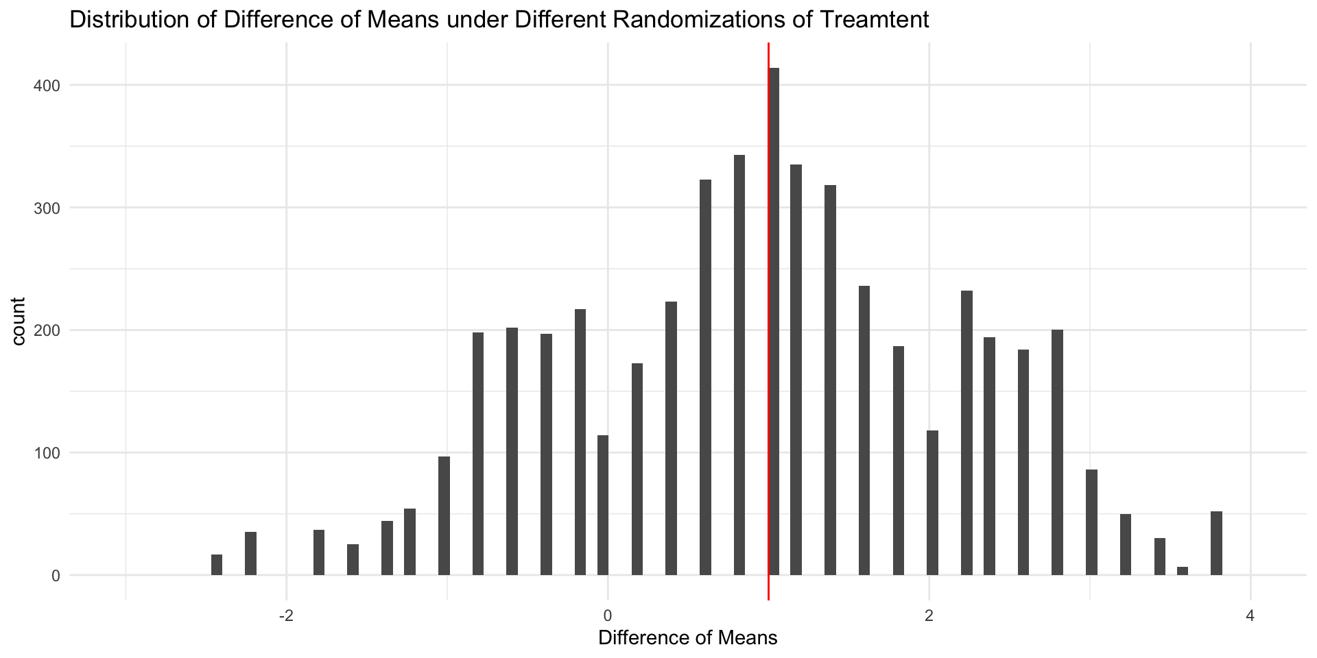
Random Assignment
When treatment has been randomly assigned, a difference in sample means provides an unbiased estimate of the ATE
The fact that our \(\hat{ATE} = ATE\) in this example is pure coincidence.
If we randomly assigned treatment a different way, we’d get a different estimate.
In general unbiased estimators will tend to be neither too high nor too low (e.g. \(E[\hat{\theta} - \theta] = 0\)])
Estimating an Average Treatment Effect
If we treatment has been randomly assigned, we can estimate the ATE by taking the difference of means between treatment and control:
\[ \begin{align*} E \left[ \frac{\sum_1^m Y_i}{m}-\frac{\sum_{m+1}^N Y_i}{N-m}\right]&=\overbrace{E \left[ \frac{\sum_1^m Y_i}{m}\right]}^{\substack{\text{Average outcome}\\ \text{among treated}\\ \text{units}}} -\overbrace{E \left[\frac{\sum_{m+1}^N Y_i}{N-m}\right]}^{\substack{\text{Average outcome}\\ \text{among control}\\ \text{units}}}\\ &= E [Y_i(1)|D_i=1] -E[Y_i(0)|D_i=0] \end{align*} \]
That is, the ATE is causally identified by the difference of means estimator in an experimental design
Random Assignment 1
| \(x_i\) | \(d_i\) | \(y_i\) |
|---|---|---|
| chocolate | 1 | 7 |
| chocolate | 1 | 8 |
| chocolate | 0 | 4 |
| chocolate | 1 | 4 |
| fruit | 0 | 10 |
| fruit | 1 | 8 |
| chocolate | 0 | 4 |
| fruit | 0 | 8 |
| chocolate | 1 | 4 |
| chocolate | 0 | 0 |
| \(\bar{y}_{d=1}\) | \(\bar{y}_{d=0}\) | \(\hat{ATE}\) |
|---|---|---|
| 5.4 | 5.8 | -0.4 |
Random Assignment 2
| \(x_i\) | \(d_i\) | \(y_i\) |
|---|---|---|
| chocolate | 0 | 3 |
| chocolate | 1 | 8 |
| chocolate | 0 | 4 |
| chocolate | 1 | 4 |
| fruit | 1 | 6 |
| fruit | 1 | 8 |
| chocolate | 0 | 4 |
| fruit | 1 | 7 |
| chocolate | 0 | 3 |
| chocolate | 0 | 0 |
| \(\bar{y}_{d=1}\) | \(\bar{y}_{d=0}\) | \(\hat{ATE}\) |
|---|---|---|
| 6.6 | 2.8 | 3.8 |
Random Assignment 3
| \(x_i\) | \(d_i\) | \(y_i\) |
|---|---|---|
| chocolate | 1 | 7 |
| chocolate | 0 | 6 |
| chocolate | 1 | 5 |
| chocolate | 1 | 4 |
| fruit | 0 | 10 |
| fruit | 0 | 9 |
| chocolate | 0 | 4 |
| fruit | 1 | 7 |
| chocolate | 1 | 4 |
| chocolate | 0 | 0 |
| \(\bar{y}_{d=1}\) | \(\bar{y}_{d=0}\) | \(\hat{ATE}\) |
|---|---|---|
| 5.4 | 5.8 | -0.4 |
Distribution of Sample ATEs
Observational vs Experimental Designs
Experimental designs are studies in which a causal variable of interest, the treatement, is manipulated by the researcher to examine its causal effects on some outcome of interest
Observational designs are studies in which a causal variable of interest is determined by someone/thing other than the researcher (nature, governments, people, etc.)
Two Kinds of Bias
Confounder bias: Failing to control for a common cause of
DandY(aka Omitted Variable Bias)Collider bias: Controlling for a common consequence
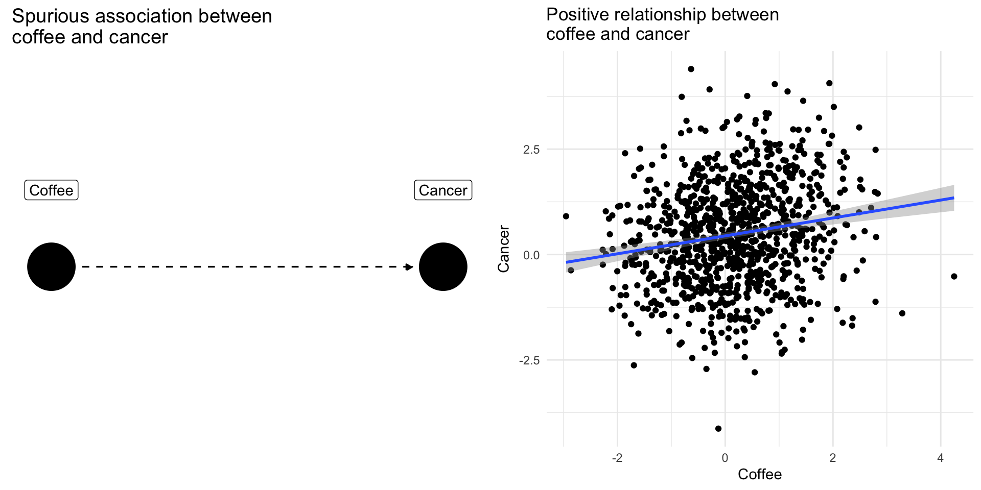
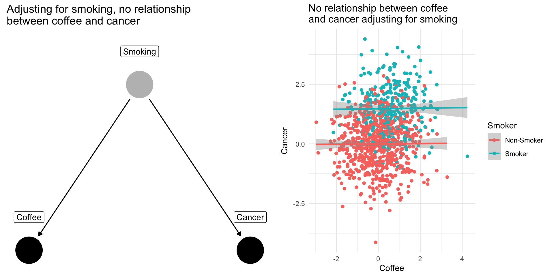
Confounding Bias: The Coffee Example
Drinking coffee doesn’t cause lung cancer we might find correlation between them because they share a common cause: smoking.
Smoking is a confounding variable, that if omitted will bias our results producing a spurious relationsip
Adjusting for confounders removes this source of bias
Note
When scholars include “control variables” in a regression, often they are trying to adjust for confounding variables that if omitted would bias their results
Collider Bias: The Dating Example
Why are attractive people such jerks?
Suppose dating is a function of looks and personality
Dating is a common consequences of looks and personality
Basing our claim off of who we date is an example of selection bias created by controlling for collider
Note
If you see a regression model that controls for everything and the kitchen sink without theoretical justification, we might worry about the potential for collider bias
$data
list()
attr(,"class")
[1] "waiver"

$layers
$layers[[1]]
geom_draw_grob: grob = list(grobs = list(list(name = "NULL", gp = NULL, vp = NULL), list(width = list(list(1, list(list(0, NULL, 1), list(0, NULL, 1), list(1, list(list(0, NULL, 8), list(0, NULL, 1)), 203), list(0, NULL, 1)), 201)), height = 1, xmin = NULL, ymin = NULL, name = "GRID.absoluteGrob.224", gp = NULL, vp = list(x = 1, y = 0.5, width = list(list(1, list(list(0, NULL, 1), list(0, NULL, 1), list(1, list(list(0, NULL, 8), list(0, NULL, 1)), 203), list(0, NULL, 1)), 201)), height = 1, justification = c(1, 0.5), gp = list(),
    clip = FALSE, xscale = c(0, 1), yscale = c(0, 1), angle = 0, layout = NULL, layout.pos.row = NULL, layout.pos.col = NULL, valid.just = c(1, 0.5), valid.pos.row = NULL, valid.pos.col = NULL, name = "GRID.VP.25", parentgpar = NULL, gpar = NULL, trans = NULL, widths = NULL, heights = NULL, width.cm = NULL, height.cm = NULL, rotation = NULL, cliprect = NULL, parent = NULL, children = NULL, devwidth = NULL, devheight = NULL, clippath = NULL, mask = TRUE, resolvedmask = NULL), children = list(`NULL` = list(
    name = "NULL", gp = NULL, vp = NULL), axis = list(grobs = list(list(name = "NULL", gp = NULL, vp = NULL), list(name = "NULL", gp = NULL, vp = NULL), list(name = "NULL", gp = NULL, vp = NULL)), layout = list(t = c(1, 1, 1), l = c(4, 2, 1), b = c(1, 1, 1), r = c(4, 2, 1), z = c(2, 1, 3), clip = c("off", "off", "off"), name = c("axis", "axis", "axis")), widths = list(list(0, NULL, 1), list(0, NULL, 1), list(1, list(list(0, NULL, 8), list(0, NULL, 1)), 203), list(0, NULL, 1)), heights = 1, respect = FALSE,
    rownames = NULL, colnames = NULL, name = "axis", gp = NULL, vp = NULL, children = list(), childrenOrder = character(0))), childrenOrder = c("NULL", "axis")), list(name = "NULL", gp = NULL, vp = NULL), list(name = "NULL", gp = NULL, vp = NULL), list(name = "panel-1.gTree.222", gp = NULL, vp = NULL, children = list(grill.gTree.220 = list(name = "grill.gTree.220", gp = NULL, vp = NULL, children = list(panel.background..zeroGrob.215 = list(name = "panel.background..zeroGrob.215", gp = NULL, vp = NULL),
    panel.grid.minor.y..zeroGrob.216 = list(name = "panel.grid.minor.y..zeroGrob.216", gp = NULL, vp = NULL), panel.grid.minor.x..zeroGrob.217 = list(name = "panel.grid.minor.x..zeroGrob.217", gp = NULL, vp = NULL), panel.grid.major.y..zeroGrob.218 = list(name = "panel.grid.major.y..zeroGrob.218", gp = NULL, vp = NULL), panel.grid.major.x..zeroGrob.219 = list(name = "panel.grid.major.x..zeroGrob.219", gp = NULL, vp = NULL)), childrenOrder = c("panel.background..zeroGrob.215", "panel.grid.minor.y..zeroGrob.216",
"panel.grid.minor.x..zeroGrob.217", "panel.grid.major.y..zeroGrob.218", "panel.grid.major.x..zeroGrob.219")), `NULL` = list(name = "NULL", gp = NULL, vp = NULL), GRID.cappedpathgrob.207 = list(x = c(0.0833333333333333, 0.0875420875420875, 0.0917508417508417, 0.095959595959596, 0.10016835016835, 0.104377104377104, 0.108585858585859, 0.112794612794613, 0.117003367003367, 0.121212121212121, 0.125420875420875, 0.12962962962963, 0.133838383838384, 0.138047138047138, 0.142255892255892, 0.146464646464646,
0.150673400673401, 0.154882154882155, 0.159090909090909, 0.163299663299663, 0.167508417508417, 0.171717171717172, 0.175925925925926, 0.18013468013468, 0.184343434343434, 0.188552188552189, 0.192760942760943, 0.196969696969697, 0.201178451178451, 0.205387205387205, 0.20959595959596, 0.213804713804714, 0.218013468013468, 0.222222222222222, 0.226430976430976, 0.230639730639731, 0.234848484848485, 0.239057239057239, 0.243265993265993, 0.247474747474747, 0.251683501683502, 0.255892255892256, 0.26010101010101,
0.264309764309764, 0.268518518518518, 0.272727272727273, 0.276936026936027, 0.281144781144781, 0.285353535353535, 0.28956228956229, 0.293771043771044, 0.297979797979798, 0.302188552188552, 0.306397306397306, 0.310606060606061, 0.314814814814815, 0.319023569023569, 0.323232323232323, 0.327441077441077, 0.331649831649832, 0.335858585858586, 0.34006734006734, 0.344276094276094, 0.348484848484848, 0.352693602693603, 0.356902356902357, 0.361111111111111, 0.365319865319865, 0.36952861952862, 0.373737373737374,
0.377946127946128, 0.382154882154882, 0.386363636363636, 0.39057239057239, 0.394781144781145, 0.398989898989899, 0.403198653198653, 0.407407407407407, 0.411616161616162, 0.415824915824916, 0.42003367003367, 0.424242424242424, 0.428451178451178, 0.432659932659933, 0.436868686868687, 0.441077441077441, 0.445286195286195, 0.449494949494949, 0.453703703703704, 0.457912457912458, 0.462121212121212, 0.466329966329966, 0.470538720538721, 0.474747474747475, 0.478956228956229, 0.483164983164983, 0.487373737373737,
0.491582491582492, 0.495791245791246, 0.5, 0.916666666666667, 0.912457912457912, 0.908249158249158, 0.904040404040404, 0.89983164983165, 0.895622895622896, 0.891414141414141, 0.887205387205387, 0.882996632996633, 0.878787878787879, 0.874579124579124, 0.87037037037037, 0.866161616161616, 0.861952861952862, 0.857744107744108, 0.853535353535353, 0.849326599326599, 0.845117845117845, 0.840909090909091, 0.836700336700337, 0.832491582491582, 0.828282828282828, 0.824074074074074, 0.81986531986532, 0.815656565656566,
0.811447811447811, 0.807239057239057, 0.803030303030303, 0.798821548821549, 0.794612794612795, 0.79040404040404, 0.786195286195286, 0.781986531986532, 0.777777777777778, 0.773569023569023, 0.769360269360269, 0.765151515151515, 0.760942760942761, 0.756734006734007, 0.752525252525252, 0.748316498316498, 0.744107744107744, 0.73989898989899, 0.735690235690236, 0.731481481481481, 0.727272727272727, 0.723063973063973, 0.718855218855219, 0.714646464646465, 0.71043771043771, 0.706228956228956, 0.702020202020202,
0.697811447811448, 0.693602693602693, 0.689393939393939, 0.685185185185185, 0.680976430976431, 0.676767676767677, 0.672558922558922, 0.668350168350168, 0.664141414141414, 0.65993265993266, 0.655723905723906, 0.651515151515151, 0.647306397306397, 0.643097643097643, 0.638888888888889, 0.634680134680135, 0.63047138047138, 0.626262626262626, 0.622053872053872, 0.617845117845118, 0.613636363636364, 0.609427609427609, 0.605218855218855, 0.601010101010101, 0.596801346801347, 0.592592592592593, 0.588383838383838,
0.584175084175084, 0.57996632996633, 0.575757575757576, 0.571548821548821, 0.567340067340067, 0.563131313131313, 0.558922558922559, 0.554713804713805, 0.55050505050505, 0.546296296296296, 0.542087542087542, 0.537878787878788, 0.533670033670034, 0.529461279461279, 0.525252525252525, 0.521043771043771, 0.516835016835017, 0.512626262626263, 0.508417508417508, 0.504208754208754, 0.5), y = c(0.857142857142857, 0.84992784992785, 0.842712842712843, 0.835497835497836, 0.828282828282828, 0.821067821067821,
0.813852813852814, 0.806637806637807, 0.7994227994228, 0.792207792207792, 0.784992784992785, 0.777777777777778, 0.770562770562771, 0.763347763347763, 0.756132756132756, 0.748917748917749, 0.741702741702742, 0.734487734487735, 0.727272727272727, 0.72005772005772, 0.712842712842713, 0.705627705627706, 0.698412698412698, 0.691197691197691, 0.683982683982684, 0.676767676767677, 0.66955266955267, 0.662337662337662, 0.655122655122655, 0.647907647907648, 0.640692640692641, 0.633477633477634, 0.626262626262626,
0.619047619047619, 0.611832611832612, 0.604617604617605, 0.597402597402597, 0.59018759018759, 0.582972582972583, 0.575757575757576, 0.568542568542569, 0.561327561327561, 0.554112554112554, 0.546897546897547, 0.53968253968254, 0.532467532467532, 0.525252525252525, 0.518037518037518, 0.510822510822511, 0.503607503607504, 0.496392496392496, 0.489177489177489, 0.481962481962482, 0.474747474747475, 0.467532467532468, 0.46031746031746, 0.453102453102453, 0.445887445887446, 0.438672438672439, 0.431457431457431,
0.424242424242424, 0.417027417027417, 0.40981240981241, 0.402597402597403, 0.395382395382395, 0.388167388167388, 0.380952380952381, 0.373737373737374, 0.366522366522367, 0.359307359307359, 0.352092352092352, 0.344877344877345, 0.337662337662338, 0.33044733044733, 0.323232323232323, 0.316017316017316, 0.308802308802309, 0.301587301587302, 0.294372294372294, 0.287157287157287, 0.27994227994228, 0.272727272727273, 0.265512265512265, 0.258297258297258, 0.251082251082251, 0.243867243867244, 0.236652236652237,
0.229437229437229, 0.222222222222222, 0.215007215007215, 0.207792207792208, 0.200577200577201, 0.193362193362193, 0.186147186147186, 0.178932178932179, 0.171717171717172, 0.164502164502165, 0.157287157287157, 0.15007215007215, 0.142857142857143, 0.857142857142857, 0.84992784992785, 0.842712842712843, 0.835497835497836, 0.828282828282828, 0.821067821067821, 0.813852813852814, 0.806637806637807, 0.7994227994228, 0.792207792207792, 0.784992784992785, 0.777777777777778, 0.770562770562771, 0.763347763347763,
0.756132756132756, 0.748917748917749, 0.741702741702742, 0.734487734487735, 0.727272727272727, 0.72005772005772, 0.712842712842713, 0.705627705627706, 0.698412698412698, 0.691197691197691, 0.683982683982684, 0.676767676767677, 0.66955266955267, 0.662337662337662, 0.655122655122655, 0.647907647907648, 0.640692640692641, 0.633477633477634, 0.626262626262626, 0.619047619047619, 0.611832611832612, 0.604617604617605, 0.597402597402597, 0.59018759018759, 0.582972582972583, 0.575757575757576, 0.568542568542569,
0.561327561327561, 0.554112554112554, 0.546897546897547, 0.53968253968254, 0.532467532467532, 0.525252525252525, 0.518037518037518, 0.510822510822511, 0.503607503607504, 0.496392496392496, 0.489177489177489, 0.481962481962482, 0.474747474747475, 0.467532467532468, 0.46031746031746, 0.453102453102453, 0.445887445887446, 0.438672438672439, 0.431457431457431, 0.424242424242424, 0.417027417027417, 0.40981240981241, 0.402597402597403, 0.395382395382395, 0.388167388167388, 0.380952380952381, 0.373737373737374,
0.366522366522367, 0.359307359307359, 0.352092352092352, 0.344877344877345, 0.337662337662338, 0.33044733044733, 0.323232323232323, 0.316017316017316, 0.308802308802309, 0.301587301587302, 0.294372294372294, 0.287157287157287, 0.27994227994228, 0.272727272727273, 0.265512265512265, 0.258297258297258, 0.251082251082251, 0.243867243867244, 0.236652236652237, 0.229437229437229, 0.222222222222222, 0.215007215007215, 0.207792207792208, 0.200577200577201, 0.193362193362193, 0.186147186147186, 0.178932178932179,
0.171717171717172, 0.164502164502165, 0.157287157287157, 0.15007215007215, 0.142857142857143), id = c(1, 1, 1, 1, 1, 1, 1, 1, 1, 1, 1, 1, 1, 1, 1, 1, 1, 1, 1, 1, 1, 1, 1, 1, 1, 1, 1, 1, 1, 1, 1, 1, 1, 1, 1, 1, 1, 1, 1, 1, 1, 1, 1, 1, 1, 1, 1, 1, 1, 1, 1, 1, 1, 1, 1, 1, 1, 1, 1, 1, 1, 1, 1, 1, 1, 1, 1, 1, 1, 1, 1, 1, 1, 1, 1, 1, 1, 1, 1, 1, 1, 1, 1, 1, 1, 1, 1, 1, 1, 1, 1, 1, 1, 1, 1, 1, 1, 1, 1, 1, 2, 2, 2, 2, 2, 2, 2, 2, 2, 2, 2, 2, 2, 2, 2, 2, 2, 2, 2, 2, 2, 2, 2, 2, 2, 2, 2, 2, 2, 2, 2, 2, 2,
2, 2, 2, 2, 2, 2, 2, 2, 2, 2, 2, 2, 2, 2, 2, 2, 2, 2, 2, 2, 2, 2, 2, 2, 2, 2, 2, 2, 2, 2, 2, 2, 2, 2, 2, 2, 2, 2, 2, 2, 2, 2, 2, 2, 2, 2, 2, 2, 2, 2, 2, 2, 2, 2, 2, 2, 2, 2, 2, 2, 2, 2, 2, 2, 2, 2, 2), arrow = list(angle = 30, length = 5, ends = 2, type = 2), constant = TRUE, start = c(TRUE, FALSE, FALSE, FALSE, FALSE, FALSE, FALSE, FALSE, FALSE, FALSE, FALSE, FALSE, FALSE, FALSE, FALSE, FALSE, FALSE, FALSE, FALSE, FALSE, FALSE, FALSE, FALSE, FALSE, FALSE, FALSE, FALSE, FALSE, FALSE, FALSE, FALSE,
FALSE, FALSE, FALSE, FALSE, FALSE, FALSE, FALSE, FALSE, FALSE, FALSE, FALSE, FALSE, FALSE, FALSE, FALSE, FALSE, FALSE, FALSE, FALSE, FALSE, FALSE, FALSE, FALSE, FALSE, FALSE, FALSE, FALSE, FALSE, FALSE, FALSE, FALSE, FALSE, FALSE, FALSE, FALSE, FALSE, FALSE, FALSE, FALSE, FALSE, FALSE, FALSE, FALSE, FALSE, FALSE, FALSE, FALSE, FALSE, FALSE, FALSE, FALSE, FALSE, FALSE, FALSE, FALSE, FALSE, FALSE, FALSE, FALSE, FALSE, FALSE, FALSE, FALSE, FALSE, FALSE, FALSE, FALSE, FALSE, FALSE, TRUE, FALSE, FALSE,
FALSE, FALSE, FALSE, FALSE, FALSE, FALSE, FALSE, FALSE, FALSE, FALSE, FALSE, FALSE, FALSE, FALSE, FALSE, FALSE, FALSE, FALSE, FALSE, FALSE, FALSE, FALSE, FALSE, FALSE, FALSE, FALSE, FALSE, FALSE, FALSE, FALSE, FALSE, FALSE, FALSE, FALSE, FALSE, FALSE, FALSE, FALSE, FALSE, FALSE, FALSE, FALSE, FALSE, FALSE, FALSE, FALSE, FALSE, FALSE, FALSE, FALSE, FALSE, FALSE, FALSE, FALSE, FALSE, FALSE, FALSE, FALSE, FALSE, FALSE, FALSE, FALSE, FALSE, FALSE, FALSE, FALSE, FALSE, FALSE, FALSE, FALSE, FALSE, FALSE,
FALSE, FALSE, FALSE, FALSE, FALSE, FALSE, FALSE, FALSE, FALSE, FALSE, FALSE, FALSE, FALSE, FALSE, FALSE, FALSE, FALSE, FALSE, FALSE, FALSE, FALSE, FALSE, FALSE, FALSE, FALSE), end = c(FALSE, FALSE, FALSE, FALSE, FALSE, FALSE, FALSE, FALSE, FALSE, FALSE, FALSE, FALSE, FALSE, FALSE, FALSE, FALSE, FALSE, FALSE, FALSE, FALSE, FALSE, FALSE, FALSE, FALSE, FALSE, FALSE, FALSE, FALSE, FALSE, FALSE, FALSE, FALSE, FALSE, FALSE, FALSE, FALSE, FALSE, FALSE, FALSE, FALSE, FALSE, FALSE, FALSE, FALSE, FALSE, FALSE,
FALSE, FALSE, FALSE, FALSE, FALSE, FALSE, FALSE, FALSE, FALSE, FALSE, FALSE, FALSE, FALSE, FALSE, FALSE, FALSE, FALSE, FALSE, FALSE, FALSE, FALSE, FALSE, FALSE, FALSE, FALSE, FALSE, FALSE, FALSE, FALSE, FALSE, FALSE, FALSE, FALSE, FALSE, FALSE, FALSE, FALSE, FALSE, FALSE, FALSE, FALSE, FALSE, FALSE, FALSE, FALSE, FALSE, FALSE, FALSE, FALSE, FALSE, FALSE, FALSE, FALSE, TRUE, FALSE, FALSE, FALSE, FALSE, FALSE, FALSE, FALSE, FALSE, FALSE, FALSE, FALSE, FALSE, FALSE, FALSE, FALSE, FALSE, FALSE, FALSE,
FALSE, FALSE, FALSE, FALSE, FALSE, FALSE, FALSE, FALSE, FALSE, FALSE, FALSE, FALSE, FALSE, FALSE, FALSE, FALSE, FALSE, FALSE, FALSE, FALSE, FALSE, FALSE, FALSE, FALSE, FALSE, FALSE, FALSE, FALSE, FALSE, FALSE, FALSE, FALSE, FALSE, FALSE, FALSE, FALSE, FALSE, FALSE, FALSE, FALSE, FALSE, FALSE, FALSE, FALSE, FALSE, FALSE, FALSE, FALSE, FALSE, FALSE, FALSE, FALSE, FALSE, FALSE, FALSE, FALSE, FALSE, FALSE, FALSE, FALSE, FALSE, FALSE, FALSE, FALSE, FALSE, FALSE, FALSE, FALSE, FALSE, FALSE, FALSE, FALSE,
FALSE, FALSE, FALSE, FALSE, FALSE, FALSE, FALSE, FALSE, FALSE, TRUE), start.cap = list(list(20, NULL, 7), list(20, NULL, 7)), start.cap2 = list(list(20, NULL, 7), list(20, NULL, 7)), start.captype = c("circle", "circle"), end.cap = list(list(20, NULL, 7), list(20, NULL, 7)), end.cap2 = list(list(20, NULL, 7), list(20, NULL, 7)), end.captype = c("circle", "circle"), name = "GRID.cappedpathgrob.207", gp = list(col = c("#000000", "#000000"), fill = c("#000000", "#000000"), lwd = c(1.70716535433071,
1.70716535433071), lty = c("solid", "solid"), lineend = "butt", linejoin = "round", linemitre = 1), vp = NULL, children = list(), childrenOrder = character(0)), `NULL` = list(name = "NULL", gp = NULL, vp = NULL), GRID.curve.208 = list(x1 = 0.0833333333333333, y1 = 0.857142857142857, x2 = 0.916666666666667, y2 = 0.857142857142857, curvature = 0.5, angle = 90, ncp = 5, shape = 0.5, square = FALSE, squareShape = 1, inflect = FALSE, arrow = NULL, open = TRUE, debug = FALSE, name = "GRID.curve.208", gp = list(
    col = "#F8766DFF", fill = "#F8766DFF", lwd = 1.70716535433071, lty = "dashed", lineend = "butt"), vp = NULL, children = list(), childrenOrder = character(0)), geom_point.points.210 = list(x = c(0.5, 0.0833333333333333, 0.916666666666667), y = c(0.142857142857143, 0.857142857142857, 0.857142857142857), pch = c(15, 19, 19), size = 1, name = "geom_point.points.210", gp = list(col = c("#7F7F7F", "#F8766D", "#F8766D"), fill = c(NA, NA, NA), fontsize = c(46.4692913385827, 46.4692913385827, 46.4692913385827
), lwd = c(0.94488188976378, 0.94488188976378, 0.94488188976378)), vp = NULL), geom_label_repel.labelrepeltree.212 = list(limits = list(x = c(0, 1), y = c(0, 1)), data = list(shape = c(15, 19, 19), fill = c("grey50", "#F8766D", "#F8766D"), label = c("Dateability", "Looks", "Personality"), x = c(0.5, 0.0833333333333333, 0.916666666666667), y = c(0.142857142857143, 0.857142857142857, 0.857142857142857), PANEL = c(1, 1, 1), group = c(2, 1, 1), colour = c("white", "white", "white"), size = c(3.88, 3.88,
3.88), angle = c(0, 0, 0), alpha = c(NA, NA, NA), family = c("", "", ""), fontface = c(1, 1, 1), lineheight = c(1.2, 1.2, 1.2), hjust = c(0.5, 0.5, 0.5), vjust = c(0.5, 0.5, 0.5), point.size = c(1, 1, 1), segment.linetype = c(1, 1, 1), segment.size = c(0.5, 0.5, 0.5), segment.curvature = c(0, 0, 0), segment.angle = c(90, 90, 90), segment.ncp = c(1, 1, 1), segment.shape = c(0.5, 0.5, 0.5), segment.square = c(TRUE, TRUE, TRUE), segment.squareShape = c(1, 1, 1), segment.inflect = c(FALSE, FALSE, FALSE
), segment.debug = c(FALSE, FALSE, FALSE), segment.colour = c("grey50", "grey50", "grey50"), nudge_x = c(0, 0, 0), nudge_y = c(0, 0, 0)), lab = c("Dateability", "Looks", "Personality"), box.padding = 0.35, label.padding = 0.25, point.padding = 1.5, label.r = 0.15, label.size = 0.25, min.segment.length = 0.5, arrow = NULL, force = 1, force_pull = 1, max.time = 0.5, max.iter = 2000, max.overlaps = 10, direction = "both", seed = NA, verbose = FALSE, name = "geom_label_repel.labelrepeltree.212", gp = NULL,
    vp = NULL, children = list(), childrenOrder = character(0)), `NULL` = list(name = "NULL", gp = NULL, vp = NULL), panel.border..zeroGrob.213 = list(name = "panel.border..zeroGrob.213", gp = NULL, vp = NULL)), childrenOrder = c("grill.gTree.220", "NULL", "GRID.cappedpathgrob.207", "NULL", "GRID.curve.208", "geom_point.points.210", "geom_label_repel.labelrepeltree.212", "NULL", "panel.border..zeroGrob.213")), list(width = 1, height = list(list(1, list(list(0, NULL, 1), list(1, list(list(0, NULL,
    8), list(0, NULL, 1)), 203), list(0, NULL, 1), list(0, NULL, 1)), 201)), xmin = NULL, ymin = NULL, name = "GRID.absoluteGrob.223", gp = NULL, vp = list(x = 0.5, y = 1, width = 1, height = list(list(1, list(list(0, NULL, 1), list(1, list(list(0, NULL, 8), list(0, NULL, 1)), 203), list(0, NULL, 1), list(0, NULL, 1)), 201)), justification = c(0.5, 1), gp = list(), clip = FALSE, xscale = c(0, 1), yscale = c(0, 1), angle = 0, layout = NULL, layout.pos.row = NULL, layout.pos.col = NULL, valid.just = c(0.5,
1), valid.pos.row = NULL, valid.pos.col = NULL, name = "GRID.VP.24", parentgpar = NULL, gpar = NULL, trans = NULL, widths = NULL, heights = NULL, width.cm = NULL, height.cm = NULL, rotation = NULL, cliprect = NULL, parent = NULL, children = NULL, devwidth = NULL, devheight = NULL, clippath = NULL, mask = TRUE, resolvedmask = NULL), children = list(`NULL` = list(name = "NULL", gp = NULL, vp = NULL), axis = list(grobs = list(list(name = "NULL", gp = NULL, vp = NULL), list(name = "NULL", gp = NULL,
    vp = NULL), list(name = "NULL", gp = NULL, vp = NULL)), layout = list(t = c(1, 3, 4), l = c(1, 1, 1), b = c(1, 3, 4), r = c(1, 1, 1), z = c(1, 2, 3), clip = c("off", "off", "off"), name = c("axis", "axis", "axis")), widths = 1, heights = list(list(0, NULL, 1), list(1, list(list(0, NULL, 8), list(0, NULL, 1)), 203), list(0, NULL, 1), list(0, NULL, 1)), respect = FALSE, rownames = NULL, colnames = NULL, name = "axis", gp = NULL, vp = NULL, children = list(), childrenOrder = character(0))), childrenOrder = c("NULL",
"axis")), list(name = "NULL", gp = NULL, vp = NULL), list(name = "NULL", gp = NULL, vp = NULL), list(name = "NULL", gp = NULL, vp = NULL), list(name = "NULL", gp = NULL, vp = NULL), list(name = "axis.title.x.bottom..zeroGrob.225", gp = NULL, vp = NULL), list(name = "axis.title.y.left..zeroGrob.226", gp = NULL, vp = NULL), list(name = "NULL", gp = NULL, vp = NULL), list(grobs = list(list(grobs = list(list(name = "legend.key.zeroGrob.228", gp = NULL, vp = NULL), list(x0 = 0.1, y0 = 0.5, x1 = 0.9, y1 = 0.5,
    arrow = NULL, name = "GRID.segments.233", gp = list(col = "#000000FF", fill = "#000000FF", lwd = 1.70716535433071, lty = "dashed", lineend = "butt"), vp = NULL), list(widths = list(list(5.5, NULL, 8), list(1, list(list(1, list(label = "activated by \nadjustment \nfor collider", x = 0, y = 0.5, just = "centre", hjust = 0, vjust = 0.5, rot = 0, check.overlap = FALSE, name = "GRID.text.230", gp = list(fontsize = 8.8, col = "black", fontfamily = "", lineheight = 0.9, font = c(plain = 1)), vp = NULL),
    21), list(0, NULL, 2)), 201), list(0, NULL, 8)), heights = list(list(0, NULL, 8), list(1, list(list(1, list(label = "activated by \nadjustment \nfor collider", x = 0, y = 0.5, just = "centre", hjust = 0, vjust = 0.5, rot = 0, check.overlap = FALSE, name = "GRID.text.230", gp = list(fontsize = 8.8, col = "black", fontfamily = "", lineheight = 0.9, font = c(plain = 1)), vp = NULL), 22), list(0.0275, NULL, 2)), 201), list(0, NULL, 8)), name = "guide.label.titleGrob.232", gp = NULL, vp = NULL, children = list(
    GRID.text.230 = list(label = "activated by \nadjustment \nfor collider", x = list(list(1, list(list(0, NULL, 0), list(0, NULL, 8), list(5.5, NULL, 8)), 201)), y = list(list(1, list(list(0.5, NULL, 0), list(0, NULL, 8), list(0, NULL, 8)), 201)), just = "centre", hjust = 0, vjust = 0.5, rot = 0, check.overlap = FALSE, name = "GRID.text.230", gp = list(fontsize = 8.8, col = "black", fontfamily = "", lineheight = 0.9, font = c(plain = 1)), vp = NULL)), childrenOrder = "GRID.text.230")), layout = list(
    t = c(2, 2, 2), l = c(2, 2, 3), b = c(2, 2, 2), r = c(2, 2, 3), z = c(1, 2, 3), clip = c("off", "off", "off"), name = c("key-1-1-bg", "key-1-1-1", "label-1-2")), widths = c(0, 0.6096, 1.96146039193303, 0), heights = c(0, 0.968374999999999, 0), respect = FALSE, rownames = NULL, colnames = NULL, name = "layout", gp = NULL, vp = list(x = 0, y = 1, width = 2.57106039193303, height = 1, justification = c(0, 1), gp = list(), clip = FALSE, xscale = c(0, 1), yscale = c(0, 1), angle = 0, layout = NULL,
    layout.pos.row = NULL, layout.pos.col = NULL, valid.just = c(0, 1), valid.pos.row = NULL, valid.pos.col = NULL, name = "GRID.VP.26", parentgpar = NULL, gpar = NULL, trans = NULL, widths = NULL, heights = NULL, width.cm = NULL, height.cm = NULL, rotation = NULL, cliprect = NULL, parent = NULL, children = NULL, devwidth = NULL, devheight = NULL, clippath = NULL, mask = TRUE, resolvedmask = NULL), children = list(), childrenOrder = character(0)), list(name = "NULL", gp = NULL, vp = NULL)), layout = list(
    t = c(3, 2), l = c(3, 2), b = c(3, 4), r = c(3, 4), z = c(1, 0), clip = c("off", "off"), name = c("guides", "legend.box.background")), widths = list(list(0.5, NULL, 5), list(0, NULL, 8), list(2.57106039193303, NULL, 1), list(0, NULL, 8), list(0.5, NULL, 5)), heights = list(list(0.5, NULL, 5), list(0, NULL, 8), list(0.968374999999999, NULL, 1), list(0, NULL, 8), list(0.5, NULL, 5)), respect = FALSE, rownames = NULL, colnames = NULL, name = "guide-box", gp = NULL, vp = list(x = 0.5, y = 0.5, width = 2.57106039193303,
    height = 0.968374999999999, justification = c(0.5, 0.5), gp = list(), clip = FALSE, xscale = c(0, 1), yscale = c(0, 1), angle = 0, layout = NULL, layout.pos.row = NULL, layout.pos.col = NULL, valid.just = c(0.5, 0.5), valid.pos.row = NULL, valid.pos.col = NULL, name = "guides", parentgpar = NULL, gpar = NULL, trans = NULL, widths = NULL, heights = NULL, width.cm = NULL, height.cm = NULL, rotation = NULL, cliprect = NULL, parent = NULL, children = NULL, devwidth = NULL, devheight = NULL, clippath = NULL,
    mask = TRUE, resolvedmask = NULL), children = list(), childrenOrder = character(0)), list(name = "NULL", gp = NULL, vp = NULL), list(name = "NULL", gp = NULL, vp = NULL), list(name = "NULL", gp = NULL, vp = NULL), list(name = "NULL", gp = NULL, vp = NULL), list(name = "plot.subtitle..zeroGrob.237", gp = NULL, vp = NULL), list(widths = list(list(0, NULL, 8), list(1, list(list(1, list(label = "Selection bias creates\nspurious relationship", x = 0, y = 1, just = "centre", hjust = 0, vjust = 1, rot = 0,
    check.overlap = FALSE, name = "GRID.text.234", gp = list(fontsize = 13.2, col = "black", fontfamily = "", lineheight = 0.9, font = c(plain = 1)), vp = NULL), 21), list(0, NULL, 2)), 201), list(0, NULL, 8)), heights = list(list(5.5, NULL, 8), list(1, list(list(1, list(label = "Selection bias creates\nspurious relationship", x = 0, y = 1, just = "centre", hjust = 0, vjust = 1, rot = 0, check.overlap = FALSE, name = "GRID.text.234", gp = list(fontsize = 13.2, col = "black", fontfamily = "", lineheight = 0.9,
    font = c(plain = 1)), vp = NULL), 22), list(0.0397222222222222, NULL, 2)), 201), list(0, NULL, 8)), name = "plot.title..titleGrob.236", gp = NULL, vp = NULL, children = list(GRID.text.234 = list(label = "Selection bias creates\nspurious relationship", x = list(list(1, list(list(0, NULL, 0), list(0, NULL, 8), list(0, NULL, 8)), 201)), y = list(list(1, list(list(1, NULL, 0), list(-5.5, NULL, 8), list(0, NULL, 8)), 201)), just = "centre", hjust = 0, vjust = 1, rot = 0, check.overlap = FALSE, name = "GRID.text.234",
    gp = list(fontsize = 13.2, col = "black", fontfamily = "", lineheight = 0.9, font = c(plain = 1)), vp = NULL)), childrenOrder = "GRID.text.234"), list(name = "plot.caption..zeroGrob.238", gp = NULL, vp = NULL)), layout = list(t = c(8, 9, 10, 8, 9, 10, 8, 9, 10, 7, 11, 9, 9, 9, 9, 13, 5, 9, 4, 3, 14), l = c(6, 6, 6, 7, 7, 7, 8, 8, 8, 7, 7, 5, 9, 11, 3, 7, 7, 7, 7, 7, 7), b = c(8, 9, 10, 8, 9, 10, 8, 9, 10, 7, 11, 9, 9, 9, 9, 13, 5, 9, 4, 3, 14), r = c(6, 6, 6, 7, 7, 7, 8, 8, 8, 7, 7, 5, 9, 11,
3, 7, 7, 7, 7, 7, 7), z = c(5, 7, 3, 6, 1, 9, 4, 8, 2, 10, 11, 12, 13, 14, 15, 16, 17, 18, 19, 20, 21), clip = c("off", "off", "off", "off", "on", "off", "off", "off", "off", "off", "off", "off", "off", "off", "off", "off", "off", "off", "off", "off", "off"), name = c("spacer", "axis-l", "spacer", "axis-t", "panel", "axis-b", "spacer", "axis-r", "spacer", "xlab-t", "xlab-b", "ylab-l", "ylab-r", "guide-box-right", "guide-box-left", "guide-box-bottom", "guide-box-top", "guide-box-inside", "subtitle",
"title", "caption")), widths = list(list(0, NULL, 3), list(0, NULL, 8), list(0, NULL, 1), list(0, NULL, 8), list(0, NULL, 1), list(1, list(list(0, NULL, 1), list(0, NULL, 1), list(1, list(list(0, NULL, 8), list(0, NULL, 1)), 203), list(0, NULL, 1)), 201), list(1, NULL, 5), list(0, NULL, 1), list(0, NULL, 1), list(0.2, NULL, 1), list(1, list(list(0.5, NULL, 5), list(0, NULL, 8), list(2.57106039193303, NULL, 1), list(0, NULL, 8), list(0.5, NULL, 5)), 201), list(0, NULL, 8), list(0, NULL, 3)), heights = list(
    list(0, NULL, 3), list(0, NULL, 8), list(1, list(widths = list(list(0, NULL, 8), list(1, list(list(1, list(label = "Selection bias creates\nspurious relationship", x = 0, y = 1, just = "centre", hjust = 0, vjust = 1, rot = 0, check.overlap = FALSE, name = "GRID.text.234", gp = list(fontsize = 13.2, col = "black", fontfamily = "", lineheight = 0.9, font = c(plain = 1)), vp = NULL), 21), list(0, NULL, 2)), 201), list(0, NULL, 8)), heights = list(list(5.5, NULL, 8), list(1, list(list(1, list(label = "Selection bias creates\nspurious relationship",
        x = 0, y = 1, just = "centre", hjust = 0, vjust = 1, rot = 0, check.overlap = FALSE, name = "GRID.text.234", gp = list(fontsize = 13.2, col = "black", fontfamily = "", lineheight = 0.9, font = c(plain = 1)), vp = NULL), 22), list(0.0397222222222222, NULL, 2)), 201), list(0, NULL, 8)), name = "plot.title..titleGrob.236", gp = NULL, vp = NULL, children = list(GRID.text.234 = list(label = "Selection bias creates\nspurious relationship", x = list(list(1, list(list(0, NULL, 0), list(0, NULL, 8),
        list(0, NULL, 8)), 201)), y = list(list(1, list(list(1, NULL, 0), list(-5.5, NULL, 8), list(0, NULL, 8)), 201)), just = "centre", hjust = 0, vjust = 1, rot = 0, check.overlap = FALSE, name = "GRID.text.234", gp = list(fontsize = 13.2, col = "black", fontfamily = "", lineheight = 0.9, font = c(plain = 1)), vp = NULL)), childrenOrder = "GRID.text.234"), 22), list(0, NULL, 1), list(0, NULL, 1), list(0, NULL, 8), list(0, NULL, 1), list(0, NULL, 1), list(1, NULL, 5), list(1, list(list(0, NULL,
        1), list(1, list(list(0, NULL, 8), list(0, NULL, 1)), 203), list(0, NULL, 1), list(0, NULL, 1)), 201), list(0, NULL, 1), list(0, NULL, 8), list(0, NULL, 1), list(0, NULL, 1), list(0, NULL, 8), list(0, NULL, 3)), respect = FALSE, rownames = NULL, colnames = NULL, name = "layout", gp = NULL, vp = NULL, children = list(), childrenOrder = character(0)), xmin = 0, xmax = 0.5, ymin = 0, ymax = 1, scale = 1, clip = inherit, halign = 0.5, valign = 0.5
stat_identity: na.rm = FALSE
position_identity

$layers[[2]]
geom_draw_grob: grob = list(grobs = list(list(name = "plot.background..zeroGrob.288", gp = NULL, vp = NULL), list(name = "NULL", gp = NULL, vp = NULL), list(width = list(list(1, list(list(0, NULL, 1), list(0.439271156773212, NULL, 1), list(1, list(list(0, NULL, 8), list(-0.0966514459665145, NULL, 1)), 203), list(0.0966514459665145, NULL, 1)), 201)), height = 1, xmin = NULL, ymin = NULL, name = "GRID.absoluteGrob.267", gp = NULL, vp = list(x = 1, y = 0.5, width = list(list(1, list(list(0, NULL, 1), list(0.439271156773212,
    NULL, 1), list(1, list(list(0, NULL, 8), list(-0.0966514459665145, NULL, 1)), 203), list(0.0966514459665145, NULL, 1)), 201)), height = 1, justification = c(1, 0.5), gp = list(), clip = FALSE, xscale = c(0, 1), yscale = c(0, 1), angle = 0, layout = NULL, layout.pos.row = NULL, layout.pos.col = NULL, valid.just = c(1, 0.5), valid.pos.row = NULL, valid.pos.col = NULL, name = "GRID.VP.29", parentgpar = NULL, gpar = NULL, trans = NULL, widths = NULL, heights = NULL, width.cm = NULL, height.cm = NULL,
    rotation = NULL, cliprect = NULL, parent = NULL, children = NULL, devwidth = NULL, devheight = NULL, clippath = NULL, mask = TRUE, resolvedmask = NULL), children = list(`NULL` = list(name = "NULL", gp = NULL, vp = NULL), axis = list(grobs = list(list(name = "NULL", gp = NULL, vp = NULL), list(widths = list(list(0, NULL, 8), list(1, list(list(1, list(label = c("-2", "-1", "0", "1", "2", "3"), x = c(1, 1, 1, 1, 1, 1), y = c(0.0545977149891934, 0.226309388765278, 0.398021062541362, 0.569732736317447,
0.741444410093531, 0.913156083869616), just = "centre", hjust = 1, vjust = 0.5, rot = 0, check.overlap = FALSE, name = "GRID.text.265", gp = list(fontsize = 8.8, col = "grey30", fontfamily = "", lineheight = 0.9, font = c(plain = 1)), vp = NULL), 21), list(0, NULL, 2)), 201), list(2.2, NULL, 8)), heights = 1, name = "GRID.titleGrob.266", gp = NULL, vp = NULL, children = list(GRID.text.265 = list(label = c("-2", "-1", "0", "1", "2", "3"), x = list(list(1, list(list(1, NULL, 0), list(-2.2, NULL, 8),
    list(0, NULL, 8)), 201), list(1, list(list(1, NULL, 0), list(-2.2, NULL, 8), list(0, NULL, 8)), 201), list(1, list(list(1, NULL, 0), list(-2.2, NULL, 8), list(0, NULL, 8)), 201), list(1, list(list(1, NULL, 0), list(-2.2, NULL, 8), list(0, NULL, 8)), 201), list(1, list(list(1, NULL, 0), list(-2.2, NULL, 8), list(0, NULL, 8)), 201), list(1, list(list(1, NULL, 0), list(-2.2, NULL, 8), list(0, NULL, 8)), 201)), y = c(0.0545977149891934, 0.226309388765278, 0.398021062541362, 0.569732736317447, 0.741444410093531,
0.913156083869616), just = "centre", hjust = 1, vjust = 0.5, rot = 0, check.overlap = FALSE, name = "GRID.text.265", gp = list(fontsize = 8.8, col = "grey30", fontfamily = "", lineheight = 0.9, font = c(plain = 1)), vp = NULL)), childrenOrder = "GRID.text.265"), list(name = "NULL", gp = NULL, vp = NULL)), layout = list(t = c(1, 1, 1), l = c(4, 2, 1), b = c(1, 1, 1), r = c(4, 2, 1), z = c(2, 1, 3), clip = c("off", "off", "off"), name = c("axis", "axis", "axis")), widths = list(list(0, NULL, 1), list(
    0.439271156773212, NULL, 1), list(1, list(list(0, NULL, 8), list(-0.0966514459665145, NULL, 1)), 203), list(0.0966514459665145, NULL, 1)), heights = 1, respect = FALSE, rownames = NULL, colnames = NULL, name = "axis", gp = NULL, vp = NULL, children = list(), childrenOrder = character(0))), childrenOrder = c("NULL", "axis")), list(name = "NULL", gp = NULL, vp = NULL), list(name = "NULL", gp = NULL, vp = NULL), list(name = "panel-1.gTree.261", gp = NULL, vp = NULL, children = list(grill.gTree.259 = list(
    name = "grill.gTree.259", gp = NULL, vp = NULL, children = list(panel.background..zeroGrob.250 = list(name = "panel.background..zeroGrob.250", gp = NULL, vp = NULL), panel.grid.minor.y..polyline.252 = list(x = c(0, 1, 0, 1, 0, 1, 0, 1, 0, 1, 0, 1), y = c(0.140453551877236, 0.140453551877236, 0.31216522565332, 0.31216522565332, 0.483876899429405, 0.483876899429405, 0.655588573205489, 0.655588573205489, 0.827300246981574, 0.827300246981574, 0.999011920757658, 0.999011920757658), id = NULL, id.lengths = c(2,
    2, 2, 2, 2, 2), arrow = NULL, name = "panel.grid.minor.y..polyline.252", gp = list(col = "grey92", fill = "grey92", lwd = 0.711318897637795, lty = 1, lineend = "butt"), vp = NULL), panel.grid.minor.x..polyline.254 = list(x = c(0.192505587203595, 0.192505587203595, 0.476072926763721, 0.476072926763721, 0.759640266323846, 0.759640266323846), y = c(0, 1, 0, 1, 0, 1), id = NULL, id.lengths = c(2, 2, 2), arrow = NULL, name = "panel.grid.minor.x..polyline.254", gp = list(col = "grey92", fill = "grey92",
        lwd = 0.711318897637795, lty = 1, lineend = "butt"), vp = NULL), panel.grid.major.y..polyline.256 = list(x = c(0, 1, 0, 1, 0, 1, 0, 1, 0, 1, 0, 1), y = c(0.0545977149891934, 0.0545977149891934, 0.226309388765278, 0.226309388765278, 0.398021062541362, 0.398021062541362, 0.569732736317447, 0.569732736317447, 0.741444410093531, 0.741444410093531, 0.913156083869616, 0.913156083869616), id = NULL, id.lengths = c(2, 2, 2, 2, 2, 2), arrow = NULL, name = "panel.grid.major.y..polyline.256", gp = list(
        col = "grey92", fill = "grey92", lwd = 1.42263779527559, lty = 1, lineend = "butt"), vp = NULL), panel.grid.major.x..polyline.258 = list(x = c(0.0507219174235327, 0.0507219174235327, 0.334289256983658, 0.334289256983658, 0.617856596543783, 0.617856596543783, 0.901423936103908, 0.901423936103908), y = c(0, 1, 0, 1, 0, 1, 0, 1), id = NULL, id.lengths = c(2, 2, 2, 2), arrow = NULL, name = "panel.grid.major.x..polyline.258", gp = list(col = "grey92", fill = "grey92", lwd = 1.42263779527559, lty = 1,
        lineend = "butt"), vp = NULL)), childrenOrder = c("panel.background..zeroGrob.250", "panel.grid.minor.y..polyline.252", "panel.grid.minor.x..polyline.254", "panel.grid.major.y..polyline.256", "panel.grid.major.x..polyline.258")), `NULL` = list(name = "NULL", gp = NULL, vp = NULL), geom_point.points.240 = list(x = c(0.776288026777173, 0.820625672486871, 0.207914077779289, 0.681398875687542, 0.840999461211945, 0.533170884074865, 0.157048534679036, 0.571858300308911, 0.689830218452245, 0.455220581685418,
0.588117659258193, 0.583299233822057, 0.56726281853653, 0.529565141752829, 0.491362212332699, 0.247528238422201, 0.949334329697763, 0.676827827132737, 0.555461890539986, 0.406122114058475, 0.326194329516352, 0.722380165577549, 0.764310791802878, 0.500066622638227, 0.369410275403906, 0.44194261510186, 0.0454545454545455, 0.595814189213168, 0.915626317159903, 0.619483854658546, 0.133183083524157, 0.625107801817585, 0.443542195315709, 0.517013400522079, 0.645316977868172, 0.241865704395955, 0.660053577014238,
0.616014502261562, 0.489796723814223, 0.720125851879282, 0.164075242810888, 0.954545454545455, 0.76888757483257), y = c(0.355661187183622, 0.390289276548094, 0.555823508477732, 0.299227272589889, 0.449732610422304, 0.252116907069123, 0.714633693671912, 0.43843968485281, 0.38577663171931, 0.646067308295915, 0.405101236591449, 0.325473424295232, 0.0454545454545455, 0.592284869061882, 0.147212111178442, 0.725836431823593, 0.137934944496003, 0.123018605563923, 0.758634283831145, 0.533285018539769, 0.53007459294814,
0.224871027337466, 0.349873910220273, 0.334068980351691, 0.56577879800384, 0.578783910299264, 0.954545454545455, 0.486772309281781, 0.461376579102657, 0.392171317380976, 0.763501100673316, 0.209825709069631, 0.614924703416827, 0.249402400220421, 0.588607333246128, 0.527500900112589, 0.312286794569676, 0.43484382558305, 0.342268701227757, 0.172941137265358, 0.740965915724435, 0.501169780106216, 0.183163162688663), pch = c(19, 19, 19, 19, 19, 19, 19, 19, 19, 19, 19, 19, 19, 19, 19, 19, 19, 19, 19,
19, 19, 19, 19, 19, 19, 19, 19, 19, 19, 19, 19, 19, 19, 19, 19, 19, 19, 19, 19, 19, 19, 19, 19), size = 1, name = "geom_point.points.240", gp = list(col = c("#FF000080", "#FF000080", "#FF000080", "#FF000080", "#FF000080", "#FF000080", "#FF000080", "#FF000080", "#FF000080", "#FF000080", "#FF000080", "#FF000080", "#FF000080", "#FF000080", "#FF000080", "#FF000080", "#FF000080", "#FF000080", "#FF000080", "#FF000080", "#FF000080", "#FF000080", "#FF000080", "#FF000080", "#FF000080", "#FF000080", "#FF000080",
"#FF000080", "#FF000080", "#FF000080", "#FF000080", "#FF000080", "#FF000080", "#FF000080", "#FF000080", "#FF000080", "#FF000080", "#FF000080", "#FF000080", "#FF000080", "#FF000080", "#FF000080", "#FF000080"), fill = c(NA, NA, NA, NA, NA, NA, NA, NA, NA, NA, NA, NA, NA, NA, NA, NA, NA, NA, NA, NA, NA, NA, NA, NA, NA, NA, NA, NA, NA, NA, NA, NA, NA, NA, NA, NA, NA, NA, NA, NA, NA, NA, NA), fontsize = c(5.21279527559055, 5.21279527559055, 5.21279527559055, 5.21279527559055, 5.21279527559055, 5.21279527559055,
5.21279527559055, 5.21279527559055, 5.21279527559055, 5.21279527559055, 5.21279527559055, 5.21279527559055, 5.21279527559055, 5.21279527559055, 5.21279527559055, 5.21279527559055, 5.21279527559055, 5.21279527559055, 5.21279527559055, 5.21279527559055, 5.21279527559055, 5.21279527559055, 5.21279527559055, 5.21279527559055, 5.21279527559055, 5.21279527559055, 5.21279527559055, 5.21279527559055, 5.21279527559055, 5.21279527559055, 5.21279527559055, 5.21279527559055, 5.21279527559055, 5.21279527559055,
5.21279527559055, 5.21279527559055, 5.21279527559055, 5.21279527559055, 5.21279527559055, 5.21279527559055, 5.21279527559055, 5.21279527559055, 5.21279527559055), lwd = c(0.94488188976378, 0.94488188976378, 0.94488188976378, 0.94488188976378, 0.94488188976378, 0.94488188976378, 0.94488188976378, 0.94488188976378, 0.94488188976378, 0.94488188976378, 0.94488188976378, 0.94488188976378, 0.94488188976378, 0.94488188976378, 0.94488188976378, 0.94488188976378, 0.94488188976378, 0.94488188976378, 0.94488188976378,
0.94488188976378, 0.94488188976378, 0.94488188976378, 0.94488188976378, 0.94488188976378, 0.94488188976378, 0.94488188976378, 0.94488188976378, 0.94488188976378, 0.94488188976378, 0.94488188976378, 0.94488188976378, 0.94488188976378, 0.94488188976378, 0.94488188976378, 0.94488188976378, 0.94488188976378, 0.94488188976378, 0.94488188976378, 0.94488188976378, 0.94488188976378, 0.94488188976378, 0.94488188976378, 0.94488188976378)), vp = NULL), geom_smooth.gTree.247 = list(name = "geom_smooth.gTree.247",
    gp = NULL, vp = NULL, children = list(geom_ribbon.gTree.244 = list(name = "geom_ribbon.gTree.244", gp = NULL, vp = NULL, children = list(GRID.polygon.241 = list(x = c(0.0454545454545455, 0.0569620253164557, 0.068469505178366, 0.0799769850402762, 0.0914844649021865, 0.102991944764097, 0.114499424626007, 0.126006904487917, 0.137514384349827, 0.149021864211738, 0.160529344073648, 0.172036823935558, 0.183544303797468, 0.195051783659379, 0.206559263521289, 0.218066743383199, 0.229574223245109, 0.24108170310702,
    0.25258918296893, 0.26409666283084, 0.27560414269275, 0.287111622554661, 0.298619102416571, 0.310126582278481, 0.321634062140391, 0.333141542002302, 0.344649021864212, 0.356156501726122, 0.367663981588032, 0.379171461449943, 0.390678941311853, 0.402186421173763, 0.413693901035673, 0.425201380897584, 0.436708860759494, 0.448216340621404, 0.459723820483314, 0.471231300345224, 0.482738780207135, 0.494246260069045, 0.505753739930955, 0.517261219792865, 0.528768699654776, 0.540276179516686, 0.551783659378596,
    0.563291139240506, 0.574798619102417, 0.586306098964327, 0.597813578826237, 0.609321058688147, 0.620828538550058, 0.632336018411968, 0.643843498273878, 0.655350978135788, 0.666858457997699, 0.678365937859609, 0.689873417721519, 0.701380897583429, 0.712888377445339, 0.72439585730725, 0.73590333716916, 0.74741081703107, 0.75891829689298, 0.770425776754891, 0.781933256616801, 0.793440736478711, 0.804948216340621, 0.816455696202532, 0.827963176064442, 0.839470655926352, 0.850978135788262, 0.862485615650173,
    0.873993095512083, 0.885500575373993, 0.897008055235903, 0.908515535097814, 0.920023014959724, 0.931530494821634, 0.943037974683544, 0.954545454545455, 0.954545454545455, 0.943037974683544, 0.931530494821634, 0.920023014959724, 0.908515535097814, 0.897008055235903, 0.885500575373993, 0.873993095512083, 0.862485615650173, 0.850978135788262, 0.839470655926352, 0.827963176064442, 0.816455696202532, 0.804948216340621, 0.793440736478711, 0.781933256616801, 0.770425776754891, 0.75891829689298, 0.74741081703107,
    0.73590333716916, 0.72439585730725, 0.712888377445339, 0.701380897583429, 0.689873417721519, 0.678365937859609, 0.666858457997699, 0.655350978135788, 0.643843498273878, 0.632336018411968, 0.620828538550058, 0.609321058688147, 0.597813578826237, 0.586306098964327, 0.574798619102417, 0.563291139240506, 0.551783659378596, 0.540276179516686, 0.528768699654776, 0.517261219792865, 0.505753739930955, 0.494246260069045, 0.482738780207135, 0.471231300345224, 0.459723820483314, 0.448216340621404, 0.436708860759494,
    0.425201380897584, 0.413693901035673, 0.402186421173763, 0.390678941311853, 0.379171461449943, 0.367663981588032, 0.356156501726122, 0.344649021864212, 0.333141542002302, 0.321634062140391, 0.310126582278481, 0.298619102416571, 0.287111622554661, 0.27560414269275, 0.26409666283084, 0.25258918296893, 0.24108170310702, 0.229574223245109, 0.218066743383199, 0.206559263521289, 0.195051783659379, 0.183544303797468, 0.172036823935558, 0.160529344073648, 0.149021864211738, 0.137514384349827, 0.126006904487917,
    0.114499424626007, 0.102991944764097, 0.0914844649021865, 0.0799769850402762, 0.068469505178366, 0.0569620253164557, 0.0454545454545455), y = c(0.85239186967543, 0.843360882412856, 0.834339054238573, 0.825326940561809, 0.816325140015887, 0.807334298447627, 0.798355113314764, 0.78938833853374, 0.780434789823785, 0.771495350596767, 0.762570978445601, 0.753662712286871, 0.744771680215406, 0.735899108129404, 0.727046329183701, 0.718214794125214, 0.709406082557269, 0.700621915167245, 0.691864166932862,
    0.683134881294453, 0.674436285240901, 0.665770805202388, 0.657141083569929, 0.648549995565458, 0.64000066606253, 0.631496485802022, 0.623041126255953, 0.614638552164124, 0.6062930305047, 0.598009134368983, 0.589791739909214, 0.581646014244843, 0.573577391991284, 0.565591537976487, 0.557694293812007, 0.549891606374331, 0.5421894370147, 0.534593651513744, 0.527109892440723, 0.519743437591461, 0.512499050380028, 0.505380830148071, 0.498392071948228, 0.491535146054326, 0.484811406936989, 0.478221139597906,
    0.471763548123993, 0.465436787517783, 0.459238035883387, 0.453163600542492, 0.447209049149195, 0.441369355657207, 0.435639051081733, 0.430012370166328, 0.424483386943795, 0.419046134365963, 0.413694705320139, 0.408423334204436, 0.40322645966996, 0.398098770124297, 0.393035234166515, 0.388031118365364, 0.38308199478845, 0.378183740524596, 0.373332531184299, 0.368524830066782, 0.363757374382953, 0.359027159644201, 0.354331423079454, 0.349667626732135, 0.345033440714629, 0.340426726957833, 0.33584552368328,
    0.331288030740608, 0.326752595889285, 0.32223770205648, 0.317741955569202, 0.313264075335362, 0.308802882932761, 0.304357293555313, 0.0987687065788904, 0.107700343462049, 0.116616377320055, 0.125515723346821, 0.134397203120151, 0.143259535547952, 0.152101326957236, 0.16092106027517, 0.169717083261224, 0.178487595765035, 0.187230636008136, 0.195944065921424, 0.204625555617284, 0.213272567139139, 0.221882337715916, 0.230451862859006, 0.238977879779316, 0.247456851776069, 0.255884954459761, 0.264258064919217,
    0.272571755222042, 0.280821291936986, 0.289001643663116, 0.297107498808021, 0.305133296022803, 0.313073269705578, 0.320921512743652, 0.328672058088853, 0.336318979773986, 0.343856512542605, 0.351279187409915, 0.358581978329627, 0.365760452955837, 0.372810918610235, 0.379730553396928, 0.386517512318452, 0.393170999461722, 0.399691299828426, 0.40607976788919, 0.41233877391784, 0.418471612967014, 0.424482384378359, 0.430375851565945, 0.436157292325595, 0.441832349226571, 0.447406888049502, 0.452886870145628,
    0.458278242391438, 0.463586846398486, 0.468818346994722, 0.47397817879556, 0.47907150892045, 0.484103213521632, 0.48907786569041, 0.493999732404948, 0.498872778405047, 0.503700675162725, 0.508486813418861, 0.513234318047009, 0.517946064269103, 0.522624694476157, 0.527272635098356, 0.531892113124579, 0.536485171995162, 0.541053686687824, 0.545599377889943, 0.550123825204847, 0.554628479379452, 0.559114673568594, 0.56358363367047, 0.568036487779911, 0.5724742748135, 0.576897952364152, 0.581308403843735,
    0.585706444971479, 0.590092829663825, 0.59446825537851, 0.598833367962353, 0.603188766048676, 0.607535005046709), id = c(1, 1, 1, 1, 1, 1, 1, 1, 1, 1, 1, 1, 1, 1, 1, 1, 1, 1, 1, 1, 1, 1, 1, 1, 1, 1, 1, 1, 1, 1, 1, 1, 1, 1, 1, 1, 1, 1, 1, 1, 1, 1, 1, 1, 1, 1, 1, 1, 1, 1, 1, 1, 1, 1, 1, 1, 1, 1, 1, 1, 1, 1, 1, 1, 1, 1, 1, 1, 1, 1, 1, 1, 1, 1, 1, 1, 1, 1, 1, 1, 1, 1, 1, 1, 1, 1, 1, 1, 1, 1, 1, 1, 1, 1, 1, 1, 1, 1, 1, 1, 1, 1, 1, 1, 1, 1, 1, 1, 1, 1, 1, 1, 1, 1, 1, 1, 1, 1, 1, 1, 1, 1, 1, 1, 1, 1,
    1, 1, 1, 1, 1, 1, 1, 1, 1, 1, 1, 1, 1, 1, 1, 1, 1, 1, 1, 1, 1, 1, 1, 1, 1, 1, 1, 1, 1, 1, 1, 1, 1, 1), id.lengths = NULL, name = "GRID.polygon.241", gp = list(fill = "#99999966", col = NA, lwd = 0, lty = 1, lineend = "butt", linejoin = "round", linemitre = 10), vp = NULL), GRID.polyline.242 = list(x = c(0.0454545454545455, 0.0569620253164557, 0.068469505178366, 0.0799769850402762, 0.0914844649021865, 0.102991944764097, 0.114499424626007, 0.126006904487917, 0.137514384349827, 0.149021864211738,
    0.160529344073648, 0.172036823935558, 0.183544303797468, 0.195051783659379, 0.206559263521289, 0.218066743383199, 0.229574223245109, 0.24108170310702, 0.25258918296893, 0.26409666283084, 0.27560414269275, 0.287111622554661, 0.298619102416571, 0.310126582278481, 0.321634062140391, 0.333141542002302, 0.344649021864212, 0.356156501726122, 0.367663981588032, 0.379171461449943, 0.390678941311853, 0.402186421173763, 0.413693901035673, 0.425201380897584, 0.436708860759494, 0.448216340621404, 0.459723820483314,
    0.471231300345224, 0.482738780207135, 0.494246260069045, 0.505753739930955, 0.517261219792865, 0.528768699654776, 0.540276179516686, 0.551783659378596, 0.563291139240506, 0.574798619102417, 0.586306098964327, 0.597813578826237, 0.609321058688147, 0.620828538550058, 0.632336018411968, 0.643843498273878, 0.655350978135788, 0.666858457997699, 0.678365937859609, 0.689873417721519, 0.701380897583429, 0.712888377445339, 0.72439585730725, 0.73590333716916, 0.74741081703107, 0.75891829689298, 0.770425776754891,
    0.781933256616801, 0.793440736478711, 0.804948216340621, 0.816455696202532, 0.827963176064442, 0.839470655926352, 0.850978135788262, 0.862485615650173, 0.873993095512083, 0.885500575373993, 0.897008055235903, 0.908515535097814, 0.920023014959724, 0.931530494821634, 0.943037974683544, 0.954545454545455, 0.954545454545455, 0.943037974683544, 0.931530494821634, 0.920023014959724, 0.908515535097814, 0.897008055235903, 0.885500575373993, 0.873993095512083, 0.862485615650173, 0.850978135788262, 0.839470655926352,
    0.827963176064442, 0.816455696202532, 0.804948216340621, 0.793440736478711, 0.781933256616801, 0.770425776754891, 0.75891829689298, 0.74741081703107, 0.73590333716916, 0.72439585730725, 0.712888377445339, 0.701380897583429, 0.689873417721519, 0.678365937859609, 0.666858457997699, 0.655350978135788, 0.643843498273878, 0.632336018411968, 0.620828538550058, 0.609321058688147, 0.597813578826237, 0.586306098964327, 0.574798619102417, 0.563291139240506, 0.551783659378596, 0.540276179516686, 0.528768699654776,
    0.517261219792865, 0.505753739930955, 0.494246260069045, 0.482738780207135, 0.471231300345224, 0.459723820483314, 0.448216340621404, 0.436708860759494, 0.425201380897584, 0.413693901035673, 0.402186421173763, 0.390678941311853, 0.379171461449943, 0.367663981588032, 0.356156501726122, 0.344649021864212, 0.333141542002302, 0.321634062140391, 0.310126582278481, 0.298619102416571, 0.287111622554661, 0.27560414269275, 0.26409666283084, 0.25258918296893, 0.24108170310702, 0.229574223245109, 0.218066743383199,
    0.206559263521289, 0.195051783659379, 0.183544303797468, 0.172036823935558, 0.160529344073648, 0.149021864211738, 0.137514384349827, 0.126006904487917, 0.114499424626007, 0.102991944764097, 0.0914844649021865, 0.0799769850402762, 0.068469505178366, 0.0569620253164557, 0.0454545454545455), y = c(0.85239186967543, 0.843360882412856, 0.834339054238573, 0.825326940561809, 0.816325140015887, 0.807334298447627, 0.798355113314764, 0.78938833853374, 0.780434789823785, 0.771495350596767, 0.762570978445601,
    0.753662712286871, 0.744771680215406, 0.735899108129404, 0.727046329183701, 0.718214794125214, 0.709406082557269, 0.700621915167245, 0.691864166932862, 0.683134881294453, 0.674436285240901, 0.665770805202388, 0.657141083569929, 0.648549995565458, 0.64000066606253, 0.631496485802022, 0.623041126255953, 0.614638552164124, 0.6062930305047, 0.598009134368983, 0.589791739909214, 0.581646014244843, 0.573577391991284, 0.565591537976487, 0.557694293812007, 0.549891606374331, 0.5421894370147, 0.534593651513744,
    0.527109892440723, 0.519743437591461, 0.512499050380028, 0.505380830148071, 0.498392071948228, 0.491535146054326, 0.484811406936989, 0.478221139597906, 0.471763548123993, 0.465436787517783, 0.459238035883387, 0.453163600542492, 0.447209049149195, 0.441369355657207, 0.435639051081733, 0.430012370166328, 0.424483386943795, 0.419046134365963, 0.413694705320139, 0.408423334204436, 0.40322645966996, 0.398098770124297, 0.393035234166515, 0.388031118365364, 0.38308199478845, 0.378183740524596, 0.373332531184299,
    0.368524830066782, 0.363757374382953, 0.359027159644201, 0.354331423079454, 0.349667626732135, 0.345033440714629, 0.340426726957833, 0.33584552368328, 0.331288030740608, 0.326752595889285, 0.32223770205648, 0.317741955569202, 0.313264075335362, 0.308802882932761, 0.304357293555313, 0.0987687065788904, 0.107700343462049, 0.116616377320055, 0.125515723346821, 0.134397203120151, 0.143259535547952, 0.152101326957236, 0.16092106027517, 0.169717083261224, 0.178487595765035, 0.187230636008136, 0.195944065921424,
    0.204625555617284, 0.213272567139139, 0.221882337715916, 0.230451862859006, 0.238977879779316, 0.247456851776069, 0.255884954459761, 0.264258064919217, 0.272571755222042, 0.280821291936986, 0.289001643663116, 0.297107498808021, 0.305133296022803, 0.313073269705578, 0.320921512743652, 0.328672058088853, 0.336318979773986, 0.343856512542605, 0.351279187409915, 0.358581978329627, 0.365760452955837, 0.372810918610235, 0.379730553396928, 0.386517512318452, 0.393170999461722, 0.399691299828426, 0.40607976788919,
    0.41233877391784, 0.418471612967014, 0.424482384378359, 0.430375851565945, 0.436157292325595, 0.441832349226571, 0.447406888049502, 0.452886870145628, 0.458278242391438, 0.463586846398486, 0.468818346994722, 0.47397817879556, 0.47907150892045, 0.484103213521632, 0.48907786569041, 0.493999732404948, 0.498872778405047, 0.503700675162725, 0.508486813418861, 0.513234318047009, 0.517946064269103, 0.522624694476157, 0.527272635098356, 0.531892113124579, 0.536485171995162, 0.541053686687824, 0.545599377889943,
    0.550123825204847, 0.554628479379452, 0.559114673568594, 0.56358363367047, 0.568036487779911, 0.5724742748135, 0.576897952364152, 0.581308403843735, 0.585706444971479, 0.590092829663825, 0.59446825537851, 0.598833367962353, 0.603188766048676, 0.607535005046709), id = c(1, 1, 1, 1, 1, 1, 1, 1, 1, 1, 1, 1, 1, 1, 1, 1, 1, 1, 1, 1, 1, 1, 1, 1, 1, 1, 1, 1, 1, 1, 1, 1, 1, 1, 1, 1, 1, 1, 1, 1, 1, 1, 1, 1, 1, 1, 1, 1, 1, 1, 1, 1, 1, 1, 1, 1, 1, 1, 1, 1, 1, 1, 1, 1, 1, 1, 1, 1, 1, 1, 1, 1, 1, 1, 1, 1,
    1, 1, 1, 1, 2, 2, 2, 2, 2, 2, 2, 2, 2, 2, 2, 2, 2, 2, 2, 2, 2, 2, 2, 2, 2, 2, 2, 2, 2, 2, 2, 2, 2, 2, 2, 2, 2, 2, 2, 2, 2, 2, 2, 2, 2, 2, 2, 2, 2, 2, 2, 2, 2, 2, 2, 2, 2, 2, 2, 2, 2, 2, 2, 2, 2, 2, 2, 2, 2, 2, 2, 2, 2, 2, 2, 2, 2, 2, 2, 2, 2, 2, 2, 2), id.lengths = NULL, arrow = NULL, name = "GRID.polyline.242", gp = list(col = NA, lwd = 2.84527559055118, lty = 1, lineend = "butt", linejoin = "round", linemitre = 10), vp = NULL)), childrenOrder = c("GRID.polygon.241", "GRID.polyline.242")), GRID.polyline.245 = list(
        x = c(0.0454545454545455, 0.0569620253164557, 0.068469505178366, 0.0799769850402762, 0.0914844649021865, 0.102991944764097, 0.114499424626007, 0.126006904487917, 0.137514384349827, 0.149021864211738, 0.160529344073648, 0.172036823935558, 0.183544303797468, 0.195051783659379, 0.206559263521289, 0.218066743383199, 0.229574223245109, 0.24108170310702, 0.25258918296893, 0.26409666283084, 0.27560414269275, 0.287111622554661, 0.298619102416571, 0.310126582278481, 0.321634062140391, 0.333141542002302,
        0.344649021864212, 0.356156501726122, 0.367663981588032, 0.379171461449943, 0.390678941311853, 0.402186421173763, 0.413693901035673, 0.425201380897584, 0.436708860759494, 0.448216340621404, 0.459723820483314, 0.471231300345224, 0.482738780207135, 0.494246260069045, 0.505753739930955, 0.517261219792865, 0.528768699654776, 0.540276179516686, 0.551783659378596, 0.563291139240506, 0.574798619102417, 0.586306098964327, 0.597813578826237, 0.609321058688147, 0.620828538550058, 0.632336018411968,
        0.643843498273878, 0.655350978135788, 0.666858457997699, 0.678365937859609, 0.689873417721519, 0.701380897583429, 0.712888377445339, 0.72439585730725, 0.73590333716916, 0.74741081703107, 0.75891829689298, 0.770425776754891, 0.781933256616801, 0.793440736478711, 0.804948216340621, 0.816455696202532, 0.827963176064442, 0.839470655926352, 0.850978135788262, 0.862485615650173, 0.873993095512083, 0.885500575373993, 0.897008055235903, 0.908515535097814, 0.920023014959724, 0.931530494821634, 0.943037974683544,
        0.954545454545455), y = c(0.72996343736107, 0.723274824230766, 0.716586211100463, 0.70989759797016, 0.703208984839856, 0.696520371709553, 0.689831758579249, 0.683143145448946, 0.676454532318643, 0.669765919188339, 0.663077306058036, 0.656388692927732, 0.649700079797429, 0.643011466667126, 0.636322853536822, 0.629634240406519, 0.622945627276215, 0.616257014145912, 0.609568401015609, 0.602879787885305, 0.596191174755002, 0.589502561624698, 0.582813948494395, 0.576125335364092, 0.569436722233788,
        0.562748109103485, 0.556059495973181, 0.549370882842878, 0.542682269712575, 0.535993656582271, 0.529305043451968, 0.522616430321664, 0.515927817191361, 0.509239204061058, 0.502550590930754, 0.495861977800451, 0.489173364670148, 0.482484751539844, 0.475796138409541, 0.469107525279237, 0.462418912148934, 0.455730299018631, 0.449041685888327, 0.442353072758024, 0.43566445962772, 0.428975846497417, 0.422287233367114, 0.41559862023681, 0.408910007106507, 0.402221393976203, 0.3955327808459, 0.388844167715597,
        0.382155554585293, 0.37546694145499, 0.368778328324686, 0.362089715194383, 0.35540110206408, 0.348712488933776, 0.342023875803473, 0.33533526267317, 0.328646649542866, 0.321958036412563, 0.315269423282259, 0.308580810151956, 0.301892197021652, 0.295203583891349, 0.288514970761046, 0.281826357630742, 0.275137744500439, 0.268449131370136, 0.261760518239832, 0.255071905109529, 0.248383291979225, 0.241694678848922, 0.235006065718619, 0.228317452588315, 0.221628839458012, 0.214940226327708, 0.208251613197405,
        0.201563000067102), id = c(1, 1, 1, 1, 1, 1, 1, 1, 1, 1, 1, 1, 1, 1, 1, 1, 1, 1, 1, 1, 1, 1, 1, 1, 1, 1, 1, 1, 1, 1, 1, 1, 1, 1, 1, 1, 1, 1, 1, 1, 1, 1, 1, 1, 1, 1, 1, 1, 1, 1, 1, 1, 1, 1, 1, 1, 1, 1, 1, 1, 1, 1, 1, 1, 1, 1, 1, 1, 1, 1, 1, 1, 1, 1, 1, 1, 1, 1, 1, 1), id.lengths = NULL, arrow = NULL, name = "GRID.polyline.245", gp = list(col = "#FF0000", fill = "#FF0000", lwd = 2.84527559055118, lty = 1, lineend = "butt", linejoin = "round", linemitre = 10), vp = NULL)), childrenOrder = c(`-11` = "geom_ribbon.gTree.244",
    `-12` = "GRID.polyline.245")), `NULL` = list(name = "NULL", gp = NULL, vp = NULL), panel.border..zeroGrob.248 = list(name = "panel.border..zeroGrob.248", gp = NULL, vp = NULL)), childrenOrder = c("grill.gTree.259", "NULL", "geom_point.points.240", "geom_smooth.gTree.247", "NULL", "panel.border..zeroGrob.248")), list(width = 1, height = list(list(1, list(list(0.0966514459665145, NULL, 1), list(1, list(list(0, NULL, 8), list(-0.0966514459665145, NULL, 1)), 203), list(0.375136156773213, NULL, 1),
    list(0, NULL, 1)), 201)), xmin = NULL, ymin = NULL, name = "GRID.absoluteGrob.264", gp = NULL, vp = list(x = 0.5, y = 1, width = 1, height = list(list(1, list(list(0.0966514459665145, NULL, 1), list(1, list(list(0, NULL, 8), list(-0.0966514459665145, NULL, 1)), 203), list(0.375136156773213, NULL, 1), list(0, NULL, 1)), 201)), justification = c(0.5, 1), gp = list(), clip = FALSE, xscale = c(0, 1), yscale = c(0, 1), angle = 0, layout = NULL, layout.pos.row = NULL, layout.pos.col = NULL, valid.just = c(0.5,
1), valid.pos.row = NULL, valid.pos.col = NULL, name = "GRID.VP.28", parentgpar = NULL, gpar = NULL, trans = NULL, widths = NULL, heights = NULL, width.cm = NULL, height.cm = NULL, rotation = NULL, cliprect = NULL, parent = NULL, children = NULL, devwidth = NULL, devheight = NULL, clippath = NULL, mask = TRUE, resolvedmask = NULL), children = list(`NULL` = list(name = "NULL", gp = NULL, vp = NULL), axis = list(grobs = list(list(name = "NULL", gp = NULL, vp = NULL), list(widths = 1, heights = list(
    list(2.2, NULL, 8), list(1, list(list(1, list(label = c("-1", "0", "1", "2"), x = c(0.0507219174235327, 0.334289256983658, 0.617856596543783, 0.901423936103908), y = c(1, 1, 1, 1), just = "centre", hjust = 0.5, vjust = 1, rot = 0, check.overlap = FALSE, name = "GRID.text.262", gp = list(fontsize = 8.8, col = "grey30", fontfamily = "", lineheight = 0.9, font = c(plain = 1)), vp = NULL), 22), list(0.0275, NULL, 2)), 201), list(0, NULL, 8)), name = "GRID.titleGrob.263", gp = NULL, vp = NULL, children = list(
    GRID.text.262 = list(label = c("-1", "0", "1", "2"), x = c(0.0507219174235327, 0.334289256983658, 0.617856596543783, 0.901423936103908), y = list(list(1, list(list(1, NULL, 0), list(-2.2, NULL, 8), list(0, NULL, 8)), 201), list(1, list(list(1, NULL, 0), list(-2.2, NULL, 8), list(0, NULL, 8)), 201), list(1, list(list(1, NULL, 0), list(-2.2, NULL, 8), list(0, NULL, 8)), 201), list(1, list(list(1, NULL, 0), list(-2.2, NULL, 8), list(0, NULL, 8)), 201)), just = "centre", hjust = 0.5, vjust = 1, rot = 0,
        check.overlap = FALSE, name = "GRID.text.262", gp = list(fontsize = 8.8, col = "grey30", fontfamily = "", lineheight = 0.9, font = c(plain = 1)), vp = NULL)), childrenOrder = "GRID.text.262"), list(name = "NULL", gp = NULL, vp = NULL)), layout = list(t = c(1, 3, 4), l = c(1, 1, 1), b = c(1, 3, 4), r = c(1, 1, 1), z = c(1, 2, 3), clip = c("off", "off", "off"), name = c("axis", "axis", "axis")), widths = 1, heights = list(list(0.0966514459665145, NULL, 1), list(1, list(list(0, NULL, 8), list(
    -0.0966514459665145, NULL, 1)), 203), list(0.375136156773213, NULL, 1), list(0, NULL, 1)), respect = FALSE, rownames = NULL, colnames = NULL, name = "axis", gp = NULL, vp = NULL, children = list(), childrenOrder = character(0))), childrenOrder = c("NULL", "axis")), list(name = "NULL", gp = NULL, vp = NULL), list(name = "NULL", gp = NULL, vp = NULL), list(name = "NULL", gp = NULL, vp = NULL), list(name = "NULL", gp = NULL, vp = NULL), list(widths = 1, heights = list(list(2.75, NULL, 8), list(1,
    list(list(1, list(label = "Looks", x = 0.5, y = 1, just = "centre", hjust = 0.5, vjust = 1, rot = 0, check.overlap = FALSE, name = "GRID.text.268", gp = list(fontsize = 11, col = "black", fontfamily = "", lineheight = 0.9, font = c(plain = 1)), vp = NULL), 22), list(0.0336111111111111, NULL, 2)), 201), list(0, NULL, 8)), name = "axis.title.x.bottom..titleGrob.270", gp = NULL, vp = NULL, children = list(GRID.text.268 = list(label = "Looks", x = 0.5, y = list(list(1, list(list(1, NULL, 0), list(
    -2.75, NULL, 8), list(0, NULL, 8)), 201)), just = "centre", hjust = 0.5, vjust = 1, rot = 0, check.overlap = FALSE, name = "GRID.text.268", gp = list(fontsize = 11, col = "black", fontfamily = "", lineheight = 0.9, font = c(plain = 1)), vp = NULL)), childrenOrder = "GRID.text.268"), list(widths = list(list(0, NULL, 8), list(1, list(list(1, list(label = "Personality", x = 0, y = 0.5, just = "centre", hjust = 0.5, vjust = 1, rot = 90, check.overlap = FALSE, name = "GRID.text.271", gp = list(fontsize = 11,
    col = "black", fontfamily = "", lineheight = 0.9, font = c(plain = 1)), vp = NULL), 21), list(0.0336111111111111, NULL, 2)), 201), list(2.75, NULL, 8)), heights = 1, name = "axis.title.y.left..titleGrob.273", gp = NULL, vp = NULL, children = list(GRID.text.271 = list(label = "Personality", x = list(list(1, list(list(0, NULL, 0), list(0, NULL, 8), list(0, NULL, 8)), 201)), y = 0.5, just = "centre", hjust = 0.5, vjust = 1, rot = 90, check.overlap = FALSE, name = "GRID.text.271", gp = list(fontsize = 11,
    col = "black", fontfamily = "", lineheight = 0.9, font = c(plain = 1)), vp = NULL)), childrenOrder = "GRID.text.271"), list(name = "NULL", gp = NULL, vp = NULL), list(grobs = list(list(grobs = list(list(name = "legend.key.zeroGrob.275", gp = NULL, vp = NULL), list(x = 0.5, y = 0.5, pch = 19, size = 1, name = "GRID.points.282", gp = list(col = "#FF000080", fill = NA, fontsize = 5.21279527559055, lwd = 0.94488188976378), vp = NULL), list(widths = list(list(5.5, NULL, 8), list(1, list(list(1, list(
    label = "Right", x = 0, y = 0.5, just = "centre", hjust = 0, vjust = 0.5, rot = 0, check.overlap = FALSE, name = "GRID.text.279", gp = list(fontsize = 8.8, col = "black", fontfamily = "", lineheight = 0.9, font = c(plain = 1)), vp = NULL), 21), list(0, NULL, 2)), 201), list(0, NULL, 8)), heights = list(list(0, NULL, 8), list(1, list(list(1, list(label = "Right", x = 0, y = 0.5, just = "centre", hjust = 0, vjust = 0.5, rot = 0, check.overlap = FALSE, name = "GRID.text.279", gp = list(fontsize = 8.8,
    col = "black", fontfamily = "", lineheight = 0.9, font = c(plain = 1)), vp = NULL), 22), list(0.0275, NULL, 2)), 201), list(0, NULL, 8)), name = "guide.label.titleGrob.281", gp = NULL, vp = NULL, children = list(GRID.text.279 = list(label = "Right", x = list(list(1, list(list(0, NULL, 0), list(0, NULL, 8), list(5.5, NULL, 8)), 201)), y = list(list(1, list(list(0.5, NULL, 0), list(0, NULL, 8), list(0, NULL, 8)), 201)), just = "centre", hjust = 0, vjust = 0.5, rot = 0, check.overlap = FALSE, name = "GRID.text.279",
    gp = list(fontsize = 8.8, col = "black", fontfamily = "", lineheight = 0.9, font = c(plain = 1)), vp = NULL)), childrenOrder = "GRID.text.279"), list(widths = list(list(0, NULL, 8), list(1, list(list(1, list(label = "Swipe", x = 0, y = 0.5, just = "centre", hjust = 0, vjust = 0.5, rot = 0, check.overlap = FALSE, name = "GRID.text.276", gp = list(fontsize = 11, col = "black", fontfamily = "", lineheight = 0.9, font = c(plain = 1)), vp = NULL), 21), list(0, NULL, 2)), 201), list(0, NULL, 8)), heights = list(
    list(0, NULL, 8), list(1, list(list(1, list(label = "Swipe", x = 0, y = 0.5, just = "centre", hjust = 0, vjust = 0.5, rot = 0, check.overlap = FALSE, name = "GRID.text.276", gp = list(fontsize = 11, col = "black", fontfamily = "", lineheight = 0.9, font = c(plain = 1)), vp = NULL), 22), list(0.0336111111111111, NULL, 2)), 201), list(5.5, NULL, 8)), name = "guide.title.titleGrob.278", gp = NULL, vp = NULL, children = list(GRID.text.276 = list(label = "Swipe", x = list(list(1, list(list(0, NULL,
    0), list(0, NULL, 8), list(0, NULL, 8)), 201)), y = list(list(1, list(list(0.5, NULL, 0), list(0, NULL, 8), list(2.75, NULL, 8)), 201)), just = "centre", hjust = 0, vjust = 0.5, rot = 0, check.overlap = FALSE, name = "GRID.text.276", gp = list(fontsize = 11, col = "black", fontfamily = "", lineheight = 0.9, font = c(plain = 1)), vp = NULL)), childrenOrder = "GRID.text.276")), layout = list(t = c(3, 3, 3, 2), l = c(2, 2, 3, 2), b = c(3, 3, 3, 2), r = c(2, 2, 3, 3), z = c(1, 2, 3, 0), clip = c("off",
"off", "off", "off"), name = c("key-1-1-bg", "key-1-1-1", "label-1-2", "title")), widths = c(0.193302891933029, 0.6096, 0.934347891933029, 0.193302891933029), heights = c(0.193302891933029, 0.55729900304414, 0.6096, 0.193302891933029), respect = FALSE, rownames = NULL, colnames = NULL, name = "layout", gp = NULL, vp = list(x = 0, y = 1, width = 1.93055367579909, height = 1, justification = c(0, 1), gp = list(), clip = FALSE, xscale = c(0, 1), yscale = c(0, 1), angle = 0, layout = NULL, layout.pos.row = NULL,
    layout.pos.col = NULL, valid.just = c(0, 1), valid.pos.row = NULL, valid.pos.col = NULL, name = "GRID.VP.30", parentgpar = NULL, gpar = NULL, trans = NULL, widths = NULL, heights = NULL, width.cm = NULL, height.cm = NULL, rotation = NULL, cliprect = NULL, parent = NULL, children = NULL, devwidth = NULL, devheight = NULL, clippath = NULL, mask = TRUE, resolvedmask = NULL), children = list(), childrenOrder = character(0)), list(name = "NULL", gp = NULL, vp = NULL)), layout = list(t = c(3, 2), l = c(3,
2), b = c(3, 4), r = c(3, 4), z = c(1, 0), clip = c("off", "off"), name = c("guides", "legend.box.background")), widths = list(list(0.5, NULL, 5), list(0, NULL, 1), list(1.93055367579909, NULL, 1), list(0, NULL, 1), list(0.5, NULL, 5)), heights = list(list(0.5, NULL, 5), list(0, NULL, 1), list(1.5535047869102, NULL, 1), list(0, NULL, 1), list(0.5, NULL, 5)), respect = FALSE, rownames = NULL, colnames = NULL, name = "guide-box", gp = NULL, vp = list(x = 0.5, y = 0.5, width = 1.93055367579909, height = 1.5535047869102,
    justification = c(0.5, 0.5), gp = list(), clip = FALSE, xscale = c(0, 1), yscale = c(0, 1), angle = 0, layout = NULL, layout.pos.row = NULL, layout.pos.col = NULL, valid.just = c(0.5, 0.5), valid.pos.row = NULL, valid.pos.col = NULL, name = "guides", parentgpar = NULL, gpar = NULL, trans = NULL, widths = NULL, heights = NULL, width.cm = NULL, height.cm = NULL, rotation = NULL, cliprect = NULL, parent = NULL, children = NULL, devwidth = NULL, devheight = NULL, clippath = NULL, mask = TRUE, resolvedmask = NULL),
    children = list(), childrenOrder = character(0)), list(name = "NULL", gp = NULL, vp = NULL), list(name = "NULL", gp = NULL, vp = NULL), list(name = "NULL", gp = NULL, vp = NULL), list(name = "NULL", gp = NULL, vp = NULL), list(name = "plot.subtitle..zeroGrob.286", gp = NULL, vp = NULL), list(widths = list(list(0, NULL, 8), list(1, list(list(1, list(label = "It looks like you date jerks", x = 0, y = 1, just = "centre", hjust = 0, vjust = 1, rot = 0, check.overlap = FALSE, name = "GRID.text.283",
    gp = list(fontsize = 13.2, col = "black", fontfamily = "", lineheight = 0.9, font = c(plain = 1)), vp = NULL), 21), list(0, NULL, 2)), 201), list(0, NULL, 8)), heights = list(list(0, NULL, 8), list(1, list(list(1, list(label = "It looks like you date jerks", x = 0, y = 1, just = "centre", hjust = 0, vjust = 1, rot = 0, check.overlap = FALSE, name = "GRID.text.283", gp = list(fontsize = 13.2, col = "black", fontfamily = "", lineheight = 0.9, font = c(plain = 1)), vp = NULL), 22), list(0.0397222222222222,
    NULL, 2)), 201), list(5.5, NULL, 8)), name = "plot.title..titleGrob.285", gp = NULL, vp = NULL, children = list(GRID.text.283 = list(label = "It looks like you date jerks", x = list(list(1, list(list(0, NULL, 0), list(0, NULL, 8), list(0, NULL, 8)), 201)), y = list(list(1, list(list(1, NULL, 0), list(0, NULL, 8), list(0, NULL, 8)), 201)), just = "centre", hjust = 0, vjust = 1, rot = 0, check.overlap = FALSE, name = "GRID.text.283", gp = list(fontsize = 13.2, col = "black", fontfamily = "", lineheight = 0.9,
    font = c(plain = 1)), vp = NULL)), childrenOrder = "GRID.text.283"), list(name = "plot.caption..zeroGrob.287", gp = NULL, vp = NULL)), layout = list(t = c(1, 8, 9, 10, 8, 9, 10, 8, 9, 10, 7, 11, 9, 9, 9, 9, 13, 5, 9, 4, 3, 14), l = c(1, 6, 6, 6, 7, 7, 7, 8, 8, 8, 7, 7, 5, 9, 11, 3, 7, 7, 7, 7, 7, 7), b = c(16, 8, 9, 10, 8, 9, 10, 8, 9, 10, 7, 11, 9, 9, 9, 9, 13, 5, 9, 4, 3, 14), r = c(13, 6, 6, 6, 7, 7, 7, 8, 8, 8, 7, 7, 5, 9, 11, 3, 7, 7, 7, 7, 7, 7), z = c(0, 5, 7, 3, 6, 1, 9, 4, 8, 2, 10,
11, 12, 13, 14, 15, 16, 17, 18, 19, 20, 21), clip = c("on", "off", "off", "off", "off", "on", "off", "off", "off", "off", "off", "off", "off", "off", "off", "off", "off", "off", "off", "off", "off", "off"), name = c("background", "spacer", "axis-l", "spacer", "axis-t", "panel", "axis-b", "spacer", "axis-r", "spacer", "xlab-t", "xlab-b", "ylab-l", "ylab-r", "guide-box-right", "guide-box-left", "guide-box-bottom", "guide-box-top", "guide-box-inside", "subtitle", "title", "caption")), widths = list(
    list(5.5, NULL, 8), list(0, NULL, 8), list(0, NULL, 1), list(0, NULL, 8), list(1, list(widths = list(list(0, NULL, 8), list(1, list(list(1, list(label = "Personality", x = 0, y = 0.5, just = "centre", hjust = 0.5, vjust = 1, rot = 90, check.overlap = FALSE, name = "GRID.text.271", gp = list(fontsize = 11, col = "black", fontfamily = "", lineheight = 0.9, font = c(plain = 1)), vp = NULL), 21), list(0.0336111111111111, NULL, 2)), 201), list(2.75, NULL, 8)), heights = 1, name = "axis.title.y.left..titleGrob.273",
        gp = NULL, vp = NULL, children = list(GRID.text.271 = list(label = "Personality", x = list(list(1, list(list(0, NULL, 0), list(0, NULL, 8), list(0, NULL, 8)), 201)), y = 0.5, just = "centre", hjust = 0.5, vjust = 1, rot = 90, check.overlap = FALSE, name = "GRID.text.271", gp = list(fontsize = 11, col = "black", fontfamily = "", lineheight = 0.9, font = c(plain = 1)), vp = NULL)), childrenOrder = "GRID.text.271"), 21), list(1, list(list(0, NULL, 1), list(0.439271156773212, NULL, 1), list(1,
        list(list(0, NULL, 8), list(-0.0966514459665145, NULL, 1)), 203), list(0.0966514459665145, NULL, 1)), 201), list(1, NULL, 5), list(0, NULL, 1), list(0, NULL, 1), list(11, NULL, 8), list(1, list(list(0.5, NULL, 5), list(0, NULL, 1), list(1.93055367579909, NULL, 1), list(0, NULL, 1), list(0.5, NULL, 5)), 201), list(0, NULL, 8), list(5.5, NULL, 8)), heights = list(list(5.5, NULL, 8), list(0, NULL, 8), list(1, list(widths = list(list(0, NULL, 8), list(1, list(list(1, list(label = "It looks like you date jerks",
    x = 0, y = 1, just = "centre", hjust = 0, vjust = 1, rot = 0, check.overlap = FALSE, name = "GRID.text.283", gp = list(fontsize = 13.2, col = "black", fontfamily = "", lineheight = 0.9, font = c(plain = 1)), vp = NULL), 21), list(0, NULL, 2)), 201), list(0, NULL, 8)), heights = list(list(0, NULL, 8), list(1, list(list(1, list(label = "It looks like you date jerks", x = 0, y = 1, just = "centre", hjust = 0, vjust = 1, rot = 0, check.overlap = FALSE, name = "GRID.text.283", gp = list(fontsize = 13.2,
    col = "black", fontfamily = "", lineheight = 0.9, font = c(plain = 1)), vp = NULL), 22), list(0.0397222222222222, NULL, 2)), 201), list(5.5, NULL, 8)), name = "plot.title..titleGrob.285", gp = NULL, vp = NULL, children = list(GRID.text.283 = list(label = "It looks like you date jerks", x = list(list(1, list(list(0, NULL, 0), list(0, NULL, 8), list(0, NULL, 8)), 201)), y = list(list(1, list(list(1, NULL, 0), list(0, NULL, 8), list(0, NULL, 8)), 201)), just = "centre", hjust = 0, vjust = 1, rot = 0,
    check.overlap = FALSE, name = "GRID.text.283", gp = list(fontsize = 13.2, col = "black", fontfamily = "", lineheight = 0.9, font = c(plain = 1)), vp = NULL)), childrenOrder = "GRID.text.283"), 22), list(0, NULL, 1), list(0, NULL, 1), list(0, NULL, 8), list(0, NULL, 1), list(0, NULL, 1), list(1, NULL, 5), list(1, list(list(0.0966514459665145, NULL, 1), list(1, list(list(0, NULL, 8), list(-0.0966514459665145, NULL, 1)), 203), list(0.375136156773213, NULL, 1), list(0, NULL, 1)), 201), list(1, list(
    widths = 1, heights = list(list(2.75, NULL, 8), list(1, list(list(1, list(label = "Looks", x = 0.5, y = 1, just = "centre", hjust = 0.5, vjust = 1, rot = 0, check.overlap = FALSE, name = "GRID.text.268", gp = list(fontsize = 11, col = "black", fontfamily = "", lineheight = 0.9, font = c(plain = 1)), vp = NULL), 22), list(0.0336111111111111, NULL, 2)), 201), list(0, NULL, 8)), name = "axis.title.x.bottom..titleGrob.270", gp = NULL, vp = NULL, children = list(GRID.text.268 = list(label = "Looks",
        x = 0.5, y = list(list(1, list(list(1, NULL, 0), list(-2.75, NULL, 8), list(0, NULL, 8)), 201)), just = "centre", hjust = 0.5, vjust = 1, rot = 0, check.overlap = FALSE, name = "GRID.text.268", gp = list(fontsize = 11, col = "black", fontfamily = "", lineheight = 0.9, font = c(plain = 1)), vp = NULL)), childrenOrder = "GRID.text.268"), 22), list(0, NULL, 8), list(0, NULL, 1), list(0, NULL, 1), list(0, NULL, 8), list(5.5, NULL, 8)), respect = FALSE, rownames = NULL, colnames = NULL, name = "layout",
    gp = NULL, vp = NULL, children = list(), childrenOrder = character(0)), xmin = 0.5, xmax = 1, ymin = 0, ymax = 1, scale = 1, clip = inherit, halign = 0.5, valign = 0.5
stat_identity: na.rm = FALSE
position_identity


$scales
<ggproto object: Class ScalesList, gg>
    add: function
    add_defaults: function
    add_missing: function
    backtransform_df: function
    clone: function
    find: function
    get_scales: function
    has_scale: function
    input: function
    map_df: function
    n: function
    non_position_scales: function
    scales: list
    set_palettes: function
    train_df: function
    transform_df: function
    super:  <ggproto object: Class ScalesList, gg>

$guides
<Guides[0] ggproto object>

<empty>

$mapping
named list()
attr(,"class")
[1] "uneval"

$theme
$line
list()
attr(,"class")
[1] "element_blank" "element"

$rect
list()
attr(,"class")
[1] "element_blank" "element"

$text
$family
[1] ""

$face
[1] "plain"

$colour
[1] "black"

$size
[1] 14

$hjust
[1] 0.5

$vjust
[1] 0.5

$angle
[1] 0

$lineheight
[1] 0.9

$margin
[1] 0points 0points 0points 0points

$debug
[1] FALSE

$inherit.blank
[1] TRUE

attr(,"class")
[1] "element_text" "element"

$title
NULL

$aspect.ratio
NULL

$axis.title
list()
attr(,"class")
[1] "element_blank" "element"

$axis.title.x
NULL

$axis.title.x.top
NULL

$axis.title.x.bottom
NULL

$axis.title.y
NULL

$axis.title.y.left
NULL

$axis.title.y.right
NULL

$axis.text
list()
attr(,"class")
[1] "element_blank" "element"

$axis.text.x
NULL

$axis.text.x.top
NULL

$axis.text.x.bottom
NULL

$axis.text.y
NULL

$axis.text.y.left
NULL

$axis.text.y.right
NULL

$axis.text.theta
NULL

$axis.text.r
NULL

$axis.ticks
list()
attr(,"class")
[1] "element_blank" "element"

$axis.ticks.x
NULL

$axis.ticks.x.top
NULL

$axis.ticks.x.bottom
NULL

$axis.ticks.y
NULL

$axis.ticks.y.left
NULL

$axis.ticks.y.right
NULL

$axis.ticks.theta
NULL

$axis.ticks.r
NULL

$axis.minor.ticks.x.top
NULL

$axis.minor.ticks.x.bottom
NULL

$axis.minor.ticks.y.left
NULL

$axis.minor.ticks.y.right
NULL

$axis.minor.ticks.theta
NULL

$axis.minor.ticks.r
NULL

$axis.ticks.length
[1] 0points

$axis.ticks.length.x
NULL

$axis.ticks.length.x.top
NULL

$axis.ticks.length.x.bottom
NULL

$axis.ticks.length.y
NULL

$axis.ticks.length.y.left
NULL

$axis.ticks.length.y.right
NULL

$axis.ticks.length.theta
NULL

$axis.ticks.length.r
NULL

$axis.minor.ticks.length
[1] 0points

$axis.minor.ticks.length.x
NULL

$axis.minor.ticks.length.x.top
NULL

$axis.minor.ticks.length.x.bottom
NULL

$axis.minor.ticks.length.y
NULL

$axis.minor.ticks.length.y.left
NULL

$axis.minor.ticks.length.y.right
NULL

$axis.minor.ticks.length.theta
NULL

$axis.minor.ticks.length.r
NULL

$axis.line
list()
attr(,"class")
[1] "element_blank" "element"

$axis.line.x
NULL

$axis.line.x.top
NULL

$axis.line.x.bottom
NULL

$axis.line.y
NULL

$axis.line.y.left
NULL

$axis.line.y.right
NULL

$axis.line.theta
NULL

$axis.line.r
NULL

$legend.background
list()
attr(,"class")
[1] "element_blank" "element"

$legend.margin
[1] 0points 0points 0points 0points

$legend.spacing
[1] 14points

$legend.spacing.x
NULL

$legend.spacing.y
NULL

$legend.key
list()
attr(,"class")
[1] "element_blank" "element"

$legend.key.size
[1] 15.4points

$legend.key.height
NULL

$legend.key.width
NULL

$legend.key.spacing
[1] 7points

$legend.key.spacing.x
NULL

$legend.key.spacing.y
NULL

$legend.frame
NULL

$legend.ticks
NULL

$legend.ticks.length
[1] 0.2 *

$legend.axis.line
NULL

$legend.text
$family
NULL

$face
NULL

$colour
NULL

$size
[1] 0.857142857142857 *

$hjust
NULL

$vjust
NULL

$angle
NULL

$lineheight
NULL

$margin
NULL

$debug
NULL

$inherit.blank
[1] TRUE

attr(,"class")
[1] "element_text" "element"

$legend.text.position
NULL

$legend.title
$family
NULL

$face
NULL

$colour
NULL

$size
NULL

$hjust
[1] 0

$vjust
NULL

$angle
NULL

$lineheight
NULL

$margin
NULL

$debug
NULL

$inherit.blank
[1] TRUE

attr(,"class")
[1] "element_text" "element"

$legend.title.position
NULL

$legend.position
[1] "none"

$legend.position.inside
NULL

$legend.direction
NULL

$legend.byrow
NULL

$legend.justification
[1] "center"

$legend.justification.top
NULL

$legend.justification.bottom
NULL

$legend.justification.left
NULL

$legend.justification.right
NULL

$legend.justification.inside
NULL

$legend.location
NULL

$legend.box
NULL

$legend.box.just
NULL

$legend.box.margin
[1] 0points 0points 0points 0points

$legend.box.background
list()
attr(,"class")
[1] "element_blank" "element"

$legend.box.spacing
[1] 14points

$panel.background
list()
attr(,"class")
[1] "element_blank" "element"

$panel.border
list()
attr(,"class")
[1] "element_blank" "element"

$panel.spacing
[1] 7points

$panel.spacing.x
NULL

$panel.spacing.y
NULL

$panel.grid
list()
attr(,"class")
[1] "element_blank" "element"

$panel.grid.major
NULL

$panel.grid.minor
NULL

$panel.grid.major.x
NULL

$panel.grid.major.y
NULL

$panel.grid.minor.x
NULL

$panel.grid.minor.y
NULL

$panel.ontop
[1] FALSE

$plot.background
list()
attr(,"class")
[1] "element_blank" "element"

$plot.title
list()
attr(,"class")
[1] "element_blank" "element"

$plot.title.position
[1] "panel"

$plot.subtitle
list()
attr(,"class")
[1] "element_blank" "element"

$plot.caption
list()
attr(,"class")
[1] "element_blank" "element"

$plot.caption.position
[1] "panel"

$plot.tag
$family
NULL

$face
[1] "bold"

$colour
NULL

$size
NULL

$hjust
[1] 0

$vjust
[1] 0.7

$angle
NULL

$lineheight
NULL

$margin
NULL

$debug
NULL

$inherit.blank
[1] TRUE

attr(,"class")
[1] "element_text" "element"

$plot.tag.position
[1] 0 1

$plot.tag.location
NULL

$plot.margin
[1] 0points 0points 0points 0points

$strip.background
list()
attr(,"class")
[1] "element_blank" "element"

$strip.background.x
NULL

$strip.background.y
NULL

$strip.clip
[1] "inherit"

$strip.placement
[1] "inside"

$strip.text
list()
attr(,"class")
[1] "element_blank" "element"

$strip.text.x
NULL

$strip.text.x.bottom
NULL

$strip.text.x.top
NULL

$strip.text.y
NULL

$strip.text.y.left
NULL

$strip.text.y.right
NULL

$strip.switch.pad.grid
[1] 0cm

$strip.switch.pad.wrap
[1] 0cm

attr(,"class")
[1] "theme" "gg"
attr(,"complete")
[1] TRUE
attr(,"validate")
[1] TRUE

$coordinates
<ggproto object: Class CoordCartesian, Coord, gg>
    aspect: function
    backtransform_range: function
    clip: off
    default: FALSE
    distance: function
    draw_panel: function
    expand: FALSE
    is_free: function
    is_linear: function
    labels: function
    limits: list
    modify_scales: function
    range: function
    render_axis_h: function
    render_axis_v: function
    render_bg: function
    render_fg: function
    reverse: none
    setup_data: function
    setup_layout: function
    setup_panel_guides: function
    setup_panel_params: function
    setup_params: function
    train_panel_guides: function
    transform: function
    super:  <ggproto object: Class CoordCartesian, Coord, gg>

$facet
<ggproto object: Class FacetNull, Facet, gg>
    attach_axes: function
    attach_strips: function
    compute_layout: function
    draw_back: function
    draw_front: function
    draw_labels: function
    draw_panel_content: function
    draw_panels: function
    finish_data: function
    format_strip_labels: function
    init_gtable: function
    init_scales: function
    map_data: function
    params: list
    set_panel_size: function
    setup_data: function
    setup_panel_params: function
    setup_params: function
    shrink: TRUE
    train_scales: function
    vars: function
    super:  <ggproto object: Class FacetNull, Facet, gg>

$plot_env
<environment: 0x139a8dbd8>

$layout
<ggproto object: Class Layout, gg>
    coord: NULL
    coord_params: list
    facet: NULL
    facet_params: list
    finish_data: function
    get_scales: function
    layout: NULL
    map_position: function
    panel_params: NULL
    panel_scales_x: NULL
    panel_scales_y: NULL
    render: function
    render_labels: function
    reset_scales: function
    resolve_label: function
    setup: function
    setup_panel_guides: function
    setup_panel_params: function
    train_position: function
    super:  <ggproto object: Class Layout, gg>

$labels
list()

attr(,"class")
[1] "gg"        "ggplot"    "ggarrange"
$data
list()
attr(,"class")
[1] "waiver"
$layers
$layers[[1]]
geom_draw_grob: grob = list(grobs = list(list(name = "NULL", gp = NULL, vp = NULL), list(width = list(list(1, list(list(0, NULL, 1), list(0, NULL, 1), list(1, list(list(0, NULL, 8), list(0, NULL, 1)), 203), list(0, NULL, 1)), 201)), height = 1, xmin = NULL, ymin = NULL, name = "GRID.absoluteGrob.305", gp = NULL, vp = list(x = 1, y = 0.5, width = list(list(1, list(list(0, NULL, 1), list(0, NULL, 1), list(1, list(list(0, NULL, 8), list(0, NULL, 1)), 203), list(0, NULL, 1)), 201)), height = 1, justification = c(1, 0.5), gp = list(),
clip = FALSE, xscale = c(0, 1), yscale = c(0, 1), angle = 0, layout = NULL, layout.pos.row = NULL, layout.pos.col = NULL, valid.just = c(1, 0.5), valid.pos.row = NULL, valid.pos.col = NULL, name = "GRID.VP.33", parentgpar = NULL, gpar = NULL, trans = NULL, widths = NULL, heights = NULL, width.cm = NULL, height.cm = NULL, rotation = NULL, cliprect = NULL, parent = NULL, children = NULL, devwidth = NULL, devheight = NULL, clippath = NULL, mask = TRUE, resolvedmask = NULL), children = list(`NULL` = list(
name = "NULL", gp = NULL, vp = NULL), axis = list(grobs = list(list(name = "NULL", gp = NULL, vp = NULL), list(name = "NULL", gp = NULL, vp = NULL), list(name = "NULL", gp = NULL, vp = NULL)), layout = list(t = c(1, 1, 1), l = c(4, 2, 1), b = c(1, 1, 1), r = c(4, 2, 1), z = c(2, 1, 3), clip = c("off", "off", "off"), name = c("axis", "axis", "axis")), widths = list(list(0, NULL, 1), list(0, NULL, 1), list(1, list(list(0, NULL, 8), list(0, NULL, 1)), 203), list(0, NULL, 1)), heights = 1, respect = FALSE,
rownames = NULL, colnames = NULL, name = "axis", gp = NULL, vp = NULL, children = list(), childrenOrder = character(0))), childrenOrder = c("NULL", "axis")), list(name = "NULL", gp = NULL, vp = NULL), list(name = "NULL", gp = NULL, vp = NULL), list(name = "panel-1.gTree.303", gp = NULL, vp = NULL, children = list(grill.gTree.301 = list(name = "grill.gTree.301", gp = NULL, vp = NULL, children = list(panel.background..zeroGrob.296 = list(name = "panel.background..zeroGrob.296", gp = NULL, vp = NULL),
panel.grid.minor.y..zeroGrob.297 = list(name = "panel.grid.minor.y..zeroGrob.297", gp = NULL, vp = NULL), panel.grid.minor.x..zeroGrob.298 = list(name = "panel.grid.minor.x..zeroGrob.298", gp = NULL, vp = NULL), panel.grid.major.y..zeroGrob.299 = list(name = "panel.grid.major.y..zeroGrob.299", gp = NULL, vp = NULL), panel.grid.major.x..zeroGrob.300 = list(name = "panel.grid.major.x..zeroGrob.300", gp = NULL, vp = NULL)), childrenOrder = c("panel.background..zeroGrob.296", "panel.grid.minor.y..zeroGrob.297",
"panel.grid.minor.x..zeroGrob.298", "panel.grid.major.y..zeroGrob.299", "panel.grid.major.x..zeroGrob.300")), `NULL` = list(name = "NULL", gp = NULL, vp = NULL), GRID.cappedpathgrob.289 = list(x = c(0.0833333333333333, 0.0875420875420875, 0.0917508417508417, 0.095959595959596, 0.10016835016835, 0.104377104377104, 0.108585858585859, 0.112794612794613, 0.117003367003367, 0.121212121212121, 0.125420875420875, 0.12962962962963, 0.133838383838384, 0.138047138047138, 0.142255892255892, 0.146464646464646,
0.150673400673401, 0.154882154882155, 0.159090909090909, 0.163299663299663, 0.167508417508417, 0.171717171717172, 0.175925925925926, 0.18013468013468, 0.184343434343434, 0.188552188552189, 0.192760942760943, 0.196969696969697, 0.201178451178451, 0.205387205387205, 0.20959595959596, 0.213804713804714, 0.218013468013468, 0.222222222222222, 0.226430976430976, 0.230639730639731, 0.234848484848485, 0.239057239057239, 0.243265993265993, 0.247474747474747, 0.251683501683502, 0.255892255892256, 0.26010101010101,
0.264309764309764, 0.268518518518518, 0.272727272727273, 0.276936026936027, 0.281144781144781, 0.285353535353535, 0.28956228956229, 0.293771043771044, 0.297979797979798, 0.302188552188552, 0.306397306397306, 0.310606060606061, 0.314814814814815, 0.319023569023569, 0.323232323232323, 0.327441077441077, 0.331649831649832, 0.335858585858586, 0.34006734006734, 0.344276094276094, 0.348484848484848, 0.352693602693603, 0.356902356902357, 0.361111111111111, 0.365319865319865, 0.36952861952862, 0.373737373737374,
0.377946127946128, 0.382154882154882, 0.386363636363636, 0.39057239057239, 0.394781144781145, 0.398989898989899, 0.403198653198653, 0.407407407407407, 0.411616161616162, 0.415824915824916, 0.42003367003367, 0.424242424242424, 0.428451178451178, 0.432659932659933, 0.436868686868687, 0.441077441077441, 0.445286195286195, 0.449494949494949, 0.453703703703704, 0.457912457912458, 0.462121212121212, 0.466329966329966, 0.470538720538721, 0.474747474747475, 0.478956228956229, 0.483164983164983, 0.487373737373737,
0.491582491582492, 0.495791245791246, 0.5, 0.916666666666667, 0.912457912457912, 0.908249158249158, 0.904040404040404, 0.89983164983165, 0.895622895622896, 0.891414141414141, 0.887205387205387, 0.882996632996633, 0.878787878787879, 0.874579124579124, 0.87037037037037, 0.866161616161616, 0.861952861952862, 0.857744107744108, 0.853535353535353, 0.849326599326599, 0.845117845117845, 0.840909090909091, 0.836700336700337, 0.832491582491582, 0.828282828282828, 0.824074074074074, 0.81986531986532, 0.815656565656566,
0.811447811447811, 0.807239057239057, 0.803030303030303, 0.798821548821549, 0.794612794612795, 0.79040404040404, 0.786195286195286, 0.781986531986532, 0.777777777777778, 0.773569023569023, 0.769360269360269, 0.765151515151515, 0.760942760942761, 0.756734006734007, 0.752525252525252, 0.748316498316498, 0.744107744107744, 0.73989898989899, 0.735690235690236, 0.731481481481481, 0.727272727272727, 0.723063973063973, 0.718855218855219, 0.714646464646465, 0.71043771043771, 0.706228956228956, 0.702020202020202,
0.697811447811448, 0.693602693602693, 0.689393939393939, 0.685185185185185, 0.680976430976431, 0.676767676767677, 0.672558922558922, 0.668350168350168, 0.664141414141414, 0.65993265993266, 0.655723905723906, 0.651515151515151, 0.647306397306397, 0.643097643097643, 0.638888888888889, 0.634680134680135, 0.63047138047138, 0.626262626262626, 0.622053872053872, 0.617845117845118, 0.613636363636364, 0.609427609427609, 0.605218855218855, 0.601010101010101, 0.596801346801347, 0.592592592592593, 0.588383838383838,
0.584175084175084, 0.57996632996633, 0.575757575757576, 0.571548821548821, 0.567340067340067, 0.563131313131313, 0.558922558922559, 0.554713804713805, 0.55050505050505, 0.546296296296296, 0.542087542087542, 0.537878787878788, 0.533670033670034, 0.529461279461279, 0.525252525252525, 0.521043771043771, 0.516835016835017, 0.512626262626263, 0.508417508417508, 0.504208754208754, 0.5), y = c(0.916666666666667, 0.908249158249158, 0.89983164983165, 0.891414141414141, 0.882996632996633, 0.874579124579124,
0.866161616161616, 0.857744107744108, 0.849326599326599, 0.840909090909091, 0.832491582491582, 0.824074074074074, 0.815656565656566, 0.807239057239057, 0.798821548821549, 0.79040404040404, 0.781986531986532, 0.773569023569023, 0.765151515151515, 0.756734006734007, 0.748316498316498, 0.73989898989899, 0.731481481481481, 0.723063973063973, 0.714646464646465, 0.706228956228956, 0.697811447811448, 0.689393939393939, 0.680976430976431, 0.672558922558922, 0.664141414141414, 0.655723905723906, 0.647306397306397,
0.638888888888889, 0.63047138047138, 0.622053872053872, 0.613636363636364, 0.605218855218855, 0.596801346801347, 0.588383838383838, 0.57996632996633, 0.571548821548821, 0.563131313131313, 0.554713804713805, 0.546296296296296, 0.537878787878788, 0.529461279461279, 0.521043771043771, 0.512626262626263, 0.504208754208754, 0.495791245791246, 0.487373737373737, 0.478956228956229, 0.47053872053872, 0.462121212121212, 0.453703703703704, 0.445286195286195, 0.436868686868687, 0.428451178451178, 0.42003367003367,
0.411616161616162, 0.403198653198653, 0.394781144781145, 0.386363636363636, 0.377946127946128, 0.369528619528619, 0.361111111111111, 0.352693602693603, 0.344276094276094, 0.335858585858586, 0.327441077441077, 0.319023569023569, 0.310606060606061, 0.302188552188552, 0.293771043771044, 0.285353535353535, 0.276936026936027, 0.268518518518518, 0.26010101010101, 0.251683501683502, 0.243265993265993, 0.234848484848485, 0.226430976430976, 0.218013468013468, 0.20959595959596, 0.201178451178451, 0.192760942760943,
0.184343434343434, 0.175925925925926, 0.167508417508417, 0.159090909090909, 0.150673400673401, 0.142255892255892, 0.133838383838384, 0.125420875420875, 0.117003367003367, 0.108585858585859, 0.10016835016835, 0.0917508417508417, 0.0833333333333333, 0.916666666666667, 0.908249158249158, 0.89983164983165, 0.891414141414141, 0.882996632996633, 0.874579124579124, 0.866161616161616, 0.857744107744108, 0.849326599326599, 0.840909090909091, 0.832491582491582, 0.824074074074074, 0.815656565656566, 0.807239057239057,
0.798821548821549, 0.79040404040404, 0.781986531986532, 0.773569023569023, 0.765151515151515, 0.756734006734007, 0.748316498316498, 0.73989898989899, 0.731481481481481, 0.723063973063973, 0.714646464646465, 0.706228956228956, 0.697811447811448, 0.689393939393939, 0.680976430976431, 0.672558922558922, 0.664141414141414, 0.655723905723906, 0.647306397306397, 0.638888888888889, 0.63047138047138, 0.622053872053872, 0.613636363636364, 0.605218855218855, 0.596801346801347, 0.588383838383838, 0.57996632996633,
0.571548821548821, 0.563131313131313, 0.554713804713805, 0.546296296296296, 0.537878787878788, 0.529461279461279, 0.521043771043771, 0.512626262626263, 0.504208754208754, 0.495791245791246, 0.487373737373737, 0.478956228956229, 0.47053872053872, 0.462121212121212, 0.453703703703704, 0.445286195286195, 0.436868686868687, 0.428451178451178, 0.42003367003367, 0.411616161616162, 0.403198653198653, 0.394781144781145, 0.386363636363636, 0.377946127946128, 0.369528619528619, 0.361111111111111, 0.352693602693603,
0.344276094276094, 0.335858585858586, 0.327441077441077, 0.319023569023569, 0.310606060606061, 0.302188552188552, 0.293771043771044, 0.285353535353535, 0.276936026936027, 0.268518518518518, 0.26010101010101, 0.251683501683502, 0.243265993265993, 0.234848484848485, 0.226430976430976, 0.218013468013468, 0.20959595959596, 0.201178451178451, 0.192760942760943, 0.184343434343434, 0.175925925925926, 0.167508417508417, 0.159090909090909, 0.150673400673401, 0.142255892255892, 0.133838383838384, 0.125420875420875,
0.117003367003367, 0.108585858585859, 0.10016835016835, 0.0917508417508417, 0.0833333333333333), id = c(1, 1, 1, 1, 1, 1, 1, 1, 1, 1, 1, 1, 1, 1, 1, 1, 1, 1, 1, 1, 1, 1, 1, 1, 1, 1, 1, 1, 1, 1, 1, 1, 1, 1, 1, 1, 1, 1, 1, 1, 1, 1, 1, 1, 1, 1, 1, 1, 1, 1, 1, 1, 1, 1, 1, 1, 1, 1, 1, 1, 1, 1, 1, 1, 1, 1, 1, 1, 1, 1, 1, 1, 1, 1, 1, 1, 1, 1, 1, 1, 1, 1, 1, 1, 1, 1, 1, 1, 1, 1, 1, 1, 1, 1, 1, 1, 1, 1, 1, 1, 2, 2, 2, 2, 2, 2, 2, 2, 2, 2, 2, 2, 2, 2, 2, 2, 2, 2, 2, 2, 2, 2, 2, 2, 2, 2, 2, 2, 2, 2, 2, 2, 2,
2, 2, 2, 2, 2, 2, 2, 2, 2, 2, 2, 2, 2, 2, 2, 2, 2, 2, 2, 2, 2, 2, 2, 2, 2, 2, 2, 2, 2, 2, 2, 2, 2, 2, 2, 2, 2, 2, 2, 2, 2, 2, 2, 2, 2, 2, 2, 2, 2, 2, 2, 2, 2, 2, 2, 2, 2, 2, 2, 2, 2, 2, 2, 2, 2, 2, 2), arrow = list(angle = 30, length = 5, ends = 2, type = 2), constant = TRUE, start = c(TRUE, FALSE, FALSE, FALSE, FALSE, FALSE, FALSE, FALSE, FALSE, FALSE, FALSE, FALSE, FALSE, FALSE, FALSE, FALSE, FALSE, FALSE, FALSE, FALSE, FALSE, FALSE, FALSE, FALSE, FALSE, FALSE, FALSE, FALSE, FALSE, FALSE, FALSE,
FALSE, FALSE, FALSE, FALSE, FALSE, FALSE, FALSE, FALSE, FALSE, FALSE, FALSE, FALSE, FALSE, FALSE, FALSE, FALSE, FALSE, FALSE, FALSE, FALSE, FALSE, FALSE, FALSE, FALSE, FALSE, FALSE, FALSE, FALSE, FALSE, FALSE, FALSE, FALSE, FALSE, FALSE, FALSE, FALSE, FALSE, FALSE, FALSE, FALSE, FALSE, FALSE, FALSE, FALSE, FALSE, FALSE, FALSE, FALSE, FALSE, FALSE, FALSE, FALSE, FALSE, FALSE, FALSE, FALSE, FALSE, FALSE, FALSE, FALSE, FALSE, FALSE, FALSE, FALSE, FALSE, FALSE, FALSE, FALSE, FALSE, TRUE, FALSE, FALSE,
FALSE, FALSE, FALSE, FALSE, FALSE, FALSE, FALSE, FALSE, FALSE, FALSE, FALSE, FALSE, FALSE, FALSE, FALSE, FALSE, FALSE, FALSE, FALSE, FALSE, FALSE, FALSE, FALSE, FALSE, FALSE, FALSE, FALSE, FALSE, FALSE, FALSE, FALSE, FALSE, FALSE, FALSE, FALSE, FALSE, FALSE, FALSE, FALSE, FALSE, FALSE, FALSE, FALSE, FALSE, FALSE, FALSE, FALSE, FALSE, FALSE, FALSE, FALSE, FALSE, FALSE, FALSE, FALSE, FALSE, FALSE, FALSE, FALSE, FALSE, FALSE, FALSE, FALSE, FALSE, FALSE, FALSE, FALSE, FALSE, FALSE, FALSE, FALSE, FALSE,
FALSE, FALSE, FALSE, FALSE, FALSE, FALSE, FALSE, FALSE, FALSE, FALSE, FALSE, FALSE, FALSE, FALSE, FALSE, FALSE, FALSE, FALSE, FALSE, FALSE, FALSE, FALSE, FALSE, FALSE, FALSE), end = c(FALSE, FALSE, FALSE, FALSE, FALSE, FALSE, FALSE, FALSE, FALSE, FALSE, FALSE, FALSE, FALSE, FALSE, FALSE, FALSE, FALSE, FALSE, FALSE, FALSE, FALSE, FALSE, FALSE, FALSE, FALSE, FALSE, FALSE, FALSE, FALSE, FALSE, FALSE, FALSE, FALSE, FALSE, FALSE, FALSE, FALSE, FALSE, FALSE, FALSE, FALSE, FALSE, FALSE, FALSE, FALSE, FALSE,
FALSE, FALSE, FALSE, FALSE, FALSE, FALSE, FALSE, FALSE, FALSE, FALSE, FALSE, FALSE, FALSE, FALSE, FALSE, FALSE, FALSE, FALSE, FALSE, FALSE, FALSE, FALSE, FALSE, FALSE, FALSE, FALSE, FALSE, FALSE, FALSE, FALSE, FALSE, FALSE, FALSE, FALSE, FALSE, FALSE, FALSE, FALSE, FALSE, FALSE, FALSE, FALSE, FALSE, FALSE, FALSE, FALSE, FALSE, FALSE, FALSE, FALSE, FALSE, FALSE, FALSE, TRUE, FALSE, FALSE, FALSE, FALSE, FALSE, FALSE, FALSE, FALSE, FALSE, FALSE, FALSE, FALSE, FALSE, FALSE, FALSE, FALSE, FALSE, FALSE,
FALSE, FALSE, FALSE, FALSE, FALSE, FALSE, FALSE, FALSE, FALSE, FALSE, FALSE, FALSE, FALSE, FALSE, FALSE, FALSE, FALSE, FALSE, FALSE, FALSE, FALSE, FALSE, FALSE, FALSE, FALSE, FALSE, FALSE, FALSE, FALSE, FALSE, FALSE, FALSE, FALSE, FALSE, FALSE, FALSE, FALSE, FALSE, FALSE, FALSE, FALSE, FALSE, FALSE, FALSE, FALSE, FALSE, FALSE, FALSE, FALSE, FALSE, FALSE, FALSE, FALSE, FALSE, FALSE, FALSE, FALSE, FALSE, FALSE, FALSE, FALSE, FALSE, FALSE, FALSE, FALSE, FALSE, FALSE, FALSE, FALSE, FALSE, FALSE, FALSE,
FALSE, FALSE, FALSE, FALSE, FALSE, FALSE, FALSE, FALSE, FALSE, TRUE), start.cap = list(list(16, NULL, 7), list(16, NULL, 7)), start.cap2 = list(list(16, NULL, 7), list(16, NULL, 7)), start.captype = c("circle", "circle"), end.cap = list(list(16, NULL, 7), list(16, NULL, 7)), end.cap2 = list(list(16, NULL, 7), list(16, NULL, 7)), end.captype = c("circle", "circle"), name = "GRID.cappedpathgrob.289", gp = list(col = c("#000000", "#000000"), fill = c("#000000", "#000000"), lwd = c(1.70716535433071,
1.70716535433071), lty = c("solid", "solid"), lineend = "butt", linejoin = "round", linemitre = 1), vp = NULL, children = list(), childrenOrder = character(0)), `NULL` = list(name = "NULL", gp = NULL, vp = NULL), geom_point.points.291 = list(x = c(0.5, 0.0833333333333333, 0.916666666666667), y = c(0.0833333333333333, 0.916666666666667, 0.916666666666667), pch = c(19, 19, 19), size = 1, name = "geom_point.points.291", gp = list(col = c("#000000", "#000000", "#000000"), fill = c(NA, NA, NA), fontsize = c(46.4692913385827,
46.4692913385827, 46.4692913385827), lwd = c(0.94488188976378, 0.94488188976378, 0.94488188976378)), vp = NULL), geom_label_repel.labelrepeltree.293 = list(limits = list(x = c(0, 1), y = c(0, 1)), data = list(label = c("Dateability", "Looks", "Personality"), x = c(0.5, 0.0833333333333333, 0.916666666666667), y = c(0.0833333333333333, 0.916666666666667, 0.916666666666667), PANEL = c(1, 1, 1), group = c(-1, -1, -1), colour = c("black", "black", "black"), fill = c("white", "white", "white"), size = c(3.88,
3.88, 3.88), angle = c(0, 0, 0), alpha = c(NA, NA, NA), family = c("", "", ""), fontface = c(1, 1, 1), lineheight = c(1.2, 1.2, 1.2), hjust = c(0.5, 0.5, 0.5), vjust = c(0.5, 0.5, 0.5), point.size = c(1, 1, 1), segment.linetype = c(1, 1, 1), segment.size = c(0.5, 0.5, 0.5), segment.curvature = c(0, 0, 0), segment.angle = c(90, 90, 90), segment.ncp = c(1, 1, 1), segment.shape = c(0.5, 0.5, 0.5), segment.square = c(TRUE, TRUE, TRUE), segment.squareShape = c(1, 1, 1), segment.inflect = c(FALSE, FALSE,
FALSE), segment.debug = c(FALSE, FALSE, FALSE), segment.colour = c("grey50", "grey50", "grey50"), nudge_x = c(0, 0, 0), nudge_y = c(0, 0, 0)), lab = c("Dateability", "Looks", "Personality"), box.padding = 0.35, label.padding = 0.25, point.padding = 1.5, label.r = 0.15, label.size = 0.25, min.segment.length = 0.5, arrow = NULL, force = 1, force_pull = 1, max.time = 0.5, max.iter = 2000, max.overlaps = 10, direction = "both", seed = NA, verbose = FALSE, name = "geom_label_repel.labelrepeltree.293",
gp = NULL, vp = NULL, children = list(), childrenOrder = character(0)), `NULL` = list(name = "NULL", gp = NULL, vp = NULL), panel.border..zeroGrob.294 = list(name = "panel.border..zeroGrob.294", gp = NULL, vp = NULL)), childrenOrder = c("grill.gTree.301", "NULL", "GRID.cappedpathgrob.289", "NULL", "geom_point.points.291", "geom_label_repel.labelrepeltree.293", "NULL", "panel.border..zeroGrob.294")), list(width = 1, height = list(list(1, list(list(0, NULL, 1), list(1, list(list(0, NULL, 8), list(
0, NULL, 1)), 203), list(0, NULL, 1), list(0, NULL, 1)), 201)), xmin = NULL, ymin = NULL, name = "GRID.absoluteGrob.304", gp = NULL, vp = list(x = 0.5, y = 1, width = 1, height = list(list(1, list(list(0, NULL, 1), list(1, list(list(0, NULL, 8), list(0, NULL, 1)), 203), list(0, NULL, 1), list(0, NULL, 1)), 201)), justification = c(0.5, 1), gp = list(), clip = FALSE, xscale = c(0, 1), yscale = c(0, 1), angle = 0, layout = NULL, layout.pos.row = NULL, layout.pos.col = NULL, valid.just = c(0.5,
1), valid.pos.row = NULL, valid.pos.col = NULL, name = "GRID.VP.32", parentgpar = NULL, gpar = NULL, trans = NULL, widths = NULL, heights = NULL, width.cm = NULL, height.cm = NULL, rotation = NULL, cliprect = NULL, parent = NULL, children = NULL, devwidth = NULL, devheight = NULL, clippath = NULL, mask = TRUE, resolvedmask = NULL), children = list(`NULL` = list(name = "NULL", gp = NULL, vp = NULL), axis = list(grobs = list(list(name = "NULL", gp = NULL, vp = NULL), list(name = "NULL", gp = NULL,
vp = NULL), list(name = "NULL", gp = NULL, vp = NULL)), layout = list(t = c(1, 3, 4), l = c(1, 1, 1), b = c(1, 3, 4), r = c(1, 1, 1), z = c(1, 2, 3), clip = c("off", "off", "off"), name = c("axis", "axis", "axis")), widths = 1, heights = list(list(0, NULL, 1), list(1, list(list(0, NULL, 8), list(0, NULL, 1)), 203), list(0, NULL, 1), list(0, NULL, 1)), respect = FALSE, rownames = NULL, colnames = NULL, name = "axis", gp = NULL, vp = NULL, children = list(), childrenOrder = character(0))), childrenOrder = c("NULL",
"axis")), list(name = "NULL", gp = NULL, vp = NULL), list(name = "NULL", gp = NULL, vp = NULL), list(name = "NULL", gp = NULL, vp = NULL), list(name = "NULL", gp = NULL, vp = NULL), list(name = "axis.title.x.bottom..zeroGrob.306", gp = NULL, vp = NULL), list(name = "axis.title.y.left..zeroGrob.307", gp = NULL, vp = NULL), list(name = "NULL", gp = NULL, vp = NULL), list(name = "NULL", gp = NULL, vp = NULL), list(name = "NULL", gp = NULL, vp = NULL), list(name = "NULL", gp = NULL, vp = NULL), list(
name = "NULL", gp = NULL, vp = NULL), list(name = "NULL", gp = NULL, vp = NULL), list(name = "plot.subtitle..zeroGrob.311", gp = NULL, vp = NULL), list(widths = list(list(0, NULL, 8), list(1, list(list(1, list(label = "Dating is collider", x = 0, y = 1, just = "centre", hjust = 0, vjust = 1, rot = 0, check.overlap = FALSE, name = "GRID.text.308", gp = list(fontsize = 13.2, col = "black", fontfamily = "", lineheight = 0.9, font = c(plain = 1)), vp = NULL), 21), list(0, NULL, 2)), 201), list(0,
NULL, 8)), heights = list(list(5.5, NULL, 8), list(1, list(list(1, list(label = "Dating is collider", x = 0, y = 1, just = "centre", hjust = 0, vjust = 1, rot = 0, check.overlap = FALSE, name = "GRID.text.308", gp = list(fontsize = 13.2, col = "black", fontfamily = "", lineheight = 0.9, font = c(plain = 1)), vp = NULL), 22), list(0.0397222222222222, NULL, 2)), 201), list(0, NULL, 8)), name = "plot.title..titleGrob.310", gp = NULL, vp = NULL, children = list(GRID.text.308 = list(label = "Dating is collider",
x = list(list(1, list(list(0, NULL, 0), list(0, NULL, 8), list(0, NULL, 8)), 201)), y = list(list(1, list(list(1, NULL, 0), list(-5.5, NULL, 8), list(0, NULL, 8)), 201)), just = "centre", hjust = 0, vjust = 1, rot = 0, check.overlap = FALSE, name = "GRID.text.308", gp = list(fontsize = 13.2, col = "black", fontfamily = "", lineheight = 0.9, font = c(plain = 1)), vp = NULL)), childrenOrder = "GRID.text.308"), list(name = "plot.caption..zeroGrob.312", gp = NULL, vp = NULL)), layout = list(t = c(8,
9, 10, 8, 9, 10, 8, 9, 10, 7, 11, 9, 9, 9, 9, 13, 5, 9, 4, 3, 14), l = c(6, 6, 6, 7, 7, 7, 8, 8, 8, 7, 7, 5, 9, 11, 3, 7, 7, 7, 7, 7, 7), b = c(8, 9, 10, 8, 9, 10, 8, 9, 10, 7, 11, 9, 9, 9, 9, 13, 5, 9, 4, 3, 14), r = c(6, 6, 6, 7, 7, 7, 8, 8, 8, 7, 7, 5, 9, 11, 3, 7, 7, 7, 7, 7, 7), z = c(5, 7, 3, 6, 1, 9, 4, 8, 2, 10, 11, 12, 13, 14, 15, 16, 17, 18, 19, 20, 21), clip = c("off", "off", "off", "off", "on", "off", "off", "off", "off", "off", "off", "off", "off", "off", "off", "off", "off", "off",
"off", "off", "off"), name = c("spacer", "axis-l", "spacer", "axis-t", "panel", "axis-b", "spacer", "axis-r", "spacer", "xlab-t", "xlab-b", "ylab-l", "ylab-r", "guide-box-right", "guide-box-left", "guide-box-bottom", "guide-box-top", "guide-box-inside", "subtitle", "title", "caption")), widths = list(list(0, NULL, 3), list(0, NULL, 8), list(0, NULL, 1), list(0, NULL, 8), list(0, NULL, 1), list(1, list(list(0, NULL, 1), list(0, NULL, 1), list(1, list(list(0, NULL, 8), list(0, NULL, 1)), 203), list(
0, NULL, 1)), 201), list(1, NULL, 5), list(0, NULL, 1), list(0, NULL, 1), list(0, NULL, 8), list(0, NULL, 1), list(0, NULL, 8), list(0, NULL, 3)), heights = list(list(0, NULL, 3), list(0, NULL, 8), list(1, list(widths = list(list(0, NULL, 8), list(1, list(list(1, list(label = "Dating is collider", x = 0, y = 1, just = "centre", hjust = 0, vjust = 1, rot = 0, check.overlap = FALSE, name = "GRID.text.308", gp = list(fontsize = 13.2, col = "black", fontfamily = "", lineheight = 0.9, font = c(plain = 1)),
vp = NULL), 21), list(0, NULL, 2)), 201), list(0, NULL, 8)), heights = list(list(5.5, NULL, 8), list(1, list(list(1, list(label = "Dating is collider", x = 0, y = 1, just = "centre", hjust = 0, vjust = 1, rot = 0, check.overlap = FALSE, name = "GRID.text.308", gp = list(fontsize = 13.2, col = "black", fontfamily = "", lineheight = 0.9, font = c(plain = 1)), vp = NULL), 22), list(0.0397222222222222, NULL, 2)), 201), list(0, NULL, 8)), name = "plot.title..titleGrob.310", gp = NULL, vp = NULL, children = list(
GRID.text.308 = list(label = "Dating is collider", x = list(list(1, list(list(0, NULL, 0), list(0, NULL, 8), list(0, NULL, 8)), 201)), y = list(list(1, list(list(1, NULL, 0), list(-5.5, NULL, 8), list(0, NULL, 8)), 201)), just = "centre", hjust = 0, vjust = 1, rot = 0, check.overlap = FALSE, name = "GRID.text.308", gp = list(fontsize = 13.2, col = "black", fontfamily = "", lineheight = 0.9, font = c(plain = 1)), vp = NULL)), childrenOrder = "GRID.text.308"), 22), list(0, NULL, 1), list(0, NULL,
1), list(0, NULL, 8), list(0, NULL, 1), list(0, NULL, 1), list(1, NULL, 5), list(1, list(list(0, NULL, 1), list(1, list(list(0, NULL, 8), list(0, NULL, 1)), 203), list(0, NULL, 1), list(0, NULL, 1)), 201), list(0, NULL, 1), list(0, NULL, 8), list(0, NULL, 1), list(0, NULL, 1), list(0, NULL, 8), list(0, NULL, 3)), respect = FALSE, rownames = NULL, colnames = NULL, name = "layout", gp = NULL, vp = NULL, children = list(), childrenOrder = character(0)), xmin = 0, xmax = 0.5, ymin = 0, ymax = 1, scale = 1, clip = inherit, halign = 0.5, valign = 0.5
stat_identity: na.rm = FALSE
position_identity
$layers[[2]]
geom_draw_grob: grob = list(grobs = list(list(name = "plot.background..zeroGrob.376", gp = NULL, vp = NULL), list(name = "NULL", gp = NULL, vp = NULL), list(width = list(list(1, list(list(0, NULL, 1), list(0.439271156773212, NULL, 1), list(1, list(list(0, NULL, 8), list(-0.0966514459665145, NULL, 1)), 203), list(0.0966514459665145, NULL, 1)), 201)), height = 1, xmin = NULL, ymin = NULL, name = "GRID.absoluteGrob.350", gp = NULL, vp = list(x = 1, y = 0.5, width = list(list(1, list(list(0, NULL, 1), list(0.439271156773212,
NULL, 1), list(1, list(list(0, NULL, 8), list(-0.0966514459665145, NULL, 1)), 203), list(0.0966514459665145, NULL, 1)), 201)), height = 1, justification = c(1, 0.5), gp = list(), clip = FALSE, xscale = c(0, 1), yscale = c(0, 1), angle = 0, layout = NULL, layout.pos.row = NULL, layout.pos.col = NULL, valid.just = c(1, 0.5), valid.pos.row = NULL, valid.pos.col = NULL, name = "GRID.VP.35", parentgpar = NULL, gpar = NULL, trans = NULL, widths = NULL, heights = NULL, width.cm = NULL, height.cm = NULL,
rotation = NULL, cliprect = NULL, parent = NULL, children = NULL, devwidth = NULL, devheight = NULL, clippath = NULL, mask = TRUE, resolvedmask = NULL), children = list(`NULL` = list(name = "NULL", gp = NULL, vp = NULL), axis = list(grobs = list(list(name = "NULL", gp = NULL, vp = NULL), list(widths = list(list(0, NULL, 8), list(1, list(list(1, list(label = c("-2", "-1", "0", "1", "2", "3"), x = c(1, 1, 1, 1, 1, 1), y = c(0.0545977149891934, 0.226309388765278, 0.398021062541362, 0.569732736317447,
0.741444410093531, 0.913156083869616), just = "centre", hjust = 1, vjust = 0.5, rot = 0, check.overlap = FALSE, name = "GRID.text.348", gp = list(fontsize = 8.8, col = "grey30", fontfamily = "", lineheight = 0.9, font = c(plain = 1)), vp = NULL), 21), list(0, NULL, 2)), 201), list(2.2, NULL, 8)), heights = 1, name = "GRID.titleGrob.349", gp = NULL, vp = NULL, children = list(GRID.text.348 = list(label = c("-2", "-1", "0", "1", "2", "3"), x = list(list(1, list(list(1, NULL, 0), list(-2.2, NULL, 8),
list(0, NULL, 8)), 201), list(1, list(list(1, NULL, 0), list(-2.2, NULL, 8), list(0, NULL, 8)), 201), list(1, list(list(1, NULL, 0), list(-2.2, NULL, 8), list(0, NULL, 8)), 201), list(1, list(list(1, NULL, 0), list(-2.2, NULL, 8), list(0, NULL, 8)), 201), list(1, list(list(1, NULL, 0), list(-2.2, NULL, 8), list(0, NULL, 8)), 201), list(1, list(list(1, NULL, 0), list(-2.2, NULL, 8), list(0, NULL, 8)), 201)), y = c(0.0545977149891934, 0.226309388765278, 0.398021062541362, 0.569732736317447, 0.741444410093531,
0.913156083869616), just = "centre", hjust = 1, vjust = 0.5, rot = 0, check.overlap = FALSE, name = "GRID.text.348", gp = list(fontsize = 8.8, col = "grey30", fontfamily = "", lineheight = 0.9, font = c(plain = 1)), vp = NULL)), childrenOrder = "GRID.text.348"), list(name = "NULL", gp = NULL, vp = NULL)), layout = list(t = c(1, 1, 1), l = c(4, 2, 1), b = c(1, 1, 1), r = c(4, 2, 1), z = c(2, 1, 3), clip = c("off", "off", "off"), name = c("axis", "axis", "axis")), widths = list(list(0, NULL, 1), list(
0.439271156773212, NULL, 1), list(1, list(list(0, NULL, 8), list(-0.0966514459665145, NULL, 1)), 203), list(0.0966514459665145, NULL, 1)), heights = 1, respect = FALSE, rownames = NULL, colnames = NULL, name = "axis", gp = NULL, vp = NULL, children = list(), childrenOrder = character(0))), childrenOrder = c("NULL", "axis")), list(name = "NULL", gp = NULL, vp = NULL), list(name = "NULL", gp = NULL, vp = NULL), list(name = "panel-1.gTree.344", gp = NULL, vp = NULL, children = list(grill.gTree.342 = list(
name = "grill.gTree.342", gp = NULL, vp = NULL, children = list(panel.background..zeroGrob.333 = list(name = "panel.background..zeroGrob.333", gp = NULL, vp = NULL), panel.grid.minor.y..polyline.335 = list(x = c(0, 1, 0, 1, 0, 1, 0, 1, 0, 1, 0, 1), y = c(0.140453551877236, 0.140453551877236, 0.31216522565332, 0.31216522565332, 0.483876899429405, 0.483876899429405, 0.655588573205489, 0.655588573205489, 0.827300246981574, 0.827300246981574, 0.999011920757658, 0.999011920757658), id = NULL, id.lengths = c(2,
2, 2, 2, 2, 2), arrow = NULL, name = "panel.grid.minor.y..polyline.335", gp = list(col = "grey92", fill = "grey92", lwd = 0.711318897637795, lty = 1, lineend = "butt"), vp = NULL), panel.grid.minor.x..polyline.337 = list(x = c(0.00687281116554484, 0.00687281116554484, 0.209050178293462, 0.209050178293462, 0.411227545421379, 0.411227545421379, 0.613404912549295, 0.613404912549295, 0.815582279677212, 0.815582279677212), y = c(0, 1, 0, 1, 0, 1, 0, 1, 0, 1), id = NULL, id.lengths = c(2, 2, 2, 2,
2), arrow = NULL, name = "panel.grid.minor.x..polyline.337", gp = list(col = "grey92", fill = "grey92", lwd = 0.711318897637795, lty = 1, lineend = "butt"), vp = NULL), panel.grid.major.y..polyline.339 = list(x = c(0, 1, 0, 1, 0, 1, 0, 1, 0, 1, 0, 1), y = c(0.0545977149891934, 0.0545977149891934, 0.226309388765278, 0.226309388765278, 0.398021062541362, 0.398021062541362, 0.569732736317447, 0.569732736317447, 0.741444410093531, 0.741444410093531, 0.913156083869616, 0.913156083869616), id = NULL,
id.lengths = c(2, 2, 2, 2, 2, 2), arrow = NULL, name = "panel.grid.major.y..polyline.339", gp = list(col = "grey92", fill = "grey92", lwd = 1.42263779527559, lty = 1, lineend = "butt"), vp = NULL), panel.grid.major.x..polyline.341 = list(x = c(0.107961494729503, 0.107961494729503, 0.31013886185742, 0.31013886185742, 0.512316228985337, 0.512316228985337, 0.714493596113254, 0.714493596113254, 0.916670963241171, 0.916670963241171), y = c(0, 1, 0, 1, 0, 1, 0, 1, 0, 1), id = NULL, id.lengths = c(2,
2, 2, 2, 2), arrow = NULL, name = "panel.grid.major.x..polyline.341", gp = list(col = "grey92", fill = "grey92", lwd = 1.42263779527559, lty = 1, lineend = "butt"), vp = NULL)), childrenOrder = c("panel.background..zeroGrob.333", "panel.grid.minor.y..polyline.335", "panel.grid.minor.x..polyline.337", "panel.grid.major.y..polyline.339", "panel.grid.major.x..polyline.341")), `NULL` = list(name = "NULL", gp = NULL, vp = NULL), geom_point.points.314 = list(x = c(0.827451772060401, 0.859063552486674,
0.422213465241487, 0.759797863940855, 0.87358962227047, 0.654114518583109, 0.385947435460013, 0.681697807855119, 0.765809228592952, 0.598537642457776, 0.693290378384056, 0.689854945481623, 0.67842132895291, 0.651543702457593, 0.62430584178324, 0.450457503190956, 0.950830035473867, 0.756538805393217, 0.670007523062188, 0.563531499189553, 0.506544721148891, 0.789016635412634, 0.818912263115782, 0.630511897673537, 0.53735675391346, 0.589070740067534, 0.306383339807437, 0.698777837428993, 0.926796953114696,
0.715653795880232, 0.368931886041318, 0.719663548312387, 0.590211206091046, 0.642594583003849, 0.734072252827055, 0.446420239158806, 0.744579128620272, 0.713180222815191, 0.623189682399633, 0.787409358605287, 0.39095732606264, 0.954545454545455, 0.822175410219727), y = c(0.355661187183622, 0.390289276548094, 0.555823508477732, 0.299227272589889, 0.449732610422304, 0.252116907069123, 0.714633693671912, 0.43843968485281, 0.38577663171931, 0.646067308295915, 0.405101236591449, 0.325473424295232, 0.0454545454545455,
0.592284869061882, 0.147212111178442, 0.725836431823593, 0.137934944496003, 0.123018605563923, 0.758634283831145, 0.533285018539769, 0.53007459294814, 0.224871027337466, 0.349873910220273, 0.334068980351691, 0.56577879800384, 0.578783910299264, 0.954545454545455, 0.486772309281781, 0.461376579102657, 0.392171317380976, 0.763501100673316, 0.209825709069631, 0.614924703416827, 0.249402400220421, 0.588607333246128, 0.527500900112589, 0.312286794569676, 0.43484382558305, 0.342268701227757, 0.172941137265358,
0.740965915724435, 0.501169780106216, 0.183163162688663), pch = c(19, 19, 19, 19, 19, 19, 19, 19, 19, 19, 19, 19, 19, 19, 19, 19, 19, 19, 19, 19, 19, 19, 19, 19, 19, 19, 19, 19, 19, 19, 19, 19, 19, 19, 19, 19, 19, 19, 19, 19, 19, 19, 19), size = 1, name = "geom_point.points.314", gp = list(col = c("#FF000080", "#FF000080", "#FF000080", "#FF000080", "#FF000080", "#FF000080", "#FF000080", "#FF000080", "#FF000080", "#FF000080", "#FF000080", "#FF000080", "#FF000080", "#FF000080", "#FF000080", "#FF000080",
"#FF000080", "#FF000080", "#FF000080", "#FF000080", "#FF000080", "#FF000080", "#FF000080", "#FF000080", "#FF000080", "#FF000080", "#FF000080", "#FF000080", "#FF000080", "#FF000080", "#FF000080", "#FF000080", "#FF000080", "#FF000080", "#FF000080", "#FF000080", "#FF000080", "#FF000080", "#FF000080", "#FF000080", "#FF000080", "#FF000080", "#FF000080"), fill = c(NA, NA, NA, NA, NA, NA, NA, NA, NA, NA, NA, NA, NA, NA, NA, NA, NA, NA, NA, NA, NA, NA, NA, NA, NA, NA, NA, NA, NA, NA, NA, NA, NA, NA, NA,
NA, NA, NA, NA, NA, NA, NA, NA), fontsize = c(5.21279527559055, 5.21279527559055, 5.21279527559055, 5.21279527559055, 5.21279527559055, 5.21279527559055, 5.21279527559055, 5.21279527559055, 5.21279527559055, 5.21279527559055, 5.21279527559055, 5.21279527559055, 5.21279527559055, 5.21279527559055, 5.21279527559055, 5.21279527559055, 5.21279527559055, 5.21279527559055, 5.21279527559055, 5.21279527559055, 5.21279527559055, 5.21279527559055, 5.21279527559055, 5.21279527559055, 5.21279527559055, 5.21279527559055,
5.21279527559055, 5.21279527559055, 5.21279527559055, 5.21279527559055, 5.21279527559055, 5.21279527559055, 5.21279527559055, 5.21279527559055, 5.21279527559055, 5.21279527559055, 5.21279527559055, 5.21279527559055, 5.21279527559055, 5.21279527559055, 5.21279527559055, 5.21279527559055, 5.21279527559055), lwd = c(0.94488188976378, 0.94488188976378, 0.94488188976378, 0.94488188976378, 0.94488188976378, 0.94488188976378, 0.94488188976378, 0.94488188976378, 0.94488188976378, 0.94488188976378, 0.94488188976378,
0.94488188976378, 0.94488188976378, 0.94488188976378, 0.94488188976378, 0.94488188976378, 0.94488188976378, 0.94488188976378, 0.94488188976378, 0.94488188976378, 0.94488188976378, 0.94488188976378, 0.94488188976378, 0.94488188976378, 0.94488188976378, 0.94488188976378, 0.94488188976378, 0.94488188976378, 0.94488188976378, 0.94488188976378, 0.94488188976378, 0.94488188976378, 0.94488188976378, 0.94488188976378, 0.94488188976378, 0.94488188976378, 0.94488188976378, 0.94488188976378, 0.94488188976378,
0.94488188976378, 0.94488188976378, 0.94488188976378, 0.94488188976378)), vp = NULL), geom_smooth.gTree.321 = list(name = "geom_smooth.gTree.321", gp = NULL, vp = NULL, children = list(geom_ribbon.gTree.318 = list(name = "geom_ribbon.gTree.318", gp = NULL, vp = NULL, children = list(GRID.polygon.315 = list(x = c(0.306383339807437, 0.314587923538298, 0.322792507269159, 0.330997091000019, 0.33920167473088, 0.347406258461741, 0.355610842192602, 0.363815425923463, 0.372020009654324, 0.380224593385185,
0.388429177116046, 0.396633760846907, 0.404838344577768, 0.413042928308629, 0.42124751203949, 0.429452095770351, 0.437656679501212, 0.445861263232073, 0.454065846962934, 0.462270430693795, 0.470475014424656, 0.478679598155517, 0.486884181886378, 0.495088765617239, 0.5032933493481, 0.511497933078961, 0.519702516809822, 0.527907100540683, 0.536111684271544, 0.544316268002405, 0.552520851733266, 0.560725435464127, 0.568930019194988, 0.577134602925849, 0.58533918665671, 0.593543770387571, 0.601748354118432,
0.609952937849293, 0.618157521580154, 0.626362105311015, 0.634566689041876, 0.642771272772737, 0.650975856503598, 0.659180440234459, 0.66738502396532, 0.675589607696181, 0.683794191427042, 0.691998775157903, 0.700203358888764, 0.708407942619625, 0.716612526350486, 0.724817110081347, 0.733021693812208, 0.741226277543069, 0.74943086127393, 0.757635445004791, 0.765840028735652, 0.774044612466513, 0.782249196197374, 0.790453779928235, 0.798658363659096, 0.806862947389957, 0.815067531120818, 0.823272114851679,
0.83147669858254, 0.839681282313401, 0.847885866044262, 0.856090449775123, 0.864295033505984, 0.872499617236845, 0.880704200967706, 0.888908784698567, 0.897113368429428, 0.905317952160289, 0.91352253589115, 0.921727119622011, 0.929931703352872, 0.938136287083733, 0.946340870814594, 0.954545454545455, 0.954545454545455, 0.946340870814594, 0.938136287083733, 0.929931703352872, 0.921727119622011, 0.91352253589115, 0.905317952160289, 0.897113368429428, 0.888908784698567, 0.880704200967706, 0.872499617236845,
0.864295033505984, 0.856090449775123, 0.847885866044262, 0.839681282313401, 0.83147669858254, 0.823272114851679, 0.815067531120818, 0.806862947389957, 0.798658363659096, 0.790453779928235, 0.782249196197374, 0.774044612466513, 0.765840028735652, 0.757635445004791, 0.74943086127393, 0.741226277543069, 0.733021693812208, 0.724817110081347, 0.716612526350486, 0.708407942619625, 0.700203358888764, 0.691998775157903, 0.683794191427042, 0.675589607696181, 0.66738502396532, 0.659180440234459, 0.650975856503598,
0.642771272772737, 0.634566689041876, 0.626362105311015, 0.618157521580154, 0.609952937849293, 0.601748354118432, 0.593543770387571, 0.58533918665671, 0.577134602925849, 0.568930019194988, 0.560725435464127, 0.552520851733266, 0.544316268002405, 0.536111684271544, 0.527907100540683, 0.519702516809822, 0.511497933078961, 0.5032933493481, 0.495088765617239, 0.486884181886378, 0.478679598155517, 0.470475014424656, 0.462270430693795, 0.454065846962934, 0.445861263232073, 0.437656679501212, 0.429452095770351,
0.42124751203949, 0.413042928308629, 0.404838344577768, 0.396633760846907, 0.388429177116046, 0.380224593385185, 0.372020009654324, 0.363815425923463, 0.355610842192602, 0.347406258461741, 0.33920167473088, 0.330997091000019, 0.322792507269159, 0.314587923538298, 0.306383339807437), y = c(0.85239186967543, 0.843360882412856, 0.834339054238573, 0.825326940561809, 0.816325140015887, 0.807334298447627, 0.798355113314764, 0.78938833853374, 0.780434789823785, 0.771495350596767, 0.762570978445601, 0.753662712286871,
0.744771680215406, 0.735899108129404, 0.727046329183701, 0.718214794125214, 0.709406082557269, 0.700621915167245, 0.691864166932862, 0.683134881294453, 0.674436285240901, 0.665770805202388, 0.657141083569929, 0.648549995565458, 0.64000066606253, 0.631496485802022, 0.623041126255953, 0.614638552164124, 0.6062930305047, 0.598009134368983, 0.589791739909214, 0.581646014244843, 0.573577391991284, 0.565591537976487, 0.557694293812007, 0.549891606374331, 0.5421894370147, 0.534593651513744, 0.527109892440723,
0.519743437591461, 0.512499050380028, 0.505380830148071, 0.498392071948228, 0.491535146054326, 0.484811406936989, 0.478221139597906, 0.471763548123993, 0.465436787517783, 0.459238035883387, 0.453163600542492, 0.447209049149195, 0.441369355657207, 0.435639051081733, 0.430012370166328, 0.424483386943795, 0.419046134365963, 0.413694705320139, 0.408423334204436, 0.40322645966996, 0.398098770124297, 0.393035234166515, 0.388031118365364, 0.38308199478845, 0.378183740524596, 0.373332531184299, 0.368524830066782,
0.363757374382953, 0.359027159644201, 0.354331423079454, 0.349667626732135, 0.345033440714629, 0.340426726957833, 0.33584552368328, 0.331288030740608, 0.326752595889285, 0.32223770205648, 0.317741955569202, 0.313264075335362, 0.308802882932761, 0.304357293555313, 0.0987687065788904, 0.107700343462049, 0.116616377320055, 0.125515723346821, 0.134397203120151, 0.143259535547952, 0.152101326957236, 0.16092106027517, 0.169717083261224, 0.178487595765035, 0.187230636008136, 0.195944065921424, 0.204625555617284,
0.213272567139139, 0.221882337715916, 0.230451862859006, 0.238977879779316, 0.247456851776069, 0.255884954459761, 0.264258064919217, 0.272571755222042, 0.280821291936986, 0.289001643663116, 0.297107498808021, 0.305133296022803, 0.313073269705578, 0.320921512743652, 0.328672058088853, 0.336318979773986, 0.343856512542605, 0.351279187409915, 0.358581978329627, 0.365760452955837, 0.372810918610235, 0.379730553396928, 0.386517512318452, 0.393170999461722, 0.399691299828426, 0.40607976788919, 0.41233877391784,
0.418471612967014, 0.424482384378359, 0.430375851565945, 0.436157292325595, 0.441832349226571, 0.447406888049502, 0.452886870145628, 0.458278242391438, 0.463586846398486, 0.468818346994722, 0.47397817879556, 0.47907150892045, 0.484103213521632, 0.48907786569041, 0.493999732404948, 0.498872778405047, 0.503700675162725, 0.508486813418861, 0.513234318047009, 0.517946064269103, 0.522624694476157, 0.527272635098356, 0.531892113124579, 0.536485171995162, 0.541053686687824, 0.545599377889943, 0.550123825204847,
0.554628479379452, 0.559114673568594, 0.56358363367047, 0.568036487779911, 0.5724742748135, 0.576897952364152, 0.581308403843735, 0.585706444971479, 0.590092829663825, 0.59446825537851, 0.598833367962353, 0.603188766048676, 0.607535005046709), id = c(1, 1, 1, 1, 1, 1, 1, 1, 1, 1, 1, 1, 1, 1, 1, 1, 1, 1, 1, 1, 1, 1, 1, 1, 1, 1, 1, 1, 1, 1, 1, 1, 1, 1, 1, 1, 1, 1, 1, 1, 1, 1, 1, 1, 1, 1, 1, 1, 1, 1, 1, 1, 1, 1, 1, 1, 1, 1, 1, 1, 1, 1, 1, 1, 1, 1, 1, 1, 1, 1, 1, 1, 1, 1, 1, 1, 1, 1, 1, 1, 1, 1, 1, 1,
1, 1, 1, 1, 1, 1, 1, 1, 1, 1, 1, 1, 1, 1, 1, 1, 1, 1, 1, 1, 1, 1, 1, 1, 1, 1, 1, 1, 1, 1, 1, 1, 1, 1, 1, 1, 1, 1, 1, 1, 1, 1, 1, 1, 1, 1, 1, 1, 1, 1, 1, 1, 1, 1, 1, 1, 1, 1, 1, 1, 1, 1, 1, 1, 1, 1, 1, 1, 1, 1, 1, 1, 1, 1, 1, 1), id.lengths = NULL, name = "GRID.polygon.315", gp = list(fill = "#99999966", col = NA, lwd = 0, lty = 1, lineend = "butt", linejoin = "round", linemitre = 10), vp = NULL), GRID.polyline.316 = list(x = c(0.306383339807437, 0.314587923538298, 0.322792507269159, 0.330997091000019,
0.33920167473088, 0.347406258461741, 0.355610842192602, 0.363815425923463, 0.372020009654324, 0.380224593385185, 0.388429177116046, 0.396633760846907, 0.404838344577768, 0.413042928308629, 0.42124751203949, 0.429452095770351, 0.437656679501212, 0.445861263232073, 0.454065846962934, 0.462270430693795, 0.470475014424656, 0.478679598155517, 0.486884181886378, 0.495088765617239, 0.5032933493481, 0.511497933078961, 0.519702516809822, 0.527907100540683, 0.536111684271544, 0.544316268002405, 0.552520851733266,
0.560725435464127, 0.568930019194988, 0.577134602925849, 0.58533918665671, 0.593543770387571, 0.601748354118432, 0.609952937849293, 0.618157521580154, 0.626362105311015, 0.634566689041876, 0.642771272772737, 0.650975856503598, 0.659180440234459, 0.66738502396532, 0.675589607696181, 0.683794191427042, 0.691998775157903, 0.700203358888764, 0.708407942619625, 0.716612526350486, 0.724817110081347, 0.733021693812208, 0.741226277543069, 0.74943086127393, 0.757635445004791, 0.765840028735652, 0.774044612466513,
0.782249196197374, 0.790453779928235, 0.798658363659096, 0.806862947389957, 0.815067531120818, 0.823272114851679, 0.83147669858254, 0.839681282313401, 0.847885866044262, 0.856090449775123, 0.864295033505984, 0.872499617236845, 0.880704200967706, 0.888908784698567, 0.897113368429428, 0.905317952160289, 0.91352253589115, 0.921727119622011, 0.929931703352872, 0.938136287083733, 0.946340870814594, 0.954545454545455, 0.954545454545455, 0.946340870814594, 0.938136287083733, 0.929931703352872, 0.921727119622011,
0.91352253589115, 0.905317952160289, 0.897113368429428, 0.888908784698567, 0.880704200967706, 0.872499617236845, 0.864295033505984, 0.856090449775123, 0.847885866044262, 0.839681282313401, 0.83147669858254, 0.823272114851679, 0.815067531120818, 0.806862947389957, 0.798658363659096, 0.790453779928235, 0.782249196197374, 0.774044612466513, 0.765840028735652, 0.757635445004791, 0.74943086127393, 0.741226277543069, 0.733021693812208, 0.724817110081347, 0.716612526350486, 0.708407942619625, 0.700203358888764,
0.691998775157903, 0.683794191427042, 0.675589607696181, 0.66738502396532, 0.659180440234459, 0.650975856503598, 0.642771272772737, 0.634566689041876, 0.626362105311015, 0.618157521580154, 0.609952937849293, 0.601748354118432, 0.593543770387571, 0.58533918665671, 0.577134602925849, 0.568930019194988, 0.560725435464127, 0.552520851733266, 0.544316268002405, 0.536111684271544, 0.527907100540683, 0.519702516809822, 0.511497933078961, 0.5032933493481, 0.495088765617239, 0.486884181886378, 0.478679598155517,
0.470475014424656, 0.462270430693795, 0.454065846962934, 0.445861263232073, 0.437656679501212, 0.429452095770351, 0.42124751203949, 0.413042928308629, 0.404838344577768, 0.396633760846907, 0.388429177116046, 0.380224593385185, 0.372020009654324, 0.363815425923463, 0.355610842192602, 0.347406258461741, 0.33920167473088, 0.330997091000019, 0.322792507269159, 0.314587923538298, 0.306383339807437), y = c(0.85239186967543, 0.843360882412856, 0.834339054238573, 0.825326940561809, 0.816325140015887, 0.807334298447627,
0.798355113314764, 0.78938833853374, 0.780434789823785, 0.771495350596767, 0.762570978445601, 0.753662712286871, 0.744771680215406, 0.735899108129404, 0.727046329183701, 0.718214794125214, 0.709406082557269, 0.700621915167245, 0.691864166932862, 0.683134881294453, 0.674436285240901, 0.665770805202388, 0.657141083569929, 0.648549995565458, 0.64000066606253, 0.631496485802022, 0.623041126255953, 0.614638552164124, 0.6062930305047, 0.598009134368983, 0.589791739909214, 0.581646014244843, 0.573577391991284,
0.565591537976487, 0.557694293812007, 0.549891606374331, 0.5421894370147, 0.534593651513744, 0.527109892440723, 0.519743437591461, 0.512499050380028, 0.505380830148071, 0.498392071948228, 0.491535146054326, 0.484811406936989, 0.478221139597906, 0.471763548123993, 0.465436787517783, 0.459238035883387, 0.453163600542492, 0.447209049149195, 0.441369355657207, 0.435639051081733, 0.430012370166328, 0.424483386943795, 0.419046134365963, 0.413694705320139, 0.408423334204436, 0.40322645966996, 0.398098770124297,
0.393035234166515, 0.388031118365364, 0.38308199478845, 0.378183740524596, 0.373332531184299, 0.368524830066782, 0.363757374382953, 0.359027159644201, 0.354331423079454, 0.349667626732135, 0.345033440714629, 0.340426726957833, 0.33584552368328, 0.331288030740608, 0.326752595889285, 0.32223770205648, 0.317741955569202, 0.313264075335362, 0.308802882932761, 0.304357293555313, 0.0987687065788904, 0.107700343462049, 0.116616377320055, 0.125515723346821, 0.134397203120151, 0.143259535547952, 0.152101326957236,
0.16092106027517, 0.169717083261224, 0.178487595765035, 0.187230636008136, 0.195944065921424, 0.204625555617284, 0.213272567139139, 0.221882337715916, 0.230451862859006, 0.238977879779316, 0.247456851776069, 0.255884954459761, 0.264258064919217, 0.272571755222042, 0.280821291936986, 0.289001643663116, 0.297107498808021, 0.305133296022803, 0.313073269705578, 0.320921512743652, 0.328672058088853, 0.336318979773986, 0.343856512542605, 0.351279187409915, 0.358581978329627, 0.365760452955837, 0.372810918610235,
0.379730553396928, 0.386517512318452, 0.393170999461722, 0.399691299828426, 0.40607976788919, 0.41233877391784, 0.418471612967014, 0.424482384378359, 0.430375851565945, 0.436157292325595, 0.441832349226571, 0.447406888049502, 0.452886870145628, 0.458278242391438, 0.463586846398486, 0.468818346994722, 0.47397817879556, 0.47907150892045, 0.484103213521632, 0.48907786569041, 0.493999732404948, 0.498872778405047, 0.503700675162725, 0.508486813418861, 0.513234318047009, 0.517946064269103, 0.522624694476157,
0.527272635098356, 0.531892113124579, 0.536485171995162, 0.541053686687824, 0.545599377889943, 0.550123825204847, 0.554628479379452, 0.559114673568594, 0.56358363367047, 0.568036487779911, 0.5724742748135, 0.576897952364152, 0.581308403843735, 0.585706444971479, 0.590092829663825, 0.59446825537851, 0.598833367962353, 0.603188766048676, 0.607535005046709), id = c(1, 1, 1, 1, 1, 1, 1, 1, 1, 1, 1, 1, 1, 1, 1, 1, 1, 1, 1, 1, 1, 1, 1, 1, 1, 1, 1, 1, 1, 1, 1, 1, 1, 1, 1, 1, 1, 1, 1, 1, 1, 1, 1, 1, 1, 1,
1, 1, 1, 1, 1, 1, 1, 1, 1, 1, 1, 1, 1, 1, 1, 1, 1, 1, 1, 1, 1, 1, 1, 1, 1, 1, 1, 1, 1, 1, 1, 1, 1, 1, 2, 2, 2, 2, 2, 2, 2, 2, 2, 2, 2, 2, 2, 2, 2, 2, 2, 2, 2, 2, 2, 2, 2, 2, 2, 2, 2, 2, 2, 2, 2, 2, 2, 2, 2, 2, 2, 2, 2, 2, 2, 2, 2, 2, 2, 2, 2, 2, 2, 2, 2, 2, 2, 2, 2, 2, 2, 2, 2, 2, 2, 2, 2, 2, 2, 2, 2, 2, 2, 2, 2, 2, 2, 2, 2, 2, 2, 2, 2, 2), id.lengths = NULL, arrow = NULL, name = "GRID.polyline.316", gp = list(col = NA, lwd = 2.84527559055118, lty = 1, lineend = "butt", linejoin = "round", linemitre = 10),
vp = NULL)), childrenOrder = c("GRID.polygon.315", "GRID.polyline.316")), GRID.polyline.319 = list(x = c(0.306383339807437, 0.314587923538298, 0.322792507269159, 0.330997091000019, 0.33920167473088, 0.347406258461741, 0.355610842192602, 0.363815425923463, 0.372020009654324, 0.380224593385185, 0.388429177116046, 0.396633760846907, 0.404838344577768, 0.413042928308629, 0.42124751203949, 0.429452095770351, 0.437656679501212, 0.445861263232073, 0.454065846962934, 0.462270430693795, 0.470475014424656,
0.478679598155517, 0.486884181886378, 0.495088765617239, 0.5032933493481, 0.511497933078961, 0.519702516809822, 0.527907100540683, 0.536111684271544, 0.544316268002405, 0.552520851733266, 0.560725435464127, 0.568930019194988, 0.577134602925849, 0.58533918665671, 0.593543770387571, 0.601748354118432, 0.609952937849293, 0.618157521580154, 0.626362105311015, 0.634566689041876, 0.642771272772737, 0.650975856503598, 0.659180440234459, 0.66738502396532, 0.675589607696181, 0.683794191427042, 0.691998775157903,
0.700203358888764, 0.708407942619625, 0.716612526350486, 0.724817110081347, 0.733021693812208, 0.741226277543069, 0.74943086127393, 0.757635445004791, 0.765840028735652, 0.774044612466513, 0.782249196197374, 0.790453779928235, 0.798658363659096, 0.806862947389957, 0.815067531120818, 0.823272114851679, 0.83147669858254, 0.839681282313401, 0.847885866044262, 0.856090449775123, 0.864295033505984, 0.872499617236845, 0.880704200967706, 0.888908784698567, 0.897113368429428, 0.905317952160289, 0.91352253589115,
0.921727119622011, 0.929931703352872, 0.938136287083733, 0.946340870814594, 0.954545454545455), y = c(0.72996343736107, 0.723274824230766, 0.716586211100463, 0.70989759797016, 0.703208984839856, 0.696520371709553, 0.689831758579249, 0.683143145448946, 0.676454532318643, 0.669765919188339, 0.663077306058036, 0.656388692927732, 0.649700079797429, 0.643011466667126, 0.636322853536822, 0.629634240406519, 0.622945627276215, 0.616257014145912, 0.609568401015609, 0.602879787885305, 0.596191174755002, 0.589502561624698,
0.582813948494395, 0.576125335364092, 0.569436722233788, 0.562748109103485, 0.556059495973181, 0.549370882842878, 0.542682269712575, 0.535993656582271, 0.529305043451968, 0.522616430321664, 0.515927817191361, 0.509239204061058, 0.502550590930754, 0.495861977800451, 0.489173364670148, 0.482484751539844, 0.475796138409541, 0.469107525279237, 0.462418912148934, 0.455730299018631, 0.449041685888327, 0.442353072758024, 0.43566445962772, 0.428975846497417, 0.422287233367114, 0.41559862023681, 0.408910007106507,
0.402221393976203, 0.3955327808459, 0.388844167715597, 0.382155554585293, 0.37546694145499, 0.368778328324686, 0.362089715194383, 0.35540110206408, 0.348712488933776, 0.342023875803473, 0.33533526267317, 0.328646649542866, 0.321958036412563, 0.315269423282259, 0.308580810151956, 0.301892197021652, 0.295203583891349, 0.288514970761046, 0.281826357630742, 0.275137744500439, 0.268449131370136, 0.261760518239832, 0.255071905109529, 0.248383291979225, 0.241694678848922, 0.235006065718619, 0.228317452588315,
0.221628839458012, 0.214940226327708, 0.208251613197405, 0.201563000067102), id = c(1, 1, 1, 1, 1, 1, 1, 1, 1, 1, 1, 1, 1, 1, 1, 1, 1, 1, 1, 1, 1, 1, 1, 1, 1, 1, 1, 1, 1, 1, 1, 1, 1, 1, 1, 1, 1, 1, 1, 1, 1, 1, 1, 1, 1, 1, 1, 1, 1, 1, 1, 1, 1, 1, 1, 1, 1, 1, 1, 1, 1, 1, 1, 1, 1, 1, 1, 1, 1, 1, 1, 1, 1, 1, 1, 1, 1, 1, 1, 1), id.lengths = NULL, arrow = NULL, name = "GRID.polyline.319", gp = list(col = "#FF0000", fill = "#FF0000", lwd = 2.84527559055118, lty = 1, lineend = "butt", linejoin = "round",
linemitre = 10), vp = NULL)), childrenOrder = c(`-11` = "geom_ribbon.gTree.318", `-12` = "GRID.polyline.319")), geom_point.points.323 = list(x = c(0.399000738426094, 0.465779550189494, 0.827451772060401, 0.526571429923982, 0.538455282882108, 0.859063552486674, 0.605503053978822, 0.256549479316996, 0.373450127785203, 0.422213465241487, 0.759797863940855, 0.585062441196014, 0.593343145686478, 0.534693769081688, 0.399937731819364, 0.87358962227047, 0.612970327897099, 0.114710750109367, 0.654114518583109,
0.416728506970202, 0.296426443552142, 0.46824663463979, 0.304881350965048, 0.364950919324623, 0.385947435460013, 0.171305016267167, 0.681697807855119, 0.543324802137723, 0.28221069962923, 0.765809228592952, 0.598537642457776, 0.45265945343943, 0.693290378384056, 0.689854945481623, 0.67842132895291, 0.651543702457593, 0.62430584178324, 0.49979908234655, 0.450457503190956, 0.43539360373213, 0.371862201061798, 0.470280061134931, 0.256481726251993, 0.950830035473867, 0.756538805393217, 0.285249092634519,
0.430862033728805, 0.417969078233648, 0.670007523062188, 0.49546089062615, 0.563531499189553, 0.506544721148891, 0.503648792802609, 0.789016635412634, 0.466670445530872, 0.818912263115782, 0.199193464694093, 0.630511897673537, 0.53735675391346, 0.555974726807465, 0.589070740067534, 0.410757795789095, 0.444949237447472, 0.306383339807437, 0.295624300705704, 0.573682850552363, 0.602934101949621, 0.523032483992361, 0.698777837428993, 0.926796953114696, 0.413040840654276, 0.0454545454545455, 0.715653795880232,
0.368931886041318, 0.373216458346646, 0.719663548312387, 0.454741572190664, 0.265514735915301, 0.54897168917215, 0.484235539010602, 0.513481616914212, 0.590211206091046, 0.437377159657998, 0.642594583003849, 0.467738836429735, 0.579395032910342, 0.734072252827055, 0.600300077024917, 0.446420239158806, 0.744579128620272, 0.713180222815191, 0.623189682399633, 0.560582382640047, 0.385367831728075, 0.787409358605287, 0.39095732606264, 0.954545454545455, 0.822175410219727, 0.464662950951298, 0.304797153796246
), y = c(0.276035962427039, 0.442130994206439, 0.355661187183622, 0.338343941090286, 0.234617045559887, 0.390289276548094, 0.263243802336558, 0.11161596084849, 0.332731730328694, 0.555823508477732, 0.299227272589889, 0.502415633906766, 0.120211714727645, 0.388480424442855, 0.48720934290185, 0.449732610422304, 0.416166898716964, 0.288004361456852, 0.252116907069123, 0.222166193744316, 0.418222356643486, 0.23532861067934, 0.313786622800203, 0.354047043578015, 0.714633693671912, 0.286073653703081, 0.43843968485281,
0.411407850508953, 0.232859049962247, 0.38577663171931, 0.646067308295915, 0.47554957921228, 0.405101236591449, 0.325473424295232, 0.0454545454545455, 0.592284869061882, 0.147212111178442, 0.525078688140557, 0.725836431823593, 0.150087751117053, 0.518525625398391, 0.352998692776177, 0.128065557557196, 0.137934944496003, 0.123018605563923, 0.30685821500086, 0.147020564390177, 0.516144403047684, 0.758634283831145, 0.177022905300531, 0.533285018539769, 0.53007459294814, 0.455064123405619, 0.224871027337466,
0.377509655519896, 0.349873910220273, 0.494692937609067, 0.334068980351691, 0.56577879800384, 0.333701156489707, 0.578783910299264, 0.21786512263935, 0.181637696246235, 0.954545454545455, 0.326441748352073, 0.449230221451029, 0.507327506744811, 0.314950281560473, 0.486772309281781, 0.461376579102657, 0.361037715075464, 0.409232638613912, 0.392171317380976, 0.763501100673316, 0.270725000619726, 0.209825709069631, 0.404509771812347, 0.451334231703497, 0.472977239747589, 0.319314384060607, 0.215435552307316,
0.614924703416827, 0.3379820091894, 0.249402400220421, 0.357449102279395, 0.364163659694476, 0.588607333246128, 0.412571444815796, 0.527500900112589, 0.312286794569676, 0.43484382558305, 0.342268701227757, 0.414262158475694, 0.244276721705263, 0.172941137265358, 0.740965915724435, 0.501169780106216, 0.183163162688663, 0.293076740033272, 0.194460292986944), pch = c(19, 19, 19, 19, 19, 19, 19, 19, 19, 19, 19, 19, 19, 19, 19, 19, 19, 19, 19, 19, 19, 19, 19, 19, 19, 19, 19, 19, 19, 19, 19, 19, 19, 19,
19, 19, 19, 19, 19, 19, 19, 19, 19, 19, 19, 19, 19, 19, 19, 19, 19, 19, 19, 19, 19, 19, 19, 19, 19, 19, 19, 19, 19, 19, 19, 19, 19, 19, 19, 19, 19, 19, 19, 19, 19, 19, 19, 19, 19, 19, 19, 19, 19, 19, 19, 19, 19, 19, 19, 19, 19, 19, 19, 19, 19, 19, 19, 19, 19, 19), size = 1, name = "geom_point.points.323", gp = list(col = c("#BEBEBE80", "#BEBEBE80", "#FF000080", "#BEBEBE80", "#BEBEBE80", "#FF000080", "#BEBEBE80", "#BEBEBE80", "#BEBEBE80", "#FF000080", "#FF000080", "#BEBEBE80", "#BEBEBE80", "#BEBEBE80",
"#BEBEBE80", "#FF000080", "#BEBEBE80", "#BEBEBE80", "#FF000080", "#BEBEBE80", "#BEBEBE80", "#BEBEBE80", "#BEBEBE80", "#BEBEBE80", "#FF000080", "#BEBEBE80", "#FF000080", "#BEBEBE80", "#BEBEBE80", "#FF000080", "#FF000080", "#BEBEBE80", "#FF000080", "#FF000080", "#FF000080", "#FF000080", "#FF000080", "#BEBEBE80", "#FF000080", "#BEBEBE80", "#BEBEBE80", "#BEBEBE80", "#BEBEBE80", "#FF000080", "#FF000080", "#BEBEBE80", "#BEBEBE80", "#BEBEBE80", "#FF000080", "#BEBEBE80", "#FF000080", "#FF000080", "#BEBEBE80",
"#FF000080", "#BEBEBE80", "#FF000080", "#BEBEBE80", "#FF000080", "#FF000080", "#BEBEBE80", "#FF000080", "#BEBEBE80", "#BEBEBE80", "#FF000080", "#BEBEBE80", "#BEBEBE80", "#BEBEBE80", "#BEBEBE80", "#FF000080", "#FF000080", "#BEBEBE80", "#BEBEBE80", "#FF000080", "#FF000080", "#BEBEBE80", "#FF000080", "#BEBEBE80", "#BEBEBE80", "#BEBEBE80", "#BEBEBE80", "#BEBEBE80", "#FF000080", "#BEBEBE80", "#FF000080", "#BEBEBE80", "#BEBEBE80", "#FF000080", "#BEBEBE80", "#FF000080", "#FF000080", "#FF000080", "#FF000080",
"#BEBEBE80", "#BEBEBE80", "#FF000080", "#FF000080", "#FF000080", "#FF000080", "#BEBEBE80", "#BEBEBE80"), fill = c(NA, NA, NA, NA, NA, NA, NA, NA, NA, NA, NA, NA, NA, NA, NA, NA, NA, NA, NA, NA, NA, NA, NA, NA, NA, NA, NA, NA, NA, NA, NA, NA, NA, NA, NA, NA, NA, NA, NA, NA, NA, NA, NA, NA, NA, NA, NA, NA, NA, NA, NA, NA, NA, NA, NA, NA, NA, NA, NA, NA, NA, NA, NA, NA, NA, NA, NA, NA, NA, NA, NA, NA, NA, NA, NA, NA, NA, NA, NA, NA, NA, NA, NA, NA, NA, NA, NA, NA, NA, NA, NA, NA, NA, NA, NA, NA, NA,
NA, NA, NA), fontsize = c(5.21279527559055, 5.21279527559055, 5.21279527559055, 5.21279527559055, 5.21279527559055, 5.21279527559055, 5.21279527559055, 5.21279527559055, 5.21279527559055, 5.21279527559055, 5.21279527559055, 5.21279527559055, 5.21279527559055, 5.21279527559055, 5.21279527559055, 5.21279527559055, 5.21279527559055, 5.21279527559055, 5.21279527559055, 5.21279527559055, 5.21279527559055, 5.21279527559055, 5.21279527559055, 5.21279527559055, 5.21279527559055, 5.21279527559055, 5.21279527559055,
5.21279527559055, 5.21279527559055, 5.21279527559055, 5.21279527559055, 5.21279527559055, 5.21279527559055, 5.21279527559055, 5.21279527559055, 5.21279527559055, 5.21279527559055, 5.21279527559055, 5.21279527559055, 5.21279527559055, 5.21279527559055, 5.21279527559055, 5.21279527559055, 5.21279527559055, 5.21279527559055, 5.21279527559055, 5.21279527559055, 5.21279527559055, 5.21279527559055, 5.21279527559055, 5.21279527559055, 5.21279527559055, 5.21279527559055, 5.21279527559055, 5.21279527559055,
5.21279527559055, 5.21279527559055, 5.21279527559055, 5.21279527559055, 5.21279527559055, 5.21279527559055, 5.21279527559055, 5.21279527559055, 5.21279527559055, 5.21279527559055, 5.21279527559055, 5.21279527559055, 5.21279527559055, 5.21279527559055, 5.21279527559055, 5.21279527559055, 5.21279527559055, 5.21279527559055, 5.21279527559055, 5.21279527559055, 5.21279527559055, 5.21279527559055, 5.21279527559055, 5.21279527559055, 5.21279527559055, 5.21279527559055, 5.21279527559055, 5.21279527559055,
5.21279527559055, 5.21279527559055, 5.21279527559055, 5.21279527559055, 5.21279527559055, 5.21279527559055, 5.21279527559055, 5.21279527559055, 5.21279527559055, 5.21279527559055, 5.21279527559055, 5.21279527559055, 5.21279527559055, 5.21279527559055, 5.21279527559055, 5.21279527559055, 5.21279527559055), lwd = c(0.94488188976378, 0.94488188976378, 0.94488188976378, 0.94488188976378, 0.94488188976378, 0.94488188976378, 0.94488188976378, 0.94488188976378, 0.94488188976378, 0.94488188976378, 0.94488188976378,
0.94488188976378, 0.94488188976378, 0.94488188976378, 0.94488188976378, 0.94488188976378, 0.94488188976378, 0.94488188976378, 0.94488188976378, 0.94488188976378, 0.94488188976378, 0.94488188976378, 0.94488188976378, 0.94488188976378, 0.94488188976378, 0.94488188976378, 0.94488188976378, 0.94488188976378, 0.94488188976378, 0.94488188976378, 0.94488188976378, 0.94488188976378, 0.94488188976378, 0.94488188976378, 0.94488188976378, 0.94488188976378, 0.94488188976378, 0.94488188976378, 0.94488188976378,
0.94488188976378, 0.94488188976378, 0.94488188976378, 0.94488188976378, 0.94488188976378, 0.94488188976378, 0.94488188976378, 0.94488188976378, 0.94488188976378, 0.94488188976378, 0.94488188976378, 0.94488188976378, 0.94488188976378, 0.94488188976378, 0.94488188976378, 0.94488188976378, 0.94488188976378, 0.94488188976378, 0.94488188976378, 0.94488188976378, 0.94488188976378, 0.94488188976378, 0.94488188976378, 0.94488188976378, 0.94488188976378, 0.94488188976378, 0.94488188976378, 0.94488188976378,
0.94488188976378, 0.94488188976378, 0.94488188976378, 0.94488188976378, 0.94488188976378, 0.94488188976378, 0.94488188976378, 0.94488188976378, 0.94488188976378, 0.94488188976378, 0.94488188976378, 0.94488188976378, 0.94488188976378, 0.94488188976378, 0.94488188976378, 0.94488188976378, 0.94488188976378, 0.94488188976378, 0.94488188976378, 0.94488188976378, 0.94488188976378, 0.94488188976378, 0.94488188976378, 0.94488188976378, 0.94488188976378, 0.94488188976378, 0.94488188976378, 0.94488188976378,
0.94488188976378, 0.94488188976378, 0.94488188976378, 0.94488188976378, 0.94488188976378)), vp = NULL), geom_smooth.gTree.330 = list(name = "geom_smooth.gTree.330", gp = NULL, vp = NULL, children = list(geom_ribbon.gTree.327 = list(name = "geom_ribbon.gTree.327", gp = NULL, vp = NULL, children = list(GRID.polygon.324 = list(x = c(0.0454545454545455, 0.0569620253164557, 0.068469505178366, 0.0799769850402762, 0.0914844649021864, 0.102991944764097, 0.114499424626007, 0.126006904487917, 0.137514384349827,
0.149021864211738, 0.160529344073648, 0.172036823935558, 0.183544303797468, 0.195051783659379, 0.206559263521289, 0.218066743383199, 0.229574223245109, 0.24108170310702, 0.25258918296893, 0.26409666283084, 0.27560414269275, 0.287111622554661, 0.298619102416571, 0.310126582278481, 0.321634062140391, 0.333141542002302, 0.344649021864212, 0.356156501726122, 0.367663981588032, 0.379171461449942, 0.390678941311853, 0.402186421173763, 0.413693901035673, 0.425201380897583, 0.436708860759494, 0.448216340621404,
0.459723820483314, 0.471231300345224, 0.482738780207135, 0.494246260069045, 0.505753739930955, 0.517261219792865, 0.528768699654776, 0.540276179516686, 0.551783659378596, 0.563291139240506, 0.574798619102417, 0.586306098964327, 0.597813578826237, 0.609321058688147, 0.620828538550058, 0.632336018411968, 0.643843498273878, 0.655350978135788, 0.666858457997698, 0.678365937859609, 0.689873417721519, 0.701380897583429, 0.71288837744534, 0.72439585730725, 0.73590333716916, 0.74741081703107, 0.75891829689298,
0.770425776754891, 0.781933256616801, 0.793440736478711, 0.804948216340621, 0.816455696202532, 0.827963176064442, 0.839470655926352, 0.850978135788262, 0.862485615650173, 0.873993095512083, 0.885500575373993, 0.897008055235903, 0.908515535097814, 0.920023014959724, 0.931530494821634, 0.943037974683544, 0.954545454545455, 0.954545454545455, 0.943037974683544, 0.931530494821634, 0.920023014959724, 0.908515535097814, 0.897008055235903, 0.885500575373993, 0.873993095512083, 0.862485615650173, 0.850978135788262,
0.839470655926352, 0.827963176064442, 0.816455696202532, 0.804948216340621, 0.793440736478711, 0.781933256616801, 0.770425776754891, 0.75891829689298, 0.74741081703107, 0.73590333716916, 0.72439585730725, 0.71288837744534, 0.701380897583429, 0.689873417721519, 0.678365937859609, 0.666858457997698, 0.655350978135788, 0.643843498273878, 0.632336018411968, 0.620828538550058, 0.609321058688147, 0.597813578826237, 0.586306098964327, 0.574798619102417, 0.563291139240506, 0.551783659378596, 0.540276179516686,
0.528768699654776, 0.517261219792865, 0.505753739930955, 0.494246260069045, 0.482738780207135, 0.471231300345224, 0.459723820483314, 0.448216340621404, 0.436708860759494, 0.425201380897583, 0.413693901035673, 0.402186421173763, 0.390678941311853, 0.379171461449942, 0.367663981588032, 0.356156501726122, 0.344649021864212, 0.333141542002302, 0.321634062140391, 0.310126582278481, 0.298619102416571, 0.287111622554661, 0.27560414269275, 0.26409666283084, 0.25258918296893, 0.24108170310702, 0.229574223245109,
0.218066743383199, 0.206559263521289, 0.195051783659379, 0.183544303797468, 0.172036823935558, 0.160529344073648, 0.149021864211738, 0.137514384349827, 0.126006904487917, 0.114499424626007, 0.102991944764097, 0.0914844649021864, 0.0799769850402762, 0.068469505178366, 0.0569620253164557, 0.0454545454545455), y = c(0.494616120264757, 0.492167540089696, 0.48972509852841, 0.487289200989993, 0.484860287817969, 0.482438837941118, 0.480025372962098, 0.477620461740895, 0.475224725537535, 0.47283884378676,
0.470463560586318, 0.468099691990276, 0.465748134208942, 0.463409872827527, 0.461085993165893, 0.458777691911058, 0.456486290161305, 0.454213248024183, 0.451960180908, 0.449728877634289, 0.44752132047243, 0.445339707151039, 0.443186474825399, 0.441064325865304, 0.438976255159774, 0.436925578397624, 0.434915960457524, 0.432951442608981, 0.431036466670897, 0.429175893590724, 0.427375013107973, 0.425639540297938, 0.423975593954101, 0.422389651130784, 0.42088847198485, 0.419478989657227, 0.418168161686051,
0.416962782644231, 0.415869262428712, 0.414893380578406, 0.414040033303427, 0.413312995184899, 0.412714720111261, 0.412246204581187, 0.411906930537504, 0.411694895206309, 0.411606724018527, 0.411637852196144, 0.411782753285938, 0.412035190046345, 0.41238846453546, 0.412835648855035, 0.413369784154717, 0.413984041683827, 0.414671844856388, 0.415426954989022, 0.416243525556621, 0.417116130738284, 0.418039774053523, 0.419009882364405, 0.420022289723268, 0.421073214673675, 0.422159233784053, 0.423277253470445,
0.424424481569122, 0.425598399650118, 0.426796736705486, 0.428017444582822, 0.429258675346449, 0.430518760618597, 0.431796192866296, 0.433089608545006, 0.434397772978074, 0.435719566835032, 0.437053974066513, 0.438400071155337, 0.439757017549526, 0.44112404715179, 0.442500460750075, 0.44388561928422, 0.277435845547143, 0.279846660568188, 0.282248730653372, 0.284641416742536, 0.287024019623623, 0.289395773199347, 0.291755836917727, 0.294103287261584, 0.296437108181551, 0.298756180347161, 0.301059269081759,
0.303345010840806, 0.305611898091332, 0.307858262455567, 0.310082255997835, 0.31228183056573, 0.314454715151307, 0.316598391324598, 0.318710066921875, 0.320786648359181, 0.322824712204944, 0.324820477002725, 0.326769776804863, 0.328668038473425, 0.330510265527924, 0.332291032147457, 0.334004491806917, 0.335644405822926, 0.337204197609507, 0.338677038415982, 0.340055969391997, 0.341334062639303, 0.342504620215996, 0.343561404880512, 0.344498890179629, 0.345312511335333, 0.34599889377855, 0.346556034735375,
0.346983416148637, 0.347282034517007, 0.347454343728928, 0.347504118365521, 0.347436254636901, 0.34725653208198, 0.346971360597703, 0.34658753475698, 0.346112012097945, 0.345551725761528, 0.34491343590459, 0.344203619581453, 0.343428395585602, 0.342593478992329, 0.341704159541144, 0.3407652981795, 0.339781336726299, 0.338756316451048, 0.337693902232418, 0.336597409759222, 0.335469833920481, 0.33431387708599, 0.333131976411029, 0.331926329624218, 0.330698918994935, 0.329451533344711, 0.328185788081858,
0.326903143313922, 0.325604920139187, 0.324292315244671, 0.322966413950237, 0.321628201841093, 0.320278575127551, 0.318918349863675, 0.317548270147215, 0.316169015412911, 0.31478120692079, 0.313385413530838, 0.311982156845714, 0.310571915794196, 0.309155130719809, 0.307732207031647), id = c(1, 1, 1, 1, 1, 1, 1, 1, 1, 1, 1, 1, 1, 1, 1, 1, 1, 1, 1, 1, 1, 1, 1, 1, 1, 1, 1, 1, 1, 1, 1, 1, 1, 1, 1, 1, 1, 1, 1, 1, 1, 1, 1, 1, 1, 1, 1, 1, 1, 1, 1, 1, 1, 1, 1, 1, 1, 1, 1, 1, 1, 1, 1, 1, 1, 1, 1, 1, 1, 1,
1, 1, 1, 1, 1, 1, 1, 1, 1, 1, 1, 1, 1, 1, 1, 1, 1, 1, 1, 1, 1, 1, 1, 1, 1, 1, 1, 1, 1, 1, 1, 1, 1, 1, 1, 1, 1, 1, 1, 1, 1, 1, 1, 1, 1, 1, 1, 1, 1, 1, 1, 1, 1, 1, 1, 1, 1, 1, 1, 1, 1, 1, 1, 1, 1, 1, 1, 1, 1, 1, 1, 1, 1, 1, 1, 1, 1, 1, 1, 1, 1, 1, 1, 1, 1, 1, 1, 1, 1, 1), id.lengths = NULL, name = "GRID.polygon.324", gp = list(fill = "#99999966", col = NA, lwd = 0, lty = 1, lineend = "butt", linejoin = "round", linemitre = 10), vp = NULL), GRID.polyline.325 = list(x = c(0.0454545454545455, 0.0569620253164557,
0.068469505178366, 0.0799769850402762, 0.0914844649021864, 0.102991944764097, 0.114499424626007, 0.126006904487917, 0.137514384349827, 0.149021864211738, 0.160529344073648, 0.172036823935558, 0.183544303797468, 0.195051783659379, 0.206559263521289, 0.218066743383199, 0.229574223245109, 0.24108170310702, 0.25258918296893, 0.26409666283084, 0.27560414269275, 0.287111622554661, 0.298619102416571, 0.310126582278481, 0.321634062140391, 0.333141542002302, 0.344649021864212, 0.356156501726122, 0.367663981588032,
0.379171461449942, 0.390678941311853, 0.402186421173763, 0.413693901035673, 0.425201380897583, 0.436708860759494, 0.448216340621404, 0.459723820483314, 0.471231300345224, 0.482738780207135, 0.494246260069045, 0.505753739930955, 0.517261219792865, 0.528768699654776, 0.540276179516686, 0.551783659378596, 0.563291139240506, 0.574798619102417, 0.586306098964327, 0.597813578826237, 0.609321058688147, 0.620828538550058, 0.632336018411968, 0.643843498273878, 0.655350978135788, 0.666858457997698, 0.678365937859609,
0.689873417721519, 0.701380897583429, 0.71288837744534, 0.72439585730725, 0.73590333716916, 0.74741081703107, 0.75891829689298, 0.770425776754891, 0.781933256616801, 0.793440736478711, 0.804948216340621, 0.816455696202532, 0.827963176064442, 0.839470655926352, 0.850978135788262, 0.862485615650173, 0.873993095512083, 0.885500575373993, 0.897008055235903, 0.908515535097814, 0.920023014959724, 0.931530494821634, 0.943037974683544, 0.954545454545455, 0.954545454545455, 0.943037974683544, 0.931530494821634,
0.920023014959724, 0.908515535097814, 0.897008055235903, 0.885500575373993, 0.873993095512083, 0.862485615650173, 0.850978135788262, 0.839470655926352, 0.827963176064442, 0.816455696202532, 0.804948216340621, 0.793440736478711, 0.781933256616801, 0.770425776754891, 0.75891829689298, 0.74741081703107, 0.73590333716916, 0.72439585730725, 0.71288837744534, 0.701380897583429, 0.689873417721519, 0.678365937859609, 0.666858457997698, 0.655350978135788, 0.643843498273878, 0.632336018411968, 0.620828538550058,
0.609321058688147, 0.597813578826237, 0.586306098964327, 0.574798619102417, 0.563291139240506, 0.551783659378596, 0.540276179516686, 0.528768699654776, 0.517261219792865, 0.505753739930955, 0.494246260069045, 0.482738780207135, 0.471231300345224, 0.459723820483314, 0.448216340621404, 0.436708860759494, 0.425201380897583, 0.413693901035673, 0.402186421173763, 0.390678941311853, 0.379171461449942, 0.367663981588032, 0.356156501726122, 0.344649021864212, 0.333141542002302, 0.321634062140391, 0.310126582278481,
0.298619102416571, 0.287111622554661, 0.27560414269275, 0.26409666283084, 0.25258918296893, 0.24108170310702, 0.229574223245109, 0.218066743383199, 0.206559263521289, 0.195051783659379, 0.183544303797468, 0.172036823935558, 0.160529344073648, 0.149021864211738, 0.137514384349827, 0.126006904487917, 0.114499424626007, 0.102991944764097, 0.0914844649021864, 0.0799769850402762, 0.068469505178366, 0.0569620253164557, 0.0454545454545455), y = c(0.494616120264757, 0.492167540089696, 0.48972509852841, 0.487289200989993,
0.484860287817969, 0.482438837941118, 0.480025372962098, 0.477620461740895, 0.475224725537535, 0.47283884378676, 0.470463560586318, 0.468099691990276, 0.465748134208942, 0.463409872827527, 0.461085993165893, 0.458777691911058, 0.456486290161305, 0.454213248024183, 0.451960180908, 0.449728877634289, 0.44752132047243, 0.445339707151039, 0.443186474825399, 0.441064325865304, 0.438976255159774, 0.436925578397624, 0.434915960457524, 0.432951442608981, 0.431036466670897, 0.429175893590724, 0.427375013107973,
0.425639540297938, 0.423975593954101, 0.422389651130784, 0.42088847198485, 0.419478989657227, 0.418168161686051, 0.416962782644231, 0.415869262428712, 0.414893380578406, 0.414040033303427, 0.413312995184899, 0.412714720111261, 0.412246204581187, 0.411906930537504, 0.411694895206309, 0.411606724018527, 0.411637852196144, 0.411782753285938, 0.412035190046345, 0.41238846453546, 0.412835648855035, 0.413369784154717, 0.413984041683827, 0.414671844856388, 0.415426954989022, 0.416243525556621, 0.417116130738284,
0.418039774053523, 0.419009882364405, 0.420022289723268, 0.421073214673675, 0.422159233784053, 0.423277253470445, 0.424424481569122, 0.425598399650118, 0.426796736705486, 0.428017444582822, 0.429258675346449, 0.430518760618597, 0.431796192866296, 0.433089608545006, 0.434397772978074, 0.435719566835032, 0.437053974066513, 0.438400071155337, 0.439757017549526, 0.44112404715179, 0.442500460750075, 0.44388561928422, 0.277435845547143, 0.279846660568188, 0.282248730653372, 0.284641416742536, 0.287024019623623,
0.289395773199347, 0.291755836917727, 0.294103287261584, 0.296437108181551, 0.298756180347161, 0.301059269081759, 0.303345010840806, 0.305611898091332, 0.307858262455567, 0.310082255997835, 0.31228183056573, 0.314454715151307, 0.316598391324598, 0.318710066921875, 0.320786648359181, 0.322824712204944, 0.324820477002725, 0.326769776804863, 0.328668038473425, 0.330510265527924, 0.332291032147457, 0.334004491806917, 0.335644405822926, 0.337204197609507, 0.338677038415982, 0.340055969391997, 0.341334062639303,
0.342504620215996, 0.343561404880512, 0.344498890179629, 0.345312511335333, 0.34599889377855, 0.346556034735375, 0.346983416148637, 0.347282034517007, 0.347454343728928, 0.347504118365521, 0.347436254636901, 0.34725653208198, 0.346971360597703, 0.34658753475698, 0.346112012097945, 0.345551725761528, 0.34491343590459, 0.344203619581453, 0.343428395585602, 0.342593478992329, 0.341704159541144, 0.3407652981795, 0.339781336726299, 0.338756316451048, 0.337693902232418, 0.336597409759222, 0.335469833920481,
0.33431387708599, 0.333131976411029, 0.331926329624218, 0.330698918994935, 0.329451533344711, 0.328185788081858, 0.326903143313922, 0.325604920139187, 0.324292315244671, 0.322966413950237, 0.321628201841093, 0.320278575127551, 0.318918349863675, 0.317548270147215, 0.316169015412911, 0.31478120692079, 0.313385413530838, 0.311982156845714, 0.310571915794196, 0.309155130719809, 0.307732207031647), id = c(1, 1, 1, 1, 1, 1, 1, 1, 1, 1, 1, 1, 1, 1, 1, 1, 1, 1, 1, 1, 1, 1, 1, 1, 1, 1, 1, 1, 1, 1, 1, 1,
1, 1, 1, 1, 1, 1, 1, 1, 1, 1, 1, 1, 1, 1, 1, 1, 1, 1, 1, 1, 1, 1, 1, 1, 1, 1, 1, 1, 1, 1, 1, 1, 1, 1, 1, 1, 1, 1, 1, 1, 1, 1, 1, 1, 1, 1, 1, 1, 2, 2, 2, 2, 2, 2, 2, 2, 2, 2, 2, 2, 2, 2, 2, 2, 2, 2, 2, 2, 2, 2, 2, 2, 2, 2, 2, 2, 2, 2, 2, 2, 2, 2, 2, 2, 2, 2, 2, 2, 2, 2, 2, 2, 2, 2, 2, 2, 2, 2, 2, 2, 2, 2, 2, 2, 2, 2, 2, 2, 2, 2, 2, 2, 2, 2, 2, 2, 2, 2, 2, 2, 2, 2, 2, 2, 2, 2, 2, 2), id.lengths = NULL, arrow = NULL, name = "GRID.polyline.325", gp = list(col = NA, lwd = 2.84527559055118, lty = 1, lineend = "butt",
linejoin = "round", linemitre = 10), vp = NULL)), childrenOrder = c("GRID.polygon.324", "GRID.polyline.325")), GRID.polyline.328 = list(x = c(0.0454545454545455, 0.0569620253164557, 0.068469505178366, 0.0799769850402762, 0.0914844649021864, 0.102991944764097, 0.114499424626007, 0.126006904487917, 0.137514384349827, 0.149021864211738, 0.160529344073648, 0.172036823935558, 0.183544303797468, 0.195051783659379, 0.206559263521289, 0.218066743383199, 0.229574223245109, 0.24108170310702, 0.25258918296893,
0.26409666283084, 0.27560414269275, 0.287111622554661, 0.298619102416571, 0.310126582278481, 0.321634062140391, 0.333141542002302, 0.344649021864212, 0.356156501726122, 0.367663981588032, 0.379171461449942, 0.390678941311853, 0.402186421173763, 0.413693901035673, 0.425201380897583, 0.436708860759494, 0.448216340621404, 0.459723820483314, 0.471231300345224, 0.482738780207135, 0.494246260069045, 0.505753739930955, 0.517261219792865, 0.528768699654776, 0.540276179516686, 0.551783659378596, 0.563291139240506,
0.574798619102417, 0.586306098964327, 0.597813578826237, 0.609321058688147, 0.620828538550058, 0.632336018411968, 0.643843498273878, 0.655350978135788, 0.666858457997698, 0.678365937859609, 0.689873417721519, 0.701380897583429, 0.71288837744534, 0.72439585730725, 0.73590333716916, 0.74741081703107, 0.75891829689298, 0.770425776754891, 0.781933256616801, 0.793440736478711, 0.804948216340621, 0.816455696202532, 0.827963176064442, 0.839470655926352, 0.850978135788262, 0.862485615650173, 0.873993095512083,
0.885500575373993, 0.897008055235903, 0.908515535097814, 0.920023014959724, 0.931530494821634, 0.943037974683544, 0.954545454545455), y = c(0.401174163648202, 0.400661335404753, 0.400148507161303, 0.399635678917853, 0.399122850674404, 0.398610022430954, 0.398097194187504, 0.397584365944055, 0.397071537700605, 0.396558709457156, 0.396045881213706, 0.395533052970256, 0.395020224726807, 0.394507396483357, 0.393994568239907, 0.393481739996458, 0.392968911753008, 0.392456083509559, 0.391943255266109,
0.391430427022659, 0.39091759877921, 0.39040477053576, 0.38989194229231, 0.389379114048861, 0.388866285805411, 0.388353457561962, 0.387840629318512, 0.387327801075062, 0.386814972831613, 0.386302144588163, 0.385789316344713, 0.385276488101264, 0.384763659857814, 0.384250831614365, 0.383738003370915, 0.383225175127465, 0.382712346884016, 0.382199518640566, 0.381686690397116, 0.381173862153667, 0.380661033910217, 0.380148205666768, 0.379635377423318, 0.379122549179868, 0.378609720936419, 0.378096892692969,
0.377584064449519, 0.37707123620607, 0.37655840796262, 0.37604557971917, 0.375532751475721, 0.375019923232271, 0.374507094988822, 0.373994266745372, 0.373481438501922, 0.372968610258473, 0.372455782015023, 0.371942953771574, 0.371430125528124, 0.370917297284674, 0.370404469041225, 0.369891640797775, 0.369378812554325, 0.368865984310876, 0.368353156067426, 0.367840327823977, 0.367327499580527, 0.366814671337077, 0.366301843093628, 0.365789014850178, 0.365276186606728, 0.364763358363279, 0.364250530119829,
0.36373770187638, 0.36322487363293, 0.36271204538948, 0.362199217146031, 0.361686388902581, 0.361173560659131, 0.360660732415682), id = c(1, 1, 1, 1, 1, 1, 1, 1, 1, 1, 1, 1, 1, 1, 1, 1, 1, 1, 1, 1, 1, 1, 1, 1, 1, 1, 1, 1, 1, 1, 1, 1, 1, 1, 1, 1, 1, 1, 1, 1, 1, 1, 1, 1, 1, 1, 1, 1, 1, 1, 1, 1, 1, 1, 1, 1, 1, 1, 1, 1, 1, 1, 1, 1, 1, 1, 1, 1, 1, 1, 1, 1, 1, 1, 1, 1, 1, 1, 1, 1), id.lengths = NULL, arrow = NULL, name = "GRID.polyline.328", gp = list(col = "#000000", fill = "#000000", lwd = 2.84527559055118,
lty = 1, lineend = "butt", linejoin = "round", linemitre = 10), vp = NULL)), childrenOrder = c(`-11` = "geom_ribbon.gTree.327", `-12` = "GRID.polyline.328")), `NULL` = list(name = "NULL", gp = NULL, vp = NULL), panel.border..zeroGrob.331 = list(name = "panel.border..zeroGrob.331", gp = NULL, vp = NULL)), childrenOrder = c("grill.gTree.342", "NULL", "geom_point.points.314", "geom_smooth.gTree.321", "geom_point.points.323", "geom_smooth.gTree.330", "NULL", "panel.border..zeroGrob.331")), list(width = 1,
height = list(list(1, list(list(0.0966514459665145, NULL, 1), list(1, list(list(0, NULL, 8), list(-0.0966514459665145, NULL, 1)), 203), list(0.375136156773213, NULL, 1), list(0, NULL, 1)), 201)), xmin = NULL, ymin = NULL, name = "GRID.absoluteGrob.347", gp = NULL, vp = list(x = 0.5, y = 1, width = 1, height = list(list(1, list(list(0.0966514459665145, NULL, 1), list(1, list(list(0, NULL, 8), list(-0.0966514459665145, NULL, 1)), 203), list(0.375136156773213, NULL, 1), list(0, NULL, 1)), 201)),
justification = c(0.5, 1), gp = list(), clip = FALSE, xscale = c(0, 1), yscale = c(0, 1), angle = 0, layout = NULL, layout.pos.row = NULL, layout.pos.col = NULL, valid.just = c(0.5, 1), valid.pos.row = NULL, valid.pos.col = NULL, name = "GRID.VP.34", parentgpar = NULL, gpar = NULL, trans = NULL, widths = NULL, heights = NULL, width.cm = NULL, height.cm = NULL, rotation = NULL, cliprect = NULL, parent = NULL, children = NULL, devwidth = NULL, devheight = NULL, clippath = NULL, mask = TRUE,
resolvedmask = NULL), children = list(`NULL` = list(name = "NULL", gp = NULL, vp = NULL), axis = list(grobs = list(list(name = "NULL", gp = NULL, vp = NULL), list(widths = 1, heights = list(list(2.2, NULL, 8), list(1, list(list(1, list(label = c("-2", "-1", "0", "1", "2"), x = c(0.107961494729503, 0.31013886185742, 0.512316228985337, 0.714493596113254, 0.916670963241171), y = c(1, 1, 1, 1, 1), just = "centre", hjust = 0.5, vjust = 1, rot = 0, check.overlap = FALSE, name = "GRID.text.345",
gp = list(fontsize = 8.8, col = "grey30", fontfamily = "", lineheight = 0.9, font = c(plain = 1)), vp = NULL), 22), list(0.0275, NULL, 2)), 201), list(0, NULL, 8)), name = "GRID.titleGrob.346", gp = NULL, vp = NULL, children = list(GRID.text.345 = list(label = c("-2", "-1", "0", "1", "2"), x = c(0.107961494729503, 0.31013886185742, 0.512316228985337, 0.714493596113254, 0.916670963241171), y = list(list(1, list(list(1, NULL, 0), list(-2.2, NULL, 8), list(0, NULL, 8)), 201), list(1, list(list(
1, NULL, 0), list(-2.2, NULL, 8), list(0, NULL, 8)), 201), list(1, list(list(1, NULL, 0), list(-2.2, NULL, 8), list(0, NULL, 8)), 201), list(1, list(list(1, NULL, 0), list(-2.2, NULL, 8), list(0, NULL, 8)), 201), list(1, list(list(1, NULL, 0), list(-2.2, NULL, 8), list(0, NULL, 8)), 201)), just = "centre", hjust = 0.5, vjust = 1, rot = 0, check.overlap = FALSE, name = "GRID.text.345", gp = list(fontsize = 8.8, col = "grey30", fontfamily = "", lineheight = 0.9, font = c(plain = 1)), vp = NULL)),
childrenOrder = "GRID.text.345"), list(name = "NULL", gp = NULL, vp = NULL)), layout = list(t = c(1, 3, 4), l = c(1, 1, 1), b = c(1, 3, 4), r = c(1, 1, 1), z = c(1, 2, 3), clip = c("off", "off", "off"), name = c("axis", "axis", "axis")), widths = 1, heights = list(list(0.0966514459665145, NULL, 1), list(1, list(list(0, NULL, 8), list(-0.0966514459665145, NULL, 1)), 203), list(0.375136156773213, NULL, 1), list(0, NULL, 1)), respect = FALSE, rownames = NULL, colnames = NULL, name = "axis",
gp = NULL, vp = NULL, children = list(), childrenOrder = character(0))), childrenOrder = c("NULL", "axis")), list(name = "NULL", gp = NULL, vp = NULL), list(name = "NULL", gp = NULL, vp = NULL), list(name = "NULL", gp = NULL, vp = NULL), list(name = "NULL", gp = NULL, vp = NULL), list(widths = 1, heights = list(list(2.75, NULL, 8), list(1, list(list(1, list(label = "Looks", x = 0.5, y = 1, just = "centre", hjust = 0.5, vjust = 1, rot = 0, check.overlap = FALSE, name = "GRID.text.351", gp = list(
fontsize = 11, col = "black", fontfamily = "", lineheight = 0.9, font = c(plain = 1)), vp = NULL), 22), list(0.0336111111111111, NULL, 2)), 201), list(0, NULL, 8)), name = "axis.title.x.bottom..titleGrob.353", gp = NULL, vp = NULL, children = list(GRID.text.351 = list(label = "Looks", x = 0.5, y = list(list(1, list(list(1, NULL, 0), list(-2.75, NULL, 8), list(0, NULL, 8)), 201)), just = "centre", hjust = 0.5, vjust = 1, rot = 0, check.overlap = FALSE, name = "GRID.text.351", gp = list(fontsize = 11,
col = "black", fontfamily = "", lineheight = 0.9, font = c(plain = 1)), vp = NULL)), childrenOrder = "GRID.text.351"), list(widths = list(list(0, NULL, 8), list(1, list(list(1, list(label = "Personality", x = 0, y = 0.5, just = "centre", hjust = 0.5, vjust = 1, rot = 90, check.overlap = FALSE, name = "GRID.text.354", gp = list(fontsize = 11, col = "black", fontfamily = "", lineheight = 0.9, font = c(plain = 1)), vp = NULL), 21), list(0.0336111111111111, NULL, 2)), 201), list(2.75, NULL, 8)),
heights = 1, name = "axis.title.y.left..titleGrob.356", gp = NULL, vp = NULL, children = list(GRID.text.354 = list(label = "Personality", x = list(list(1, list(list(0, NULL, 0), list(0, NULL, 8), list(0, NULL, 8)), 201)), y = 0.5, just = "centre", hjust = 0.5, vjust = 1, rot = 90, check.overlap = FALSE, name = "GRID.text.354", gp = list(fontsize = 11, col = "black", fontfamily = "", lineheight = 0.9, font = c(plain = 1)), vp = NULL)), childrenOrder = "GRID.text.354"), list(name = "NULL", gp = NULL,
vp = NULL), list(grobs = list(list(grobs = list(list(name = "legend.key.zeroGrob.358", gp = NULL, vp = NULL), list(name = "NULL", gp = NULL, vp = NULL), list(x = 0.5, y = 0.5, pch = 19, size = 1, name = "GRID.points.368", gp = list(col = "#BEBEBE80", fill = NA, fontsize = 5.21279527559055, lwd = 0.94488188976378), vp = NULL), list(name = "legend.key.zeroGrob.358", gp = NULL, vp = NULL), list(x = 0.5, y = 0.5, pch = 19, size = 1, name = "GRID.points.369", gp = list(col = "#FF000080", fill = NA,
fontsize = 5.21279527559055, lwd = 0.94488188976378), vp = NULL), list(x = 0.5, y = 0.5, pch = 19, size = 1, name = "GRID.points.370", gp = list(col = "#FF000080", fill = NA, fontsize = 5.21279527559055, lwd = 0.94488188976378), vp = NULL), list(widths = list(list(5.5, NULL, 8), list(1, list(list(1, list(label = "Left", x = 0, y = 0.5, just = "centre", hjust = 0, vjust = 0.5, rot = 0, check.overlap = FALSE, name = "GRID.text.362", gp = list(fontsize = 8.8, col = "black", fontfamily = "", lineheight = 0.9,
font = c(plain = 1)), vp = NULL), 21), list(0, NULL, 2)), 201), list(0, NULL, 8)), heights = list(list(0, NULL, 8), list(1, list(list(1, list(label = "Left", x = 0, y = 0.5, just = "centre", hjust = 0, vjust = 0.5, rot = 0, check.overlap = FALSE, name = "GRID.text.362", gp = list(fontsize = 8.8, col = "black", fontfamily = "", lineheight = 0.9, font = c(plain = 1)), vp = NULL), 22), list(0.0275, NULL, 2)), 201), list(0, NULL, 8)), name = "guide.label.titleGrob.364", gp = NULL, vp = NULL, children = list(
GRID.text.362 = list(label = "Left", x = list(list(1, list(list(0, NULL, 0), list(0, NULL, 8), list(5.5, NULL, 8)), 201)), y = list(list(1, list(list(0.5, NULL, 0), list(0, NULL, 8), list(0, NULL, 8)), 201)), just = "centre", hjust = 0, vjust = 0.5, rot = 0, check.overlap = FALSE, name = "GRID.text.362", gp = list(fontsize = 8.8, col = "black", fontfamily = "", lineheight = 0.9, font = c(plain = 1)), vp = NULL)), childrenOrder = "GRID.text.362"), list(widths = list(list(5.5, NULL, 8), list(1,
list(list(1, list(label = "Right", x = 0, y = 0.5, just = "centre", hjust = 0, vjust = 0.5, rot = 0, check.overlap = FALSE, name = "GRID.text.365", gp = list(fontsize = 8.8, col = "black", fontfamily = "", lineheight = 0.9, font = c(plain = 1)), vp = NULL), 21), list(0, NULL, 2)), 201), list(0, NULL, 8)), heights = list(list(0, NULL, 8), list(1, list(list(1, list(label = "Right", x = 0, y = 0.5, just = "centre", hjust = 0, vjust = 0.5, rot = 0, check.overlap = FALSE, name = "GRID.text.365", gp = list(
fontsize = 8.8, col = "black", fontfamily = "", lineheight = 0.9, font = c(plain = 1)), vp = NULL), 22), list(0.0275, NULL, 2)), 201), list(0, NULL, 8)), name = "guide.label.titleGrob.367", gp = NULL, vp = NULL, children = list(GRID.text.365 = list(label = "Right", x = list(list(1, list(list(0, NULL, 0), list(0, NULL, 8), list(5.5, NULL, 8)), 201)), y = list(list(1, list(list(0.5, NULL, 0), list(0, NULL, 8), list(0, NULL, 8)), 201)), just = "centre", hjust = 0, vjust = 0.5, rot = 0, check.overlap = FALSE,
name = "GRID.text.365", gp = list(fontsize = 8.8, col = "black", fontfamily = "", lineheight = 0.9, font = c(plain = 1)), vp = NULL)), childrenOrder = "GRID.text.365"), list(widths = list(list(0, NULL, 8), list(1, list(list(1, list(label = "Swipe", x = 0, y = 0.5, just = "centre", hjust = 0, vjust = 0.5, rot = 0, check.overlap = FALSE, name = "GRID.text.359", gp = list(fontsize = 11, col = "black", fontfamily = "", lineheight = 0.9, font = c(plain = 1)), vp = NULL), 21), list(0, NULL, 2)), 201),
list(0, NULL, 8)), heights = list(list(0, NULL, 8), list(1, list(list(1, list(label = "Swipe", x = 0, y = 0.5, just = "centre", hjust = 0, vjust = 0.5, rot = 0, check.overlap = FALSE, name = "GRID.text.359", gp = list(fontsize = 11, col = "black", fontfamily = "", lineheight = 0.9, font = c(plain = 1)), vp = NULL), 22), list(0.0336111111111111, NULL, 2)), 201), list(5.5, NULL, 8)), name = "guide.title.titleGrob.361", gp = NULL, vp = NULL, children = list(GRID.text.359 = list(label = "Swipe",
x = list(list(1, list(list(0, NULL, 0), list(0, NULL, 8), list(0, NULL, 8)), 201)), y = list(list(1, list(list(0.5, NULL, 0), list(0, NULL, 8), list(2.75, NULL, 8)), 201)), just = "centre", hjust = 0, vjust = 0.5, rot = 0, check.overlap = FALSE, name = "GRID.text.359", gp = list(fontsize = 11, col = "black", fontfamily = "", lineheight = 0.9, font = c(plain = 1)), vp = NULL)), childrenOrder = "GRID.text.359")), layout = list(t = c(3, 3, 3, 5, 5, 5, 3, 5, 2), l = c(2, 2, 2, 2, 2, 2, 3, 3, 2),
b = c(3, 3, 3, 5, 5, 5, 3, 5, 2), r = c(2, 2, 2, 2, 2, 2, 3, 3, 3), z = c(1, 2, 3, 4, 5, 6, 7, 8, 0), clip = c("off", "off", "off", "off", "off", "off", "off", "off", "off"), name = c("key-1-1-bg", "key-1-1-1", "key-1-1-2", "key-3-1-bg", "key-3-1-1", "key-3-1-2", "label-1-2", "label-3-2", "title")), widths = c(0.193302891933029, 0.6096, 0.934347891933029, 0.193302891933029), heights = c(0.193302891933029, 0.55729900304414, 0.6096, 0, 0.6096, 0.193302891933029), respect = FALSE, rownames = NULL,
colnames = NULL, name = "layout", gp = NULL, vp = list(x = 0, y = 1, width = 1.93055367579909, height = 1, justification = c(0, 1), gp = list(), clip = FALSE, xscale = c(0, 1), yscale = c(0, 1), angle = 0, layout = NULL, layout.pos.row = NULL, layout.pos.col = NULL, valid.just = c(0, 1), valid.pos.row = NULL, valid.pos.col = NULL, name = "GRID.VP.36", parentgpar = NULL, gpar = NULL, trans = NULL, widths = NULL, heights = NULL, width.cm = NULL, height.cm = NULL, rotation = NULL, cliprect = NULL,
parent = NULL, children = NULL, devwidth = NULL, devheight = NULL, clippath = NULL, mask = TRUE, resolvedmask = NULL), children = list(), childrenOrder = character(0)), list(name = "NULL", gp = NULL, vp = NULL)), layout = list(t = c(3, 2), l = c(3, 2), b = c(3, 4), r = c(3, 4), z = c(1, 0), clip = c("off", "off"), name = c("guides", "legend.box.background")), widths = list(list(0.5, NULL, 5), list(0, NULL, 1), list(1.93055367579909, NULL, 1), list(0, NULL, 1), list(0.5, NULL, 5)), heights = list(
list(0.5, NULL, 5), list(0, NULL, 1), list(2.1631047869102, NULL, 1), list(0, NULL, 1), list(0.5, NULL, 5)), respect = FALSE, rownames = NULL, colnames = NULL, name = "guide-box", gp = NULL, vp = list(x = 0.5, y = 0.5, width = 1.93055367579909, height = 2.1631047869102, justification = c(0.5, 0.5), gp = list(), clip = FALSE, xscale = c(0, 1), yscale = c(0, 1), angle = 0, layout = NULL, layout.pos.row = NULL, layout.pos.col = NULL, valid.just = c(0.5, 0.5), valid.pos.row = NULL, valid.pos.col = NULL,
name = "guides", parentgpar = NULL, gpar = NULL, trans = NULL, widths = NULL, heights = NULL, width.cm = NULL, height.cm = NULL, rotation = NULL, cliprect = NULL, parent = NULL, children = NULL, devwidth = NULL, devheight = NULL, clippath = NULL, mask = TRUE, resolvedmask = NULL), children = list(), childrenOrder = character(0)), list(name = "NULL", gp = NULL, vp = NULL), list(name = "NULL", gp = NULL, vp = NULL), list(name = "NULL", gp = NULL, vp = NULL), list(name = "NULL", gp = NULL, vp = NULL),
list(name = "plot.subtitle..zeroGrob.374", gp = NULL, vp = NULL), list(widths = list(list(0, NULL, 8), list(1, list(list(1, list(label = "No relationship between looks\nand personality overall", x = 0, y = 1, just = "centre", hjust = 0, vjust = 1, rot = 0, check.overlap = FALSE, name = "GRID.text.371", gp = list(fontsize = 13.2, col = "black", fontfamily = "", lineheight = 0.9, font = c(plain = 1)), vp = NULL), 21), list(0, NULL, 2)), 201), list(0, NULL, 8)), heights = list(list(0, NULL, 8),
list(1, list(list(1, list(label = "No relationship between looks\nand personality overall", x = 0, y = 1, just = "centre", hjust = 0, vjust = 1, rot = 0, check.overlap = FALSE, name = "GRID.text.371", gp = list(fontsize = 13.2, col = "black", fontfamily = "", lineheight = 0.9, font = c(plain = 1)), vp = NULL), 22), list(0.0397222222222222, NULL, 2)), 201), list(5.5, NULL, 8)), name = "plot.title..titleGrob.373", gp = NULL, vp = NULL, children = list(GRID.text.371 = list(label = "No relationship between looks\nand personality overall",
x = list(list(1, list(list(0, NULL, 0), list(0, NULL, 8), list(0, NULL, 8)), 201)), y = list(list(1, list(list(1, NULL, 0), list(0, NULL, 8), list(0, NULL, 8)), 201)), just = "centre", hjust = 0, vjust = 1, rot = 0, check.overlap = FALSE, name = "GRID.text.371", gp = list(fontsize = 13.2, col = "black", fontfamily = "", lineheight = 0.9, font = c(plain = 1)), vp = NULL)), childrenOrder = "GRID.text.371"), list(name = "plot.caption..zeroGrob.375", gp = NULL, vp = NULL)), layout = list(t = c(1,
8, 9, 10, 8, 9, 10, 8, 9, 10, 7, 11, 9, 9, 9, 9, 13, 5, 9, 4, 3, 14), l = c(1, 6, 6, 6, 7, 7, 7, 8, 8, 8, 7, 7, 5, 9, 11, 3, 7, 7, 7, 7, 7, 7), b = c(16, 8, 9, 10, 8, 9, 10, 8, 9, 10, 7, 11, 9, 9, 9, 9, 13, 5, 9, 4, 3, 14), r = c(13, 6, 6, 6, 7, 7, 7, 8, 8, 8, 7, 7, 5, 9, 11, 3, 7, 7, 7, 7, 7, 7), z = c(0, 5, 7, 3, 6, 1, 9, 4, 8, 2, 10, 11, 12, 13, 14, 15, 16, 17, 18, 19, 20, 21), clip = c("on", "off", "off", "off", "off", "on", "off", "off", "off", "off", "off", "off", "off", "off", "off", "off",
"off", "off", "off", "off", "off", "off"), name = c("background", "spacer", "axis-l", "spacer", "axis-t", "panel", "axis-b", "spacer", "axis-r", "spacer", "xlab-t", "xlab-b", "ylab-l", "ylab-r", "guide-box-right", "guide-box-left", "guide-box-bottom", "guide-box-top", "guide-box-inside", "subtitle", "title", "caption")), widths = list(list(5.5, NULL, 8), list(0, NULL, 8), list(0, NULL, 1), list(0, NULL, 8), list(1, list(widths = list(list(0, NULL, 8), list(1, list(list(1, list(label = "Personality",
x = 0, y = 0.5, just = "centre", hjust = 0.5, vjust = 1, rot = 90, check.overlap = FALSE, name = "GRID.text.354", gp = list(fontsize = 11, col = "black", fontfamily = "", lineheight = 0.9, font = c(plain = 1)), vp = NULL), 21), list(0.0336111111111111, NULL, 2)), 201), list(2.75, NULL, 8)), heights = 1, name = "axis.title.y.left..titleGrob.356", gp = NULL, vp = NULL, children = list(GRID.text.354 = list(label = "Personality", x = list(list(1, list(list(0, NULL, 0), list(0, NULL, 8), list(0, NULL,
8)), 201)), y = 0.5, just = "centre", hjust = 0.5, vjust = 1, rot = 90, check.overlap = FALSE, name = "GRID.text.354", gp = list(fontsize = 11, col = "black", fontfamily = "", lineheight = 0.9, font = c(plain = 1)), vp = NULL)), childrenOrder = "GRID.text.354"), 21), list(1, list(list(0, NULL, 1), list(0.439271156773212, NULL, 1), list(1, list(list(0, NULL, 8), list(-0.0966514459665145, NULL, 1)), 203), list(0.0966514459665145, NULL, 1)), 201), list(1, NULL, 5), list(0, NULL, 1), list(0, NULL,
1), list(11, NULL, 8), list(1, list(list(0.5, NULL, 5), list(0, NULL, 1), list(1.93055367579909, NULL, 1), list(0, NULL, 1), list(0.5, NULL, 5)), 201), list(0, NULL, 8), list(5.5, NULL, 8)), heights = list(list(5.5, NULL, 8), list(0, NULL, 8), list(1, list(widths = list(list(0, NULL, 8), list(1, list(list(1, list(label = "No relationship between looks\nand personality overall", x = 0, y = 1, just = "centre", hjust = 0, vjust = 1, rot = 0, check.overlap = FALSE, name = "GRID.text.371", gp = list(
fontsize = 13.2, col = "black", fontfamily = "", lineheight = 0.9, font = c(plain = 1)), vp = NULL), 21), list(0, NULL, 2)), 201), list(0, NULL, 8)), heights = list(list(0, NULL, 8), list(1, list(list(1, list(label = "No relationship between looks\nand personality overall", x = 0, y = 1, just = "centre", hjust = 0, vjust = 1, rot = 0, check.overlap = FALSE, name = "GRID.text.371", gp = list(fontsize = 13.2, col = "black", fontfamily = "", lineheight = 0.9, font = c(plain = 1)), vp = NULL), 22),
list(0.0397222222222222, NULL, 2)), 201), list(5.5, NULL, 8)), name = "plot.title..titleGrob.373", gp = NULL, vp = NULL, children = list(GRID.text.371 = list(label = "No relationship between looks\nand personality overall", x = list(list(1, list(list(0, NULL, 0), list(0, NULL, 8), list(0, NULL, 8)), 201)), y = list(list(1, list(list(1, NULL, 0), list(0, NULL, 8), list(0, NULL, 8)), 201)), just = "centre", hjust = 0, vjust = 1, rot = 0, check.overlap = FALSE, name = "GRID.text.371", gp = list(
fontsize = 13.2, col = "black", fontfamily = "", lineheight = 0.9, font = c(plain = 1)), vp = NULL)), childrenOrder = "GRID.text.371"), 22), list(0, NULL, 1), list(0, NULL, 1), list(0, NULL, 8), list(0, NULL, 1), list(0, NULL, 1), list(1, NULL, 5), list(1, list(list(0.0966514459665145, NULL, 1), list(1, list(list(0, NULL, 8), list(-0.0966514459665145, NULL, 1)), 203), list(0.375136156773213, NULL, 1), list(0, NULL, 1)), 201), list(1, list(widths = 1, heights = list(list(2.75, NULL, 8), list(1,
list(list(1, list(label = "Looks", x = 0.5, y = 1, just = "centre", hjust = 0.5, vjust = 1, rot = 0, check.overlap = FALSE, name = "GRID.text.351", gp = list(fontsize = 11, col = "black", fontfamily = "", lineheight = 0.9, font = c(plain = 1)), vp = NULL), 22), list(0.0336111111111111, NULL, 2)), 201), list(0, NULL, 8)), name = "axis.title.x.bottom..titleGrob.353", gp = NULL, vp = NULL, children = list(GRID.text.351 = list(label = "Looks", x = 0.5, y = list(list(1, list(list(1, NULL, 0), list(
-2.75, NULL, 8), list(0, NULL, 8)), 201)), just = "centre", hjust = 0.5, vjust = 1, rot = 0, check.overlap = FALSE, name = "GRID.text.351", gp = list(fontsize = 11, col = "black", fontfamily = "", lineheight = 0.9, font = c(plain = 1)), vp = NULL)), childrenOrder = "GRID.text.351"), 22), list(0, NULL, 8), list(0, NULL, 1), list(0, NULL, 1), list(0, NULL, 8), list(5.5, NULL, 8)), respect = FALSE, rownames = NULL, colnames = NULL, name = "layout", gp = NULL, vp = NULL, children = list(), childrenOrder = character(0)), xmin = 0.5, xmax = 1, ymin = 0, ymax = 1, scale = 1, clip = inherit, halign = 0.5, valign = 0.5
stat_identity: na.rm = FALSE
position_identity
$scales
<ggproto object: Class ScalesList, gg>
add: function
add_defaults: function
add_missing: function
backtransform_df: function
clone: function
find: function
get_scales: function
has_scale: function
input: function
map_df: function
n: function
non_position_scales: function
scales: list
set_palettes: function
train_df: function
transform_df: function
super: <ggproto object: Class ScalesList, gg>
$guides
<Guides[0] ggproto object>
<empty>
$mapping
named list()
attr(,"class")
[1] "uneval"
$theme
$line
list()
attr(,"class")
[1] "element_blank" "element"
$rect
list()
attr(,"class")
[1] "element_blank" "element"
$text
$family
[1] ""
$face
[1] "plain"
$colour
[1] "black"
$size
[1] 14
$hjust
[1] 0.5
$vjust
[1] 0.5
$angle
[1] 0
$lineheight
[1] 0.9
$margin
[1] 0points 0points 0points 0points
$debug
[1] FALSE
$inherit.blank
[1] TRUE
attr(,"class")
[1] "element_text" "element"
$title
NULL
$aspect.ratio
NULL
$axis.title
list()
attr(,"class")
[1] "element_blank" "element"
$axis.title.x
NULL
$axis.title.x.top
NULL
$axis.title.x.bottom
NULL
$axis.title.y
NULL
$axis.title.y.left
NULL
$axis.title.y.right
NULL
$axis.text
list()
attr(,"class")
[1] "element_blank" "element"
$axis.text.x
NULL
$axis.text.x.top
NULL
$axis.text.x.bottom
NULL
$axis.text.y
NULL
$axis.text.y.left
NULL
$axis.text.y.right
NULL
$axis.text.theta
NULL
$axis.text.r
NULL
$axis.ticks
list()
attr(,"class")
[1] "element_blank" "element"
$axis.ticks.x
NULL
$axis.ticks.x.top
NULL
$axis.ticks.x.bottom
NULL
$axis.ticks.y
NULL
$axis.ticks.y.left
NULL
$axis.ticks.y.right
NULL
$axis.ticks.theta
NULL
$axis.ticks.r
NULL
$axis.minor.ticks.x.top
NULL
$axis.minor.ticks.x.bottom
NULL
$axis.minor.ticks.y.left
NULL
$axis.minor.ticks.y.right
NULL
$axis.minor.ticks.theta
NULL
$axis.minor.ticks.r
NULL
$axis.ticks.length
[1] 0points
$axis.ticks.length.x
NULL
$axis.ticks.length.x.top
NULL
$axis.ticks.length.x.bottom
NULL
$axis.ticks.length.y
NULL
$axis.ticks.length.y.left
NULL
$axis.ticks.length.y.right
NULL
$axis.ticks.length.theta
NULL
$axis.ticks.length.r
NULL
$axis.minor.ticks.length
[1] 0points
$axis.minor.ticks.length.x
NULL
$axis.minor.ticks.length.x.top
NULL
$axis.minor.ticks.length.x.bottom
NULL
$axis.minor.ticks.length.y
NULL
$axis.minor.ticks.length.y.left
NULL
$axis.minor.ticks.length.y.right
NULL
$axis.minor.ticks.length.theta
NULL
$axis.minor.ticks.length.r
NULL
$axis.line
list()
attr(,"class")
[1] "element_blank" "element"
$axis.line.x
NULL
$axis.line.x.top
NULL
$axis.line.x.bottom
NULL
$axis.line.y
NULL
$axis.line.y.left
NULL
$axis.line.y.right
NULL
$axis.line.theta
NULL
$axis.line.r
NULL
$legend.background
list()
attr(,"class")
[1] "element_blank" "element"
$legend.margin
[1] 0points 0points 0points 0points
$legend.spacing
[1] 14points
$legend.spacing.x
NULL
$legend.spacing.y
NULL
$legend.key
list()
attr(,"class")
[1] "element_blank" "element"
$legend.key.size
[1] 15.4points
$legend.key.height
NULL
$legend.key.width
NULL
$legend.key.spacing
[1] 7points
$legend.key.spacing.x
NULL
$legend.key.spacing.y
NULL
$legend.frame
NULL
$legend.ticks
NULL
$legend.ticks.length
[1] 0.2 *
$legend.axis.line
NULL
$legend.text
$family
NULL
$face
NULL
$colour
NULL
$size
[1] 0.857142857142857 *
$hjust
NULL
$vjust
NULL
$angle
NULL
$lineheight
NULL
$margin
NULL
$debug
NULL
$inherit.blank
[1] TRUE
attr(,"class")
[1] "element_text" "element"
$legend.text.position
NULL
$legend.title
$family
NULL
$face
NULL
$colour
NULL
$size
NULL
$hjust
[1] 0
$vjust
NULL
$angle
NULL
$lineheight
NULL
$margin
NULL
$debug
NULL
$inherit.blank
[1] TRUE
attr(,"class")
[1] "element_text" "element"
$legend.title.position
NULL
$legend.position
[1] "none"
$legend.position.inside
NULL
$legend.direction
NULL
$legend.byrow
NULL
$legend.justification
[1] "center"
$legend.justification.top
NULL
$legend.justification.bottom
NULL
$legend.justification.left
NULL
$legend.justification.right
NULL
$legend.justification.inside
NULL
$legend.location
NULL
$legend.box
NULL
$legend.box.just
NULL
$legend.box.margin
[1] 0points 0points 0points 0points
$legend.box.background
list()
attr(,"class")
[1] "element_blank" "element"
$legend.box.spacing
[1] 14points
$panel.background
list()
attr(,"class")
[1] "element_blank" "element"
$panel.border
list()
attr(,"class")
[1] "element_blank" "element"
$panel.spacing
[1] 7points
$panel.spacing.x
NULL
$panel.spacing.y
NULL
$panel.grid
list()
attr(,"class")
[1] "element_blank" "element"
$panel.grid.major
NULL
$panel.grid.minor
NULL
$panel.grid.major.x
NULL
$panel.grid.major.y
NULL
$panel.grid.minor.x
NULL
$panel.grid.minor.y
NULL
$panel.ontop
[1] FALSE
$plot.background
list()
attr(,"class")
[1] "element_blank" "element"
$plot.title
list()
attr(,"class")
[1] "element_blank" "element"
$plot.title.position
[1] "panel"
$plot.subtitle
list()
attr(,"class")
[1] "element_blank" "element"
$plot.caption
list()
attr(,"class")
[1] "element_blank" "element"
$plot.caption.position
[1] "panel"
$plot.tag
$family
NULL
$face
[1] "bold"
$colour
NULL
$size
NULL
$hjust
[1] 0
$vjust
[1] 0.7
$angle
NULL
$lineheight
NULL
$margin
NULL
$debug
NULL
$inherit.blank
[1] TRUE
attr(,"class")
[1] "element_text" "element"
$plot.tag.position
[1] 0 1
$plot.tag.location
NULL
$plot.margin
[1] 0points 0points 0points 0points
$strip.background
list()
attr(,"class")
[1] "element_blank" "element"
$strip.background.x
NULL
$strip.background.y
NULL
$strip.clip
[1] "inherit"
$strip.placement
[1] "inside"
$strip.text
list()
attr(,"class")
[1] "element_blank" "element"
$strip.text.x
NULL
$strip.text.x.bottom
NULL
$strip.text.x.top
NULL
$strip.text.y
NULL
$strip.text.y.left
NULL
$strip.text.y.right
NULL
$strip.switch.pad.grid
[1] 0cm
$strip.switch.pad.wrap
[1] 0cm
attr(,"class")
[1] "theme" "gg"
attr(,"complete")
[1] TRUE
attr(,"validate")
[1] TRUE
$coordinates
<ggproto object: Class CoordCartesian, Coord, gg>
aspect: function
backtransform_range: function
clip: off
default: FALSE
distance: function
draw_panel: function
expand: FALSE
is_free: function
is_linear: function
labels: function
limits: list
modify_scales: function
range: function
render_axis_h: function
render_axis_v: function
render_bg: function
render_fg: function
reverse: none
setup_data: function
setup_layout: function
setup_panel_guides: function
setup_panel_params: function
setup_params: function
train_panel_guides: function
transform: function
super: <ggproto object: Class CoordCartesian, Coord, gg>
$facet
<ggproto object: Class FacetNull, Facet, gg>
attach_axes: function
attach_strips: function
compute_layout: function
draw_back: function
draw_front: function
draw_labels: function
draw_panel_content: function
draw_panels: function
finish_data: function
format_strip_labels: function
init_gtable: function
init_scales: function
map_data: function
params: list
set_panel_size: function
setup_data: function
setup_panel_params: function
setup_params: function
shrink: TRUE
train_scales: function
vars: function
super: <ggproto object: Class FacetNull, Facet, gg>
$plot_env
<environment: 0x12ded7938>
$layout
<ggproto object: Class Layout, gg>
coord: NULL
coord_params: list
facet: NULL
facet_params: list
finish_data: function
get_scales: function
layout: NULL
map_position: function
panel_params: NULL
panel_scales_x: NULL
panel_scales_y: NULL
render: function
render_labels: function
reset_scales: function
resolve_label: function
setup: function
setup_panel_guides: function
setup_panel_params: function
train_position: function
super: <ggproto object: Class Layout, gg>
$labels
list()
attr(,"class")
[1] "gg" "ggplot" "ggarrange"When to control for a variable:

Causal Inference
Causal inference is about making credible counterfactual comparisons
In an experiment, researchers create these comparisons through random assignment
- Pro: Addresses concerns about selection bias
- Con: Do results generalize?
In an observational study, also attempt to make credible counterfactual comparisons through how they design their studies and analyze their data.
- Pro: May generalize better/greater ecological validity
- Cons: Greater potential for confounding and colliding bias
In general characteristics of the design are more important than the specifics variables in a given model for addressing bias
What’s the effect of the Harris-Trump Debate?
Take a few moments and consider the following:
What’s the effect of the debate on the 2024 election?
Why might the debate have an effect?
Why might the debate not have an effect?
How would you know? What types of comparisons would you make?
The Polls So Far
What to expect when:
- Day of:
- Snap polls (CNN)
- Online non-probability polls (ignore)
- This week:
- Online Panels (YouGov/IPSOS)
- Next week:
- More traditional RDD (NYT/Sienna)
- It will take a while to know the “effect” of the debates.
![]()
:::
Using polls to forecast elections
Forecasting Elections
Election forecasts reflect varying combinations of:
- Expert Opinion
- Fundamentals
- Polling
Forecasts differ in the extent to which they rely on these components and how they integrate them in their final predictions
FiveThirtyEight’s Approach to Forecasting
Under Nate Silver…
Forecasting Elections with Polls
The preeminence of polling in modern forecasts reflects the success of Nate Silver and FiveThirtyEight in correctly predicting the 2008 (49/50 states correct) 2012 (50/50) presidential elections
Any one poll is likely to deviate from the true outcome
Averaging over multiple polls \(\to\) more accurate predictions than any one poll, provided…
the polls aren’t systematically biased
Concerns about the polls reflect the failure of such approaches to predict
Trump’s Victory in 2016
Strength of Trumps Support in 2020
Polling in Recent Elections
Polling the 2016 Election:
- The polls missed bigly
- National polls were reasonably accurate (Clinton wins Popular Vote)
- State polls overstated Clinton’s lead / understated Trump support
How did we get it so wrong in 2016?
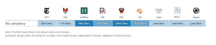
Some likely explanations
Likely voter models overstated Clinton’s support
Large number of undecided voters broke decisively for Trump
White voters without a college degree underrepresented in pre-election surveys
Weighting for education


2018: A brief repreive?
Polls did a better job
- Most state polls weighted by education
- Underestimated Democrats in House and Gubernatorial races
- No partisan bias in Senate Races
Forecasts correctly call:
- Democratic House
- Republican Senate
However…

2020: Historic Problems, Unclear Solutions
Average polling errors for national popular vote were 4.5 percentage points highest in 40 years
Polls overstated Biden’s support by 3.9 points national polls (4.3 points in state polls)
Polls overstated Democratic support in Senate and Guberatorial races by about 6 points
Forecasts predicted Democrats would hold
- 48-55 seats in the Senate (actual: 50 seats)
- 225-254 seats in the House (actual: 222 seats)
2020: What Went Wrong
Unlike 2016, no clear cut explanations for what went wrong
Not a cause:
- Undecided voters
- Failing to weight for education
- Other demographic imbalances
- “Shy Trump Voters”
- Polling early vs election day voters
Potential Explanations
- Covid-19
- Democrats more likely to take polls
- Unit non-response
- Between parties
- Within parties
- Across new and unaffiliated voters
How the polls did in 2022
Overall, pretty good
Average error close to 0
Average absolute error ~ 4.5 percentage points
Some polls tended overstate Republican support (e.g. Trafalgar)
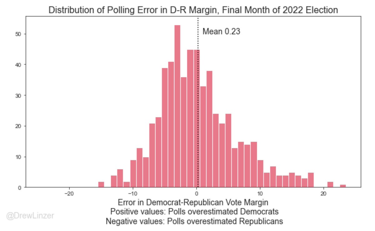
How the polls did in 2024
Overview
Good and bad news (Silver Bulletin)
Good:
- Average Polling Error within historical norms
Bad:
Consistently underestimate Trump/Republican support in Presidential election years
Bad job of calling close races
Average Error
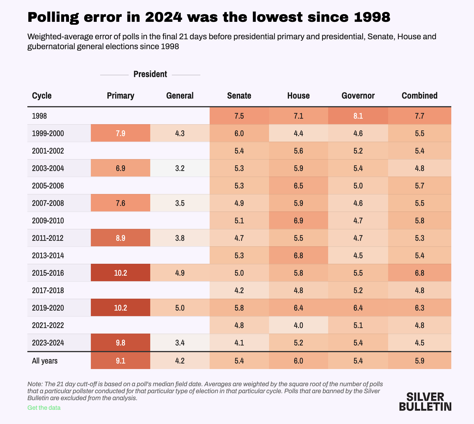
Persistent Bias
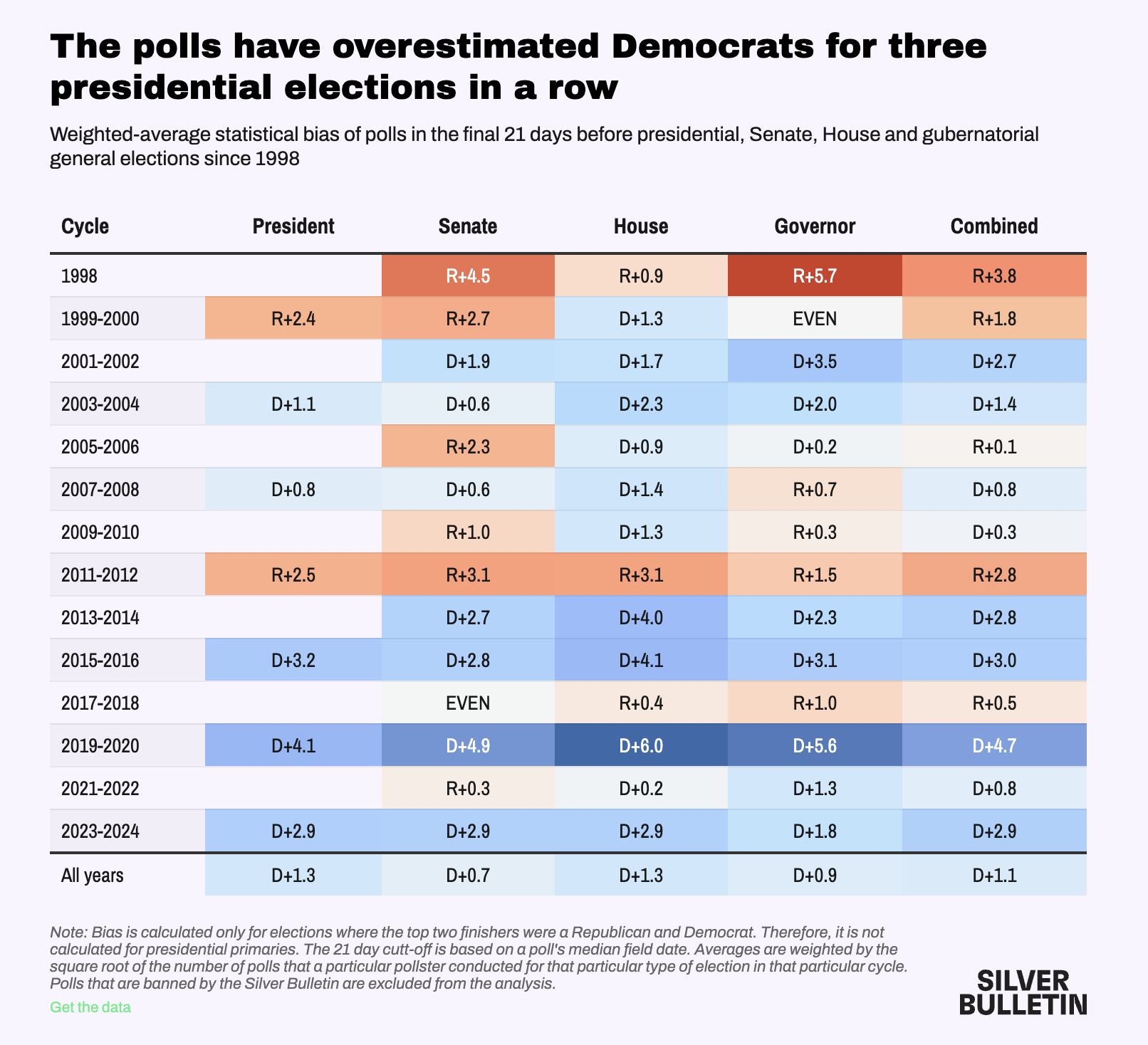
Calling Races
What to expect for 2026 Midterms
Democrats hold a 3-5 point lead in generic ballots
Polling traditionally better when Trumps not on the ballot
Lot’s can change between now and November (Temporal Error…)

For Next Week
References
Ansolabehere, Stephen, Jonathan Rodden, and James M Snyder. 2008. “The strength of issues: Using multiple measures to gauge preference stability, ideological constraint, and issue voting.” American Political Science Review 102 (2): 215–32.
Blair, Graeme, Alexander Coppock, and Macartan Humphreys. 2023. Research Design in the Social Sciences: Declaration, Diagnosis, and Redesign. Princeton University Press.
Converse, P E. 1964. “The nature of belief systems in mass publics.” In Ideology and discontent, edited by D Apter. Free Press.
Freeder, Sean, Gabriel S Lenz, and Shad Turney. 2019. “The Importance of Knowing ‘What Goes with What’: Reinterpreting the Evidence on Policy Attitude Stability.” Journal of Politics 81 (1): 274–90.
Glynn, Carroll J, Robert Y Shapiro, Garrett J O’Keefe, Mark Lindeman, and Susan Herbst. 2015. Public opinion. Westview Press.

POLS 1140